The last year has been a year of using up paints for me, so I changed the colors on my palettes quite a bit.
I didn’t post every single change in my palette, but now I have more or less settled into a palette setup that I like: I have one small field kit for everyday use (actually two field palettes that have almost the same colors, one waits in my sketching bag), and the rest of the paints that I own are consolidated in a larger studio palette and taken out or rearranged as I need them.
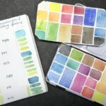
I’m using a mix of half pans and full pans. I find I don’t use too many large brushes for my work, so picking up color from the smaller pans isn’t a problem for the brush. More colors mean that I’m more flexible with mixing – this helps a lot, especially outdoors. I don’t want to spend all my time mixing colors in the field. I still follow the basic setup of having a warm and a cool version of each primary color, earth tones, and an opaque white. All in all, my field kit has now 19 colors.
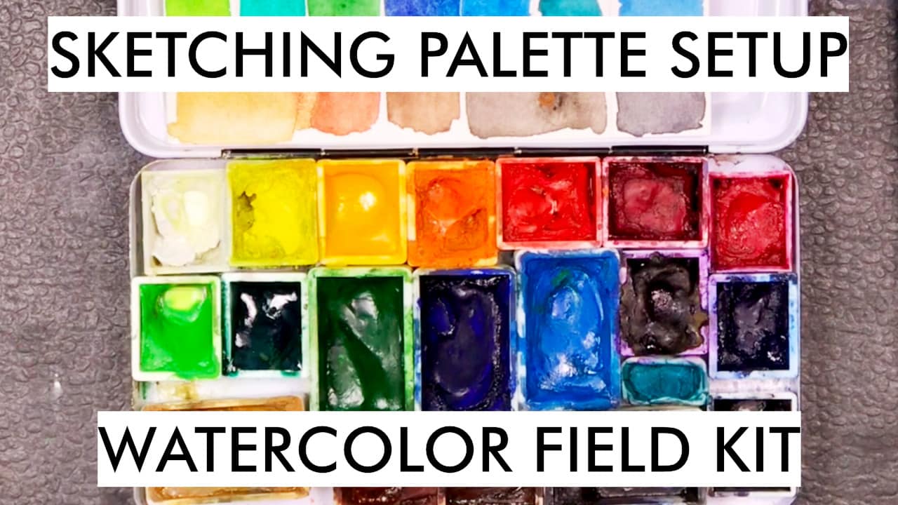
In this post, I will show all the colors in my small field palette.
Here’s the video version of this post:
My sketching palette in 2021 (video)
Here are all the colors in my small palette (field kit):
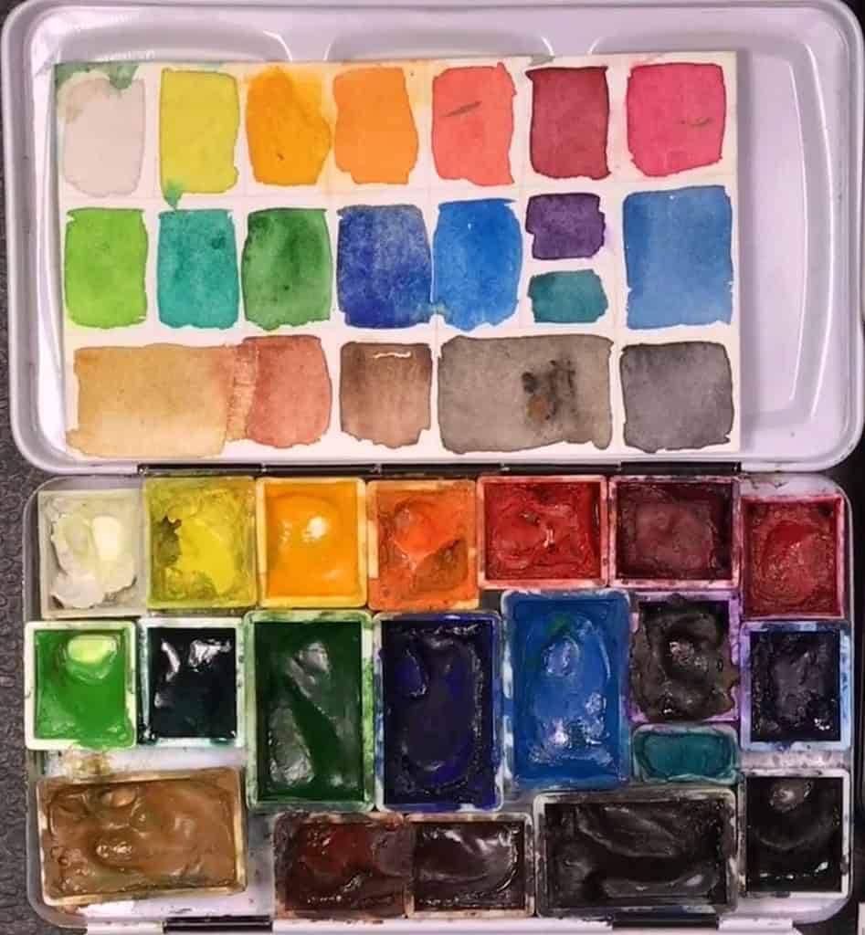
Titanium White PW6 – Gouache white, for adding highlights and mixing slightly opaque colors.
Schmincke Lemon Yellow PY3 – Semi-transparent, semi-staining cold yellow. A good primary yellow for mixing.
Schmincke Chromium Yellow Hue Deep PY65 – Semi-staining, semi-transparent warm yellow. My basic warm yellow. (Alternative: Yellow Orange PY153 – semi-staining, more transparent. For a lighter basic yellow choose Pure Yellow PY154. Another alternative yellow between lemon and darker yellow is Transparent yellow PY150, which can vary in color depending on how it’s applied – thin washes tend towards lemon, stronger layers tend towards ochre.)
Schmincke Chromium Orange Hue PO62 – Semi-staining, semi-transparent warm, dark orange that bridges the gap between the yellows and the reds. I find clean oranges hard to mix so I included this one.
Schmincke Vermilion PR255 – semi-staining, opaque red, a good warm red for mixing. (Alternative: Vermilion light PR188, lighter and more yellow, not as lightfast. Or: Schmincke Scarlet Red PR254 – semitransparent, staining red, slightly cooler than the Vermilion)
Schmincke Perylene maroon PR179 – semi-staining, and semi-transparent dark cool red. My alternative for the traditional (fugitive) Alizarin Crimson. (Alternative: Schmincke Madder Red Deep PV19/PR179, non-staining, semi-transparent)
Schmincke Ruby Red PV19 – semi-transparent, semi-staining pink. A cool red that’s great for mixing purples, pinks and oranges.
Winsor & Newton Dioxazine Violet PV23 – staining, transparent purple, great for shadows (alternative: Schmincke Cobalt Violet, non-staining, transparent, granulating, lighter and softer)
Schmincke French Ultramarine PB29 – A semi-staining, semi-transparent warm, dark blue, great for mixing. Granulating pigment. Schmincke Ultramarine finest for a non-granulating choice.
Winsor & Newton Cerulean Blue PB36 – semi-opaque, cool blue, great for skies because of its granulation
Schmincke Phthalo Blue PB15:1 – semi-staining, semi-transparent primary cyan (greenish blue), good mixing color, but intense.
Schmincke May Green PY151, PG7 – semi-staining, semitransparent warm, bright green mix, great for mixing into Spring foliage
Schmincke Sap Green PY153/PG7 – a semi-staining, transparent middle green tone that works as a great base for mixing greens
Schmincke Phthalo Green PG7 – non-staining, semi-transparent cool green. I never use this on its own, but it’s a good color for mixing with yellow or reds or for cooler greens.
Schmincke Yellow Ochre PY42/PY43 – semi-opaque earth yellow, similar to raw siena (which you could use as an alternative)
Schmincke Burnt Sienna PR101, PBk9 – semi-transparent, staining warm earth tone, very useful for mixing, traditional landscape color. (Unusual alternative: Schmincke Mahagoni Brown PBr33, non-staining, semi-opaque, granulating pigment that has less red but gives interesting effects – somehow I like it!)
Schmincke Burnt Umber PBr7 – semi-staining, semi-opaque warm brown, a bit cooler and darker than the Burnt Siena, great for dark warm areas.
Schmincke Sepia PBR7, PBk9, PB15:1 – a semi-staining, semi-opaque cool, dark brown, good for toning down mixes, fur, feathers and landscapes (Alternative: Daniel Smith Raw Umber PBr7, staining, semitransparent deep cool brown, or W&N sepia).
Schmincke Payne’s Gray PR101, PB29, Pbk7 – traditional dark gray. (Alternative: Schmincke Neutral Gray PR255, PO62, PB60 – semi-staining, semi-opaque grey without black pigment).
With this palette, I find I can cover a big range of subjects – nature, wildlife, landscapes, buildings, portraits, and whatever else I encounter. I’m very pleased with the current setup of my palette right now.
And I really like these small metal palettes since they’re very versatile, and they have served me well for years now.
More basic tips for setting up custom watercolor palettes:
How to set up your watercolor palette – basic tips
How to get vibrant mixes using the right primary colors with watercolor
How to get better mixes with watercolor and avoid muddy colors
If you’re looking into setting up your custom palette based on this post, I’d like to bring your attention to a video course called “Setting up a custom sketching palette with watercolor”. It’s an in-depth introduction to watercolor palettes, pigments and color theory and can help you even further when assembling your own palette. I go over color theory, mixing, palette and layout options and share what I look for when choosing colors for my sketching palette:
Setting up a custom sketching palette with watercolor

Thank you. Lots of good info
It’s always interesting to see what other people are using. I started with 4 colours (artists primaries) and added paints as I found I needed them (convenience, I didn’t like the shades I could mix, etc). I’ve ended up with a setup overall very similar to yours.
That sounds like a good process to put together your palette!
This was really informative – thanks!