Let’s take a look at primary colors and how understanding them gets you better mixing results.
You can watch a more or less similar video version on this topic here:
Colors in painting are an important tool – they’re not actually the most important for getting a painting to look right (that would be value), but the versatility of mixing different hues with each other to get new ones is fascinating. Yet, sometimes color mixing can seem difficult or it will not result in the colors you’d like to get.
Using primary colors for mixing is actually a big factor for getting better mixes, and understanding how the intensity, or chroma, of your primaries plays a role, is too. By choosing your primaries you can decide if you want a more muted mixing palette, or the ability to get clean, vibrant color mixes. Since watercolor often relies on the paper white shining through, a vibrant palette is often a good choice. But how to get there?
The idea of primary colors is that they can’t be mixed from other colors, and that you can mix every other color out of them. We all learn at some point that the primary colors are red, blue and yellow. If you try mixing with these colors as your primaries, you’ll get a muted palette. The Oranges might turn out well, but your greens and violets will be more on the muddy side. Now this might be what you intended if you chose these colors knowingly, but for most beginning painters it’s a big mystery why they can’t get all of the colors from mixing their primaries. The secret is that you’ve been using the wrong primary colors.
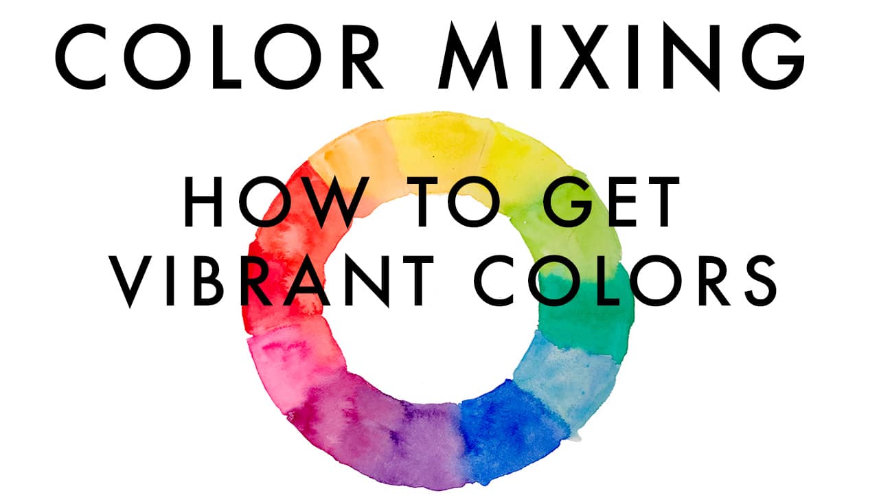
If you’ve ever looked at the cartridges in your printer, you will see that they use different colors for mixing (that’s all a ink printer does, mixing different hues by adding inks together). For most printing processes all over the world today the primary colors are yellow, magenta (a very intense pink) and cyan (a greenish intense blue). With these three, you can mix intense, beautiful secondary colors like violet and greens, as well as neutral colors like greys and browns. Secondary colors in this context means mixable from primaries.
Primary colors are called that way because they can’t be mixed. Whatever you do, you can’t mix magenta, or yellow, or cyan. You can, however, mix a red and a blue from these three primaries. So instead of using a red and a blue as your primary colors, try using magenta and cyan instead (yellow can stay if it’s a bright and clear one), and you can mix a surprising amount of different red shades.
Now we’ve learned the right colors for getting clean, intense mixes. Of course you don’t have to reduce your palette to only these three colors – it’s always useful to have the convenience of a few more color options, and I personally don’t like to mix all the time when I’m painting, so I add more colors to my palette as shortcuts. But as an exercise for getting to know the characteristics of your colors it’s good to know what the true primaries are and why only they will get you really clean, intense secondary colors. If you need them, you’ll be glad you have the right colors for mixing.
The good thing is that you can use this knowledge to get the effect you want each time – if you want a more subdued, darkish purple, you can use your blue and red for mixing, if you want an intense violet, use your magenta and cyan. Experiment and mix for yourself – this is still the best way to learn.
What I like to do in my palette (and countless other artists too), is to have a few more choices besides the primaries, so that I can mix vibrant or subdued colors, and have a few shortcut colors like greens or earth tones. Some artists like to describe their palette as a split-primary palette and they have the vibrant primaries and their subdued cousins (red, blue) next to each other. When compared, one of these versions can look warmer or cooler – this is where color temperature comes into play. Since perceiving the temperature of a color seems to be a highly subjective thing, it can be difficult to figure out where you perceive a single color on the spectrum – you always need a point of reference, or other colors.
One important thing that I want you to take away from this post is that your definition of primary colors can vary, depending on how you set up your palette (you could have a subdued earth palette with ochre and siena tones as your yellow and red), but if you want maximum vibrancy and the biggest range of hues, then you should make cyan, magenta and yellow your primary colors. We don’t really have integrated these basic hues into our vocabulary – cyan often is described as a greenish blue, when in fact it should simply be called cyan, and blue should be described as a reddish cyan.
Color manufacturers often have weird labels for their colors too – if you take a closer look at Phthalo Blue, you will discover that the pigment used for it is called Phthalocyanine blue – that’s where cyan reappears, an in fact Phthalo Blue (PB15) makes a great choice as a basic cyan. As for magenta, Quinacridone Magenta (PR122) or Quinacridone Red (PV19) is usually a good choice. For primary yellow, Benzimidazolone Yellow (PY154, PY151) is a good choice.
The discussion about primary colors, color temperature and mixing has been around for a while, and there are many resources and books out there. Some of them are really confusing, and all of them seem to quote Goethe (who had his own funny color theory that didn’t really hold up that well). In the end, what matters to us as we’re using these colors in our palettes, is to understand how they interact with each other, and how you can use these effects to get the painting you want. Mixing an exact color can be fun and very rewarding, but most of the time it isn’t as important as we think – getting your values right is much more important. Still, mixing colors and studying their characteristics can be a lot of fun.
If you’ve found this post or the above video useful. It’s part of a longer video class called “Setting up a custom sketching palette with watercolors”. In this video series, I show you everything you need for organizing a custom watercolor palette for outdoor sketching.
As always, I’m curious to hear what your experiences with mixing are. What primaries do you have on your palette? Do you pick your colors by temperature?

I just finished watching your class and it was really helpful, Julia. Thank you. I am now trying to decipher which brand is best and realize I need to use a few brands depending on the colors I want in my palette. I’d prefer to buy pans already filled but think tubes are going to be better, I just need patience layering and waiting for them to dry in the pans!
I’m happy to hear that, Nancy! You can’t really go wrong with any of the big names. Pans are more convenient, tubes a bit less expensive. I usually fill my pans in two sessions and let the paint dry overnight. And you don’t even need to fill the pans to the brim for painting. Happy sketching! 🙂
Thank you. One question, in your course you mention Quinacridone Pink, what brand makes it? I am not finding it.
My apologies for being unclear. The red quinacridone pigments are often named a bit confusingly, so I probably made up the quin. pink…
For a cool primary red/pink color, you could use quin. red (PV19), quin. violet (PV42) or quin. magenta (PR122), pyrrol red (PR264) is also a great choice, it comes close to the traditional Alizarin Crimson. I like the PV19 variety, very bright and clear – also what I used in the course as my magenta. If you compare the pigment names you should be able to find the corresponding colors, they will all have differing names depending on the manufacturer. Hope that helps!!
Thank you, makes sense!
I have tried in vain to find benzimidazolone. Who makes it?
If you search by pigment number you should find it: PY154. Most paint companies call it something else: W&N Winsor Yellow, Schmincke Pure Yellow, and Holbein Imidazolone Yallow are a few name varieties for this pigment. Hope this helps!
Good morning, Julia – Delighted to find your website. I am new to watercolor (new to “art,” to be fully frank) and have been using various palettes. It’s time to figure out a palette that is more personal to me and my part of the world (Maine’s mountains lakes forests areas, and more broadly the same sort of geography in New Hampshire and Vermont). I would like to start with your vibrant CYM triad and am using Daniel Smith paints. I can find PY151 in the DS line, which is marketed as Azo Yellow. I can find PR122 as DS QuinViolet, and PV42 as DS QuinPink. Blue is my main difficulty, since Phthalo Blue (PB15:0) is tough to find.
Can you tell me which specific watercolours you used for the primary CYM triad you’re discussing here? Brand + Marketing Name would be wonderful. I’m really stuck on the blue, because it seems that a non-granulating paint would be desirable for a transparent and vibrant palette, and DS’s PB15 is Manganese Blue Hue (granulating and fairly light in shade). However! I only know what i have read, and much general info is contradictory.
Thank you, Julia – your nature sketches are what i strive for. Best, -karen.
Thank you Karen! Daniel Smith offers Phthalo Blue Green Shade which should work well as a cyan. The pigments I used here were probably Lemon Yellow (PY3) or Winsor Yellow (PY154), Quin. Red/Permanent Rose (PV19) and Phthalo Blue GS (PB15), a mix of Schmincke and Winsor&Newton colors. Remember to add warm versions of these primaries for a well-rounded palette, for landscapes this will come in handy. 🙂
This post is so helpful! I’ve never thought about going outside of blue, yellow, red as primaries. But it explains why the Daniel Smith six-colour primaries set appealed to me – I knew it basically was two sets of primaries, but I didn’t understand WHY. Now I know. And now I’ll know what to look for in the future when buying individual colours. I love vibrant colours, and couldn’t figure out why using b/y/r was frustrating for me!!