If you’ve followed my blog for a while, you know I made a few updates to my watercolor palette last year (read more about my previous palette layouts here and here), mainly about arrangement and a few pigments, and now I’ve changed my palette again. This time the changes are more prominent. I’ve shared my complete palette layout and why I use each pigment at the end of the post, so if you want to set up a new palette and need some ideas I hope this information is helpful. So let’s dive into a bit of technical talk about pigments.
Here is a video version of this post:
Click here if you can’t see the video.
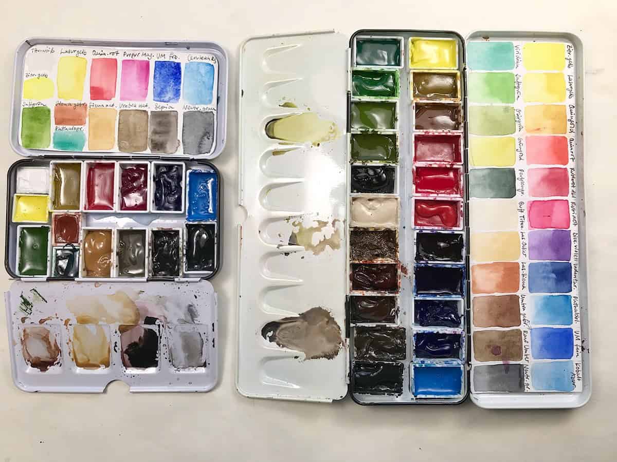
I have two small metal palettes that I use for sketching, one of them is a slightly bigger one that I introduced last year. I use it mainly in the studio, but sometimes I like to bring it with me when I want to have a lot of choice with my colors and don’t want to mix a lot – it holds 22 colors. I have changed my smaller palette to a simpler, more reduced palette with 14 colors, one of these being white. Both palettes use more full pans, which has proven useful since I’ve switched to slightly bigger brushes (mostly size 8 round).
The weight of the bigger metal palette isn’t much higher, it’s around 100 g heavier than the old metal palette, and it’s compact enough for me. It has a larger mixing area, which I find very practical.
The color choices in both palettes are mostly ones that I know and use often. In the small palette I have put a few classic colors that I either want to become comfortable with (like Sepia and Raw Sienna), and ones that I want to use up this year (like Purple Magenta, which is not my usual choice for a cool red). I’ve also added a gouache white to the small kit, since I found myself reaching for it a lot while sketching – usually for highlights. The smaller palette comes close to a classic plein air palette (for outdoor painting), and I’m thinking of reducing it further to see how far I can get with only a few colors.
The bigger palette is what I use mainly for illustration work where it’s nice to have more color choices, and it holds a selection of very transparent, vibrant pigments for every kind of use. Most of my pigments are chosen for transparency in that palette.
There are some changes pigment-wise, I’ve thrown out my vermilion red for now, as I didn’t like how it muddied mixes, the same is true for Chrome Orange. May Green, and Quinacridone Violet had to go, too – I simply don’t use them during this season, and they can easily be mixed. Instead, I’ve added Quinacridone Gold to the big palette, which a lot of watercolorists love, and I can see why, it’s a great mixer and very versatile. It isn’t essential though, as it can be easily mixed.
As a warm red I’ve decided on W&N Quinacridone Red (PR 209) for the time being, which is an unusual choice, but I like it so far. It’s not a classic warm red hue – in direct comparison to Pyrrol Red or Vermilion it looks almost pink – but it’s a very good mixer, as it’s very transparent, which a lot of the other warm red hues aren’t. You can get lovely violets, dark reds, and oranges with it.
In the big palette I’ve added Indanthrone Blue as a dark blue to be able to punch my dark blues a bit more, and I’ve exchanged Phthalo Green for Viridian, which is the same hue, but softer and granulating. This is a new pigment for me, so I will see how I like it. It’s much less intense compared to the Phthalo color, and you have to work a bit more at it to get a good amount for mixing – since I don’t use this as a standalone color. I expect to make small tweaks to both palettes throughout the year as I’m using up my existing paint tubes before I buy new ones (read here why).
The rest has more or less stayed the same, I’m still astonished at the number of colors I was able to fit into both palettes, although I rarely use more than 3-6 colors in a single painting.
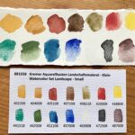
Here are all the colors in my small palette:
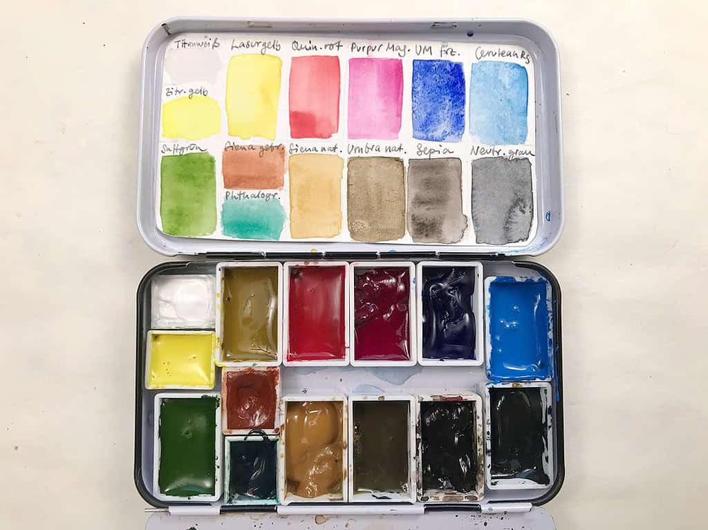
Titanium White PW6 – Gouache white, for adding highlights and mixing slightly opaque colors.
Lemon Yellow PY3 – Semi-transparent, semi-staining cold yellow. A good primary yellow for mixing.
Transparent Yellow PY150 – Semi-staining, transparent warm yellow that changes from a brownish dark tone to light warm yellow when diluted.
Quinacridone Red PR209 – A non-staining, semi-transparent red that’s slightly warm and can be mixed to warm or cool hues easily.
Purple Magenta PR122 – Transparent, semi-staining quinacridone magenta, close to the primary color magenta.
French Ultramarine PB29 – A semi-staining, semi-transparent warm, dark blue, great for mixing. Granulating pigment.
Cerulean Blue PB36 – semi-opaque, cool blue, great for skies because of its granulation
Sap Green PY153/PG7 – a semi-staining, transparent middle green tone that works as a great base for mixing greens
Phthalo Green PG7 – non-staining, semi-transparent cool green. I never use this on its own, but it’s a great color for mixing with yellow or reds.
Burnt Sienna PR101, PBk9 – semi-transparent, staining warm earth tone, great for mixing, traditional landscape color.
Raw Sienna PBr7, PY43 – a semi-staining, semi-transparent light earth yellow, great for mixing and landscapes.
Green Umber PBr7 – a non-staining, semi-transparent greenish Earth tone, lighter than Raw Umber, great for landscapes.
Sepia PBR7, PBk9, PB15:1 – a semi-staining, semi-opaque cool, dark brown, good for toning down mixes, fur, feathers and landscapes
Neutral Gray PR255, PO62, PB60 – semi-staining, semi-opaque grey without black pigment. Great for mixing and painting dark areas you want to look alive.
All colors by Schmincke except Quin. Red and Sap Green (Winsor & Newton)
Here are all the colors in my big palette:
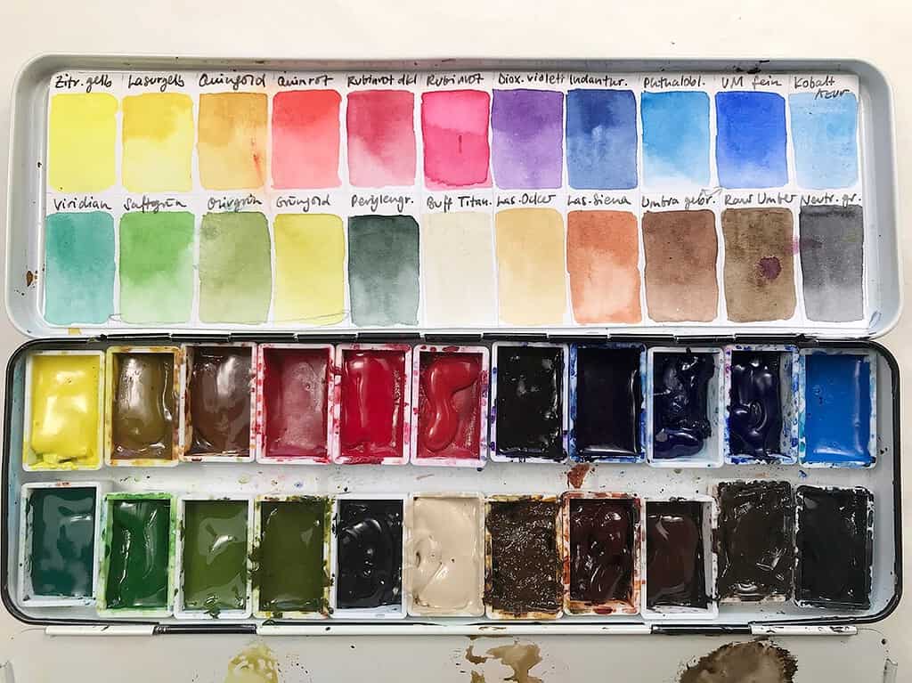
Lemon Yellow PY3 – Semi-transparent, semi-staining cold yellow. A good primary yellow for mixing.
Transparent Yellow PY150 – Semi-staining, transparent warm yellow that changes from a brownish dark tone to light warm yellow when diluted.
Quinacridone Gold PY150, PR101 – Semi-staining, transparent goldbrown yellow, very good for mixing greens and foliage.
Quinacridone Red PR209 – A non-staining, semi-transparent red that’s slightly warm and can be mixed to warm or cool hues easily.
Ruby Red Dark PR264 – Staining, semi-opaque dark cool red. Good alternative for the traditional Alizarin Crimson.
Ruby Red PV19 – semi-transparent, semi-staining pink. A cool red that’s great for mixing purples, pinks and oranges.
Dioxazine Violet PV23 – staining, transparent purple, great for shadows
Indanthrone Blue PB60 – semi-staining, semitransparent warm, blue that can go very dark.
Phthalo Blue PB15:1 – semi-staining, semi-transparent primary cyan (greenish blue), good mixing color, but intense.
Ultramarine finest PB29 – A semi-staining, semi-transparent warm, dark blue, great for mixing. This Ultramarine doesn’t granulate.
Cerulean Blue PB36 – semi-opaque, cool blue, great for skies because of its granulation
Viridian PG18 – non-staining, semi-transparent green, a softer alternative for Phthalo Green when mixing other greens. Granulating.
Sap Green PY153, PG7 – a semi-staining, transparent middle green tone that works as a great base for mixing greens
Olive Green PO62, PG36 – staining, semi-transparent warm green mix, good for landscapes.
Green Gold PY129 – warm transparent yellow-green, good for mixing with other greens.
Perylene Green PBk31 – semi-staining, opaque dark green, almost black, great for shadows.
Buff Titanium PW6:1 – Semi-transparent pale light brown. A favorite of mine for painting sand, or light areas of birds.
Transparent Ochre PY42 – a staining, transparent light earth yellow similar to Raw Sienna, but entirely transparent, so great for mixing and glazing.
Transparent Sienna PR101 – staining, transparent warm brown, a transparent alternative to Burnt Sienna, great for mixing.
Burnt Umber PBr7 – semi-staining, semi-opaque warm brown. Good for landscapes.
Raw Umber PBr7 – staining, semi-transparent deep cool brown, cooler than Green Umber (see small palette).
Neutral Gray PR255, PO62, PB60 – semi-staining, semi-opaque grey without black pigment. Great for mixing and painting dark areas you want to look alive.
All colors by Schmincke except Quin. Red and Green Gold (Winsor & Newton), and Buff Titanium and Raw Umber (Daniel Smith).
If you’re looking into setting up your custom palette based on this post, I’d like to bring your attention to a video series that I recently published called “Setting up a custom sketching palette with watercolor”. It’s an in-depth introduction to watercolor palettes, pigments and color theory and can help you even further when assembling your own palette. I go over color theory, mixing, palette and layout options and share what I look for when choosing colors for my sketching palette. I’ve also recently added a Q&A video with the most popular questions and hope to add more of these in the future – these updates are of course free for existing students.
How is your palette arranged? What kind of pigments do you prefer and how big is your palette? Let’s talk about color!

Where did you purchase the small palette box?
At my local art supply store. You can also get these empty metal palettes online.
Maybe I shouldn’t mention this as you are trying to avoid buying new art equipment this year. I wanted a palette and sketchbook small enough that I would have no excuse not to take it with me. I have ended up with an A7 book, a water brush and a wonderful tiny palette from Expeditionary Art. https://art-toolkit.com/ It just makes me smile every time I open it.
That’s perfectly alright Steve I still love seeing what other artists use! I have heard good things about these tiny palettes. I’m glad to hear it motivates you to sketch more!
This is great! Good information, thanks.
You’re welcome Nancy!
I am glad to find the included Pigment # and for all the technical information that you share, it is uncommon to encounter this level of color analysis for setting up a palette. Previously I had been frustrated in mixing vibrant violets, you have made some very useful suggestions, that I will use in updating my existing palette. Thanks, Julia!
Laurie, I’m glad what I share is helpful to you, and that you found violet mixes that work for you!
Thank you for this insightful and inspiring blog post. I am always interested in other artists’ palettes as there is so much to learn about color and color combinations. It’s easy to get stuck in the rut of just using the same paints over and over. This post is inspiring me to switch things up, and swatch too, and discover what there is to discover. I see you use mostly Schmincke which is a gorgeous watercolour. Do you ever use Sennelier watercolors? Thanks again!
You’re welcome! I’m actually liking that rut, because it prevents me from overconsuming paints. 😀 You can learn so much about painting, and color and light, with just a few colors in your palette. But anyway, no, I’ve never used Sennelier, I understand they’re formulated with honey?
Hi Julia,
Thanks for posting your palette.
Both my warm yellow (PY110) and Light Ochre (PY42+PY43) ran out at the same time, and looking at your transparent yellow I am wondering if it would be a good choice to replace both of my colors.
I usually use warm yellow to mix muted greens with ultramarine and I use light ochre with Phthalo Green to mix natural looking greens. I also use light ochre with a warm red to mix skin tones when sketching people. From your experience do you think I could do this with transparent yellow (PY150). Ideally I would just buy it and try it out, but I am trying to minimize the amount of paints I buy and keep.
Thank you!
Hi Simao, you can definitely mix nice transparent greens with transparent yellow, and the range of blues with UM Blue and Cerulean Blue is great. As for skin tones, I understand you want a muted orange mix tending towards ochre – you won’t get that from PY150 unless you add white to the mix. It’s very intense and overpowering, and will give clear orange mixes – think of sunsets. I would tend towards adding a light earth tone back into the palette for that. I find either Raw Sienna or Yellow Ochre to be very useful in lots of cases. Hope that helps!
ah ok, yes this helps a lot. I think I’ll keep using yellow ochre then which is very useful to me. I think I’ll try the transparent ochre from schmincke which is also single pigment. Thank you!
That’s also a nice choice for a transparent pigment, yellow ochre can be very opaque.
I have tied to find out what colors you used for the color wheel and I tried going to the site of your blog and it wasn’t there, then another one sent me to ? I wish I could just get an list of the paints and a conversion chart or a DS equivalent. Really wanted to do the work for class, I hope you can help me. Enjoyed the class!!! Thank you so much.
Hi Kathleen,
the color wheel that I showed throughout the class is based on my small field palette shown above. I have listed the colors/pigments I use in that palette in the post. As for DS paints, I don’t know them enough to name equivalents on the top of my head, but you can choose similar colors if you go by the pigment number that I have supplied. It doesn’t matter as much to choose the same exact pigments, what’s important is that you have the ones that are useful to you. I will put this on my list though! I hope that helps you, let me know if you have any more questions at all!! 🙂
Mijello is also a great palette! I use it at home and out. I was surprised to discover I can fit 2 regular-size brushes, a pencil, an eraser, and a few paper towels in it and close the lid. There’s even more space but that’s all I need for quick sketches on the road.
Oh I have to try this at some point! But won’t soggy paints make the brushes etc. dirty on the way back home?