I have made a few updates to my palette recently that I will share in this post. I’m also happy to report that I’ve slowly started drawing and painting again after a few months of dealing with a hand injury that prevented me from sketching altogether. Currently I’m exploring painting more loosely and with a bigger brush to avoid straining my hand again, and I have to say that I’m really enjoying the results.
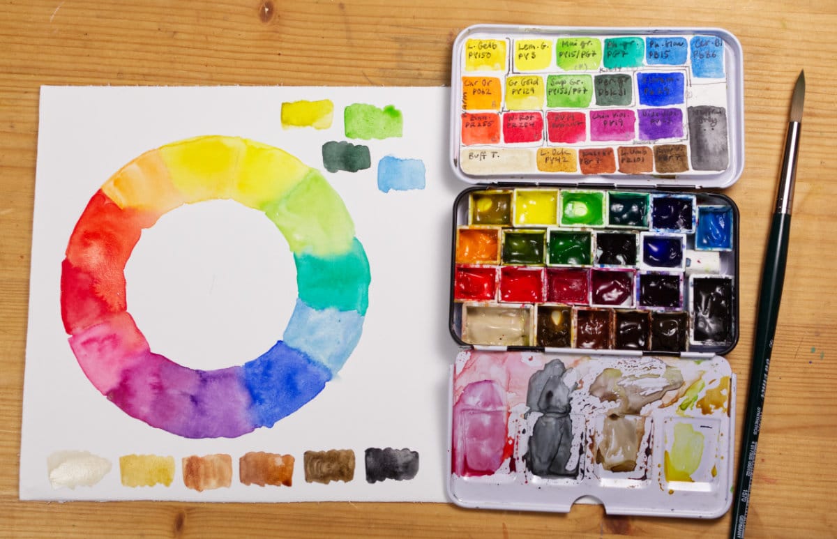
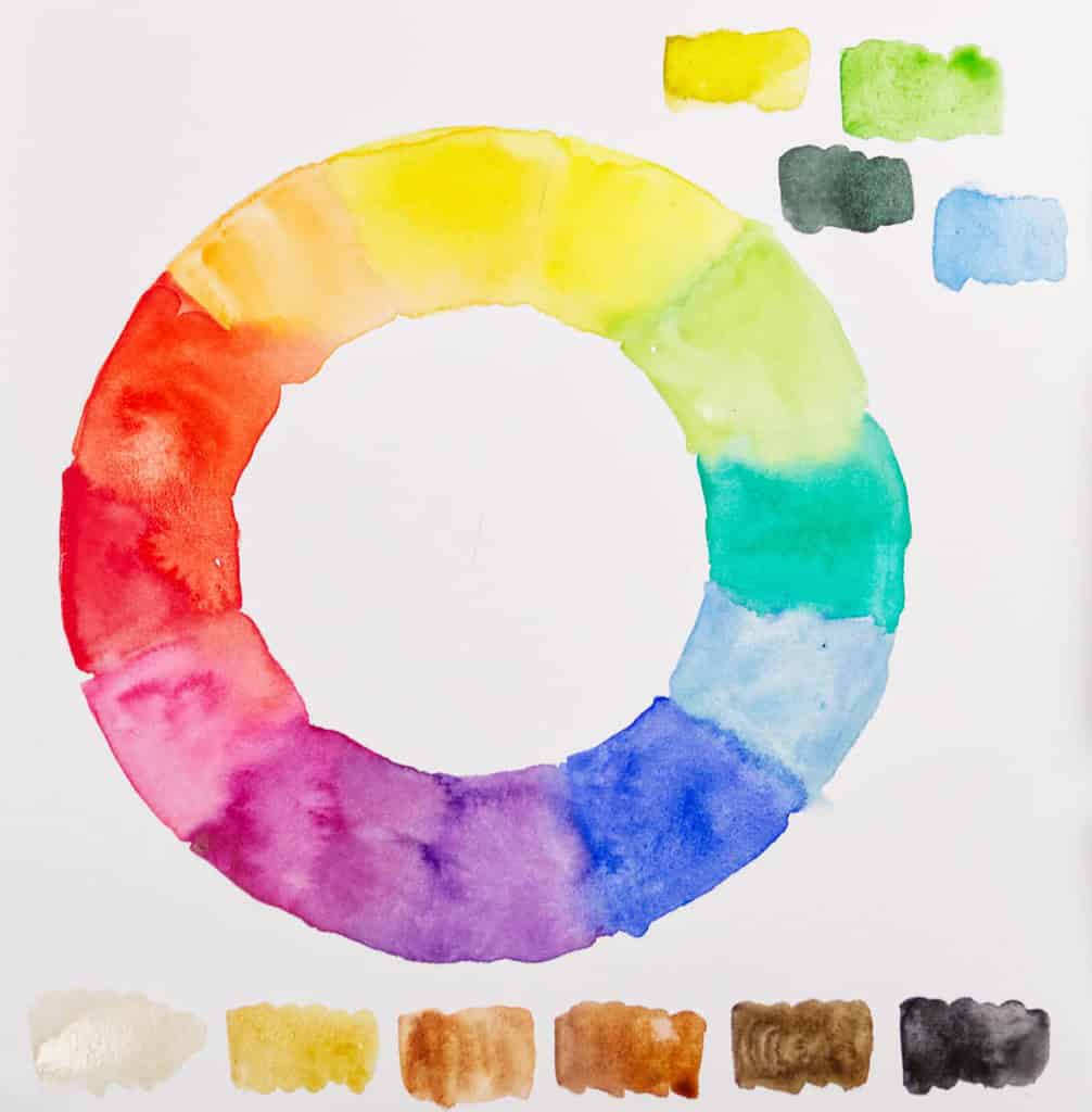
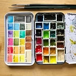
On to my palette: I’ve mainly made changes in the arrangement of colors (here’s the old palette, still mostly the same colors), I’ve now set up my palette more like a traditional split primaries color wheel – in addition to already having a warm and a cold version of each primary color. I’ve tried to group them in together by similar mixing properties in the palette, and, as far as I could arrange the colors, in a wheel-shape. I’ve never entirely understood the appeal behind this layout and its benefits before, but it comes in handy when you want to create stronger and more vibrant mixes. Basically you group your colors in similar groups and create your mixes based on that. So for example you put your cold (lemon) yellow in a group with a cold green (Phthalo Green) and a cold blue (Cerulean or Phthalo) and by mixing in the same group, you can intensify these colors with each other without muddying them. I’ve always painted and mixed my colors in a more intuitive way and enjoyed learning a structured approach. I will see if it changes anything about my sketching technique or if I basically did the same thing without explicitly knowing. I will explain more about the concept behind the split primaries palette and how you mix different colors with it soon if you’re interested.
I’ve also taken out one color of my palette because it didn’t fit anymore in the small metal case, so I now have 22 pans – which is more than enough. Payne’s Gray and Davy’s Gray had to go, I wasn’t using them enough to justify them, and I’ve never entirely liked the slightly greenish Davy’s Gray and the fact that it is made of 4(!) pigments. I’ve also replaced Cobalt Blue with Ultramarine (PB29), and added Schmincke Quinacridone Violet (PV19) to my palette to see if I need a purple.
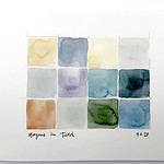
As for favorites in this palette, right now I’m really loving the transparent Earth tones – especially the intense Transparent Umber (PR101) and Transparent Ochre (PY42) (both by Schmincke) – they are great for glazing, and I particularly like that I have an ochre hue that has no opacity whatsoever – great for mixes! I’m also very much enjoying the return of Ultramarine to my palette, although I’m not sure if I’ll miss the Cobalt Blue that had to go.
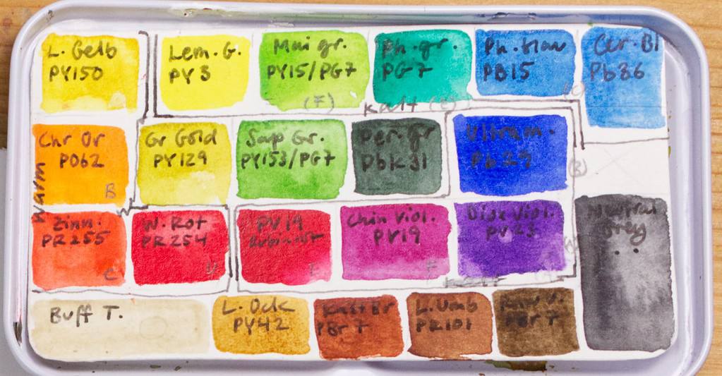
My palette is now made of:
Schmincke Transparent Yellow PY150 – Semi-staining, transparent warm yellow that changes from a brownish dark tone to light warm yellow when diluted.
Schmincke Lemon Yellow PY3 – Semitransparent, semi-staining cold yellow. A good primary yellow for mixing.
Schmincke May Green PY151, PG7 – semi-staining, semitransparent warm, bright green mix, great for mixing into Spring foliage
Schmincke Phthalo Green PG7 – non-staining, semitransparent cool green. I never use this on its own, but it’s a great color for mixing with yellow or reds.
Schmincke Phthalo Blue PB15:1 – semi-staining, semitransparent primary cyan (greenish blue), good mixing color, but intense.
W&N Cerulean Blue Red Shade PB36 – semi-opaque, cool blue, great for skies because of its granulation
Schmincke Chrome Orange PO62 – Semitransparent, semi-staining orange
W&N Green Gold PY129 – warm transparent yellow-green, good for mixing with other greens.
Schmincke Sap Green PY153, PG7 – a semi-staining, transparent middle green tone that works as a great base for mixing greens
Schmincke Perylene Green PBk31 – semi-staining, opaque dark green, almost black, great for shadows.
Schmincke Ultramarine finest PB29 – A semi-staining, semi-transparent warm, dark blue, great for mixing. This Ultramarine doesn’t granulate.
Schmincke Vermilion PR255 – semi-staining, opaque red, a good warm red for mixing
W&N Winsor Red (Pyrrol Red) PR254 – semitransparent, staining, cool red
Schmincke Ruby Red PV19 – semitransparent, semi-staining pink. A cool red that’s great for mixing purples, pinks and oranges.
Schmincke Quinacridone Violet PV19 – a semi-staining, semi-opaque intense purple.
W&N Winsor Violet (Dioxazine Violet) PV23 – staining, transparent purple, great for shadows
DS Buff Titanium PW6:1 – Semitransparent pale light brown. A favorite of mine for painting sand, or light areas of birds.
Schmincke Transparent Ochre PY42 – a staining, transparent light earth yellow similar to Raw Siena, but entirely transparent, so great for mixing and glazing.
Schmincke Maroon Brown PBr7 – semi-opaque, non-staining warm earth tone, a granulating alternative to Burnt Siena.
Schmincke Transparent Umber PR101 – staining, transparent warm brown, a bit cooler than the Maroon Brown, great for mixing.
DS Raw Umber PBr7 – staining, semitransparent deep cool brown, a difficult color to mix.
Schmincke Neutral Gray PR255, PO62, PB60 – semi-staining, semi-opaque grey without black pigment. Great for mixing and painting dark areas you want to look alive.
DS = Daniel Smith W&N = Winsor & Newton Professional
So actually I haven’t changed a lot of colors in my palette, I’ve just changed the layout a bit and exchanged a few select pigments. I still have mostly transparent, single pigment paints in my palette, and I’ve grouped them as best as I could in a sort of color wheel in my palette – the warm yellows and reds on the left, the cool yellow, greens and blue on the top, the violets, cool red and warm blue in a third group, and the earth tones at the bottom. I will let you know how I like this updated layout. And by the way I’m also really happy that I’m back at painting again, it has been such a long time of not doing much with pen and brush, and I’m really excited about that! I’m also currently in the process of making a small class about sketching in autumn, so that will come out soon, too.
How is your palette arranged? What kind of colors do you prefer and how many do you use? Let’s talk about palettes, I’m curious to know.

The Daniel Smith Raw Umber, did you mean that that specific tint doesn’t mix well with other colors or that the tint itself is difficult to produce from your existing palette? I think you mean it produces a muddy look when mixed with other colors. Thanks for the continuing watercolor series. It’s informative and well curated.
I meant that this particular cold brown tone is hard to mix from other colors in my palette. It actually mixes quite well with other colors when you don’t use too much.
So glad to hear that your hand has improved enough for you to resume drawing and painting. Thank you for this update.
Thank you Barbara, I’m also very relieved and happy that I can paint again! 🙂
Sorry to hear about your hand! Glad it’s getting better! Thank you for the very informative update and your kind reply to my email – wanted to get back to you but haven’t gotten around to it yet. I’m very much looking forward to your autumn course!!
Liebe Grüße von Ayoka
Thank you Ayoka! Don’t stress about the email. 🙂 The autumn class will hopefully be finished next week, I’m having a great time filming it!
Thank you for this interesting post Julia. The tip about mixing cool colours to avoid muddy colours is one I will try. I had tried managing without a green as my outdoor palette is very small but recently I have squeezed in a sap green and a vermillion to make it easier to paint quickly when time is short.
I’m glad you enjoyed the post, Kathryn! You can of course, also make bright mixes from warm colors (think of yellow and orange hues). I agree that having a few more colors will save time when painting outdoors!