One of the most important things I learned about painting is to choose by watercolor pigments, not just by names. Watercolor manufacturers pick the name on the tube mainly for marketing reasons, so you can never be sure if your Indian Yellow, Sap Green or even Quinacridone Magenta have the same characteristics when bought from different companies. Usually they don’t, and this is not only due to the specific paint formula, but it depends on which pigment the manufacturer chooses to include. Fortunately, they document what pigments go into the paint, and that means that you can use that information to choose specific pigments. Let’s take a look at how watercolor pigments and paints are made, and how you can learn to choose the right colors for your palette.
What watercolors are made of – Binder + Pigment
All paints are made of pigments and some kind of binder to keep the pigments in one place and on the paper. For watercolor, this binder is gum arabic, a natural substance from acacia trees, some companies also use honey or glycerin to add viscosity to the paint. But essentially, the recipe for paint made with gum arabic is the same one like 1000 years ago – you take the yellow pieces of the dried gum arabic, mill them, add water, and stir in your pigments.
The history of color pigments is quite fascinating and I enjoy reading about the origins of the paints we use today, since the names connected with certain colors show the stories and culture behind them, and can help to understand where they came from and how people used them. Until ca. two hundred years ago, all of the pigments that people used, came from minerals, plants, or metals, from organic and anorganic sources. You could measure how rare or difficult to obtain a pigment was by its price and its use in paintings – the tyrian purple made from sea snails (1000 snails for 1 gram of pure pigment) was so expensive it became a symbol for royalty in paintings, because kings were the only ones who could afford it.
Another exceptionally expensive pigment was ultramarin (meaning „over the sea“) which came from so far away (a certain mine in Afghanistan to be precise), and was so unbelievably laborious to extract that it was worth more than gold. But the process resulted in a wonderfully fine and exquisit blue, and Renaissance painters almost only used it for the robes of the Virgin Mary (and occasionally for more when they had wealthy patrons, see below).

Photo by Hugo DK, via Wikimedia Commons
Only when synthetic pigments were invented, the palette of painters changed and expanded. Today, we have hundreds of pigments available, and almost all of them come from the labs of the chemical industry! There are almost no pigments left that come from natural sources today, except a few handmade paints, or explicitly mineral-based paints by certain manufacturers. This was something that surprised me when I learned it, because the paints surely have nice-sounding names like Burnt Siena (which reminds us of the place where this Earth pigment was mined in Italy) or Vermilion (which used to be made of the powdered mineral cinnabar). Essentially all of these paint names are nice sounding marketing tricks by the manufacturers, because the pigment powders that you pay for when buying a paint tube today are made in the factories of Bayer, Hoechst or Geigy, often as by-products from other chemical processes.
The main buyers for pigments today are not artists, but the industry: for automobiles, industrial paints, and so on. But we as artists want to love the colors we buy, and so that tiny fraction of the pigment industry keeps their traditional names on top of their pigment names. Let’s take a look at the system with which pigments are named, because you can use it to your advantage as an artist.
How To Read The Information On Paint Tubes
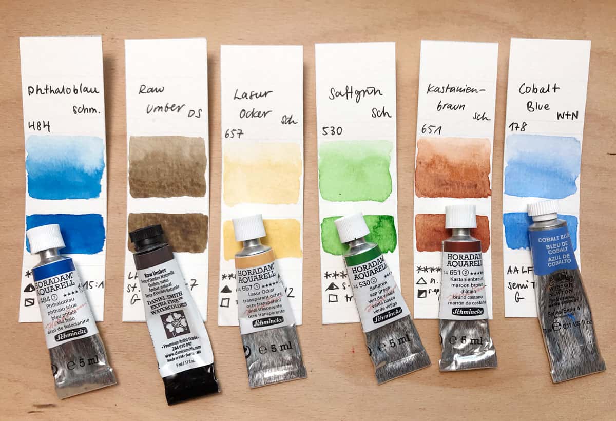
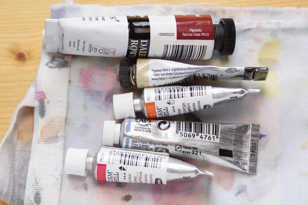
The way these pigments are named is pretty straight forward: they all get a so-called color index, or pigment name. The name starts with letters indicating the color, so „PY“ stands for yellow pigment, or „PB“ stands for blue pigment. This is followed by a number, so PY35 would be short for „Cadmium Zinc Sulfide“, which can be made into different hues of Cadmium Yellow.
Note that even one particular pigment can turn into different hues depending on how the pigment is processed, so some manufacturers might make a Cadmium Yellow Light from PY35, and others a Cadmium Yellow Deep. This is most notable with the different Earth tones, for example PBr7 , where you can get a vast range of pale earthy browns to intense red browns from the same synthetic iron oxides, depending on how they are processed (natural, calcinated, etc). And of course you can also mix pigments with each other, so what’s traditionally called „Raw Sienna“ in your palette might be a pure PBr7, or a PY42, or PY43, or a mix of one of these with even another pigment thrown in. All of these mixes might have the name „Raw Siena“.
This is why it’s usually more helpful to look at the pigments and mostly ignore the name on the tube and choose your paint by looking at the pigment name. You will get a feel for the characteristics of certain pigments after a while, and you can make more informed decisions about your paints that way.
Choose pigments instead of color names
So how can this information help you when choosing paints? Well, for one it can help you to see how manufacturers make their mixes. If you take a look at a tube of Schmincke Olive Green Yellow, you can see it’s a mix of PO62 (Benzimidazolone Orange) and PG36 (Phthalocyanine Green) – both pigments that I regularly have on my palette, so I could choose to mix it from scratch. Since it’s a color I use quite often, I prefer to have it ready to go and use the premixed paint by Schmincke instead.
Knowing how certain colors are made gives you the freedom to choose and decide if you rather want to use colors that only consist of one pigment, or if it’s ok to use convenience mixes in some places. You can also choose to avoid certain pigments based on their characteristics (like opaqueness, lightfastness, staining, heavy metal content). Pure pigments are usually better for mixing since they give brighter results, but I like to have a mixture of both on my palette. You don’t need to be a purist who only uses three primaries to mix all their other colors from scratch to enjoy watercolor paint. When I want to sketch a landscape or a plant quickly, I don’t want to start mixing my colors from primaries, instead a grab a green that I know will mix well with my other colors, and I know that because I have chosen it based on its pigments and because I have tested how well it mixes beforehand. This information can also help you to avoid duplicate pigments on your palette, and simplify your choices.
Most manufacturers have extensive information about pigments on their website, and they all are required to print the pigment names on the paint packaging. Another great place to learn about the characteristics of pigments is the website of Bruce McEvoy – handprint.com. Despite being slightly outdated, it has a ton of valuable information about watercolor pigments, and I’ve spent quite a few rainy afternoons on the site, reading and taking notes.
Learn about pigments by mixing them
The best way to learn about pigments in a practical way is to use them. So I want to encourage you to take a look at the pigment name (not the arbitrary name the manufacturer has chosen) and see how it combines with another pigment. Make small mixing charts, or try to mix a certain color like black, cool brown, or gray from your paints. Mix different shades of violet, or green. Note which pigments you used and what effect you get. Particularly note when mixed colors stay brilliant, or turn to mud – this is often a hurdle for watercolorists, as of course we want our painting to have strong and vibrant colors. Take a look at some paint tubes, and try to mix the same color from scratch with single pigments you have. By doing this you can learn a lot about watercolors, and it’s a lot of fun, too! I often paint these mixing experiments straight into my sketchbook to have a reference later on.
I hope you found this insight into pigment names interesting! Have more questions about pigments and colors and paint names? Let me know in the comments!


Hi Julia
I really enjoyed your article on pigments and your scientific approach (being a retired scientist)!
After years of watercolour painting following instructions and tutorials where colour choices have been made for me by the instructor I started feeling unhappy with what happens in my paintings and when doing my own experiments. I had a particular problem with sap green that often muddied my mixes and dulled the layered washes. To really get on the bottom of the problem I spent a summer studying the pigments that my colours were comprised of and found sap green by the manufacturer I used was already comprised of 3 pigments and from other manufacturers even 5. In mixed with other colours the number of pigments rose to up to 10. This explained my problem and J became a big of a purist. I switched to the Daniel Smith range which has the best and most thorough characteristics list with every of their over 250 colours and built my palette up gradually from just single pigment colours. I bought their pigment tester charts and made large swatch cards to help with my choices. I also have a swatch card with all vital info I.e pigment, granulating or not, transparency and lightfastness in the other of colours in my palette. I know people find that a bit over the top but it helps me immensely to keep my paintings fresh, transparent, luminous.
Best wishes and happy painting
Marion
Hi Marion,
I make the same kind of swatch cards, so it’s definitely not over the top from my standpoint. It helps understanding the different color choices so much better. And I can relate to your experience with dulled colors – this also happened to me in the beginning a lot. So like you, I went through this learning process. It’s unbelievable what kind of mixtures you sometimes encounter.
Daniel Smith is a great choice for watercolors, unfortunately they’re very expensive over here in Europe. I mainly use Schmincke, which also have a great range and are thoroughly documented by the manufacturer, as well as a few other paints with single pigments (Winsor, Daler Rowney). Happy painting!
Hello Julia, I have only just begun using watercolors. I never thought about this background of colors and pigments. I found your blogpost so very interesting! Thank you. I was particularly pleased to learn about the origin of the names of colors. I will look at old masters in a different way now (= even more interested!
Thank you Margriet, I’m glad to hear you found the post interesting! Have fun exploring watercolors. 🙂
Hi Julia – I love your nature journal classes and have now found your blog! This post on colors is perfect for me right now. I am trying to match fall leaf colors and find it a bit of a struggle to get the right color. Undaunted, I see this as a great opportunity to learn about my paints. I have invested in a Daniel Smith palate (14 colors).
You mentioned using your sketchbook for color studies. Can you elaborate on another blog post?
Thanks!
Sue
Thank you Sue, I’m glad the post is helpful to you! I hope you’ll enjoy your Daniel Smith palette, I like their paints so far.
I will show how I test colors and explore the characteristics of different paints in another post soon – thank you for the suggestion!
Superb information. Love the examples. Thank you.