
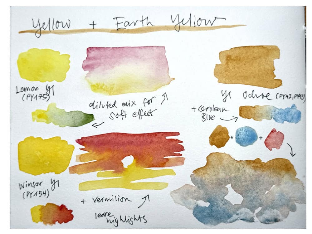
Yellow is a useful part of any landscape painting palette, whether it’s as a pure, bright color or a more muted earth yellow.
I personally like to have one from each group so that I can decide if I need a slightly more saturated or less intense yellow. For a very minimal palette of 3-5 colors, I would probably pick a yellow earth.
Let’s take a closer look at how you can use different yellow pigments in a landscape sketch.
Yellow for landscapes – skies
Yellow doesn’t seem like the most typical color for skies if you think of a classic blue sky, but it has its use. Think of sunrises or sunsets. For those sunlit, golden parts of the sky, a very bright yellow or yellow earth mix is quite effective. Whether it’s more soft and diluted or saturated and strong depends on the light situation. If you have a golden, almost orange yellow use a stronger mix, for more diffuse light (filtered through clouds or fog) or when the sun hasn’t come up yet it can help to mix a rather soft, diluted yellow.
Choosing between a classic yellow or an earth yellow depends a bit on the mood and the overall colors you’ve chosen for your sketch. I like yellow ochre or raw sienna for a very warm, golden light, and classic yellows or even a lemon yellow for brighter, slightly more intense light. You can of course also mix both, very often the sunrise or sunset sky will also change into orange or pink.

Yellow + blue mixes without green
Near the horizon, even a dark blue sky will seem warmer and lighter. In sunrise situations, you’ll often have a golden band of light at the horizon and light blue sky above.
To paint this, start with a graded wash – you fade out the color to white by adding a bit of water and diluting the mix until it’s transparent.
Add a touch of the the other color in the same way, but start on the opposite side. To avoid getting a green mix, try not to overlap the two areas too much. If the two colors meet and mingle, you can lift them or blot them out while they’re still wet.
This takes a bit of practice but it’s a beautiful effect.

Cool or warm – yellow pigments
How do you choose yellows for your landscape palette? Well, as everything, it’s an individual choice. Many pre-made palettes already come with three yellows: a cool lemon yellow, a slightly warmer, darker yellow, and an earth yellow.
I like to have a fairly balanced yellow (meaning not too cool or warm) like Benzimidazolone Yellow (PY154) or Hansa Yellow medium (PY97), plus a yellow earth like Yellow Ochre or Raw Sienna (PY42, PY43). A closer comparison of earth yellows will follow soon. If I have space in my palette I also add a lemon yellow, though I don’t use it as often, I like Benzi Lemon (PY175) better than the more common Hansa Yellow light (PY3) for lightfastness reasons.
To learn more about color temperature, and how to group cool and warm colors, go here.
There are also interesting other choices for yellow. A few years ago, I used a lot of Nickel Azo Yellow (PY150) – I can still spot the sketches from this time immediately because they have this unreal glow to them.
I don’t have a lot of painting experience with Quinacridone Gold, which is a lovely warm muted yellow, but some painters like it as a replacement for earth colors – it will give you very clean, saturated mixes.
You can also try out opaque pigments like any Cadmium Yellow or Nickel Titanate Yellow – for skies, you’ll likely dilute it anyway so that it has a certain air and transparency. A bit more opacity will work well for foggy scenes. I sometimes add Titanium White or use opaque colors like the pastel-yellow Jaune Brilliant, this can be a good way to soften the colors and make everything a bit hazy. White will also cool down your colors a bit.


Yellow beyond skies
All of these yellows are of course very useful for grasses, foliage and other elements in nature that need a touch of yellow or an earthy tone. Yellow ochre is probably my most used earth color – for using on its own and for mixing. It has the colors of golden fields, dried grasses, slightly wilted or muted foliage and can be used to mix a variety of neutral colors. I also like it for clouds together with cerulean blue and vermilion as I described here.
Brighter yellows are of course great to mix greens from scratch, or adapt green mixes, for warming up reds and oranges. Often you’ll get very interesting warm neutrals if you mix yellow with purples.

What are your favorite yellow mixes?


Grazie Julia,sono felice di leggere e vedere questo tuo post. Era tanto tempo che non mandavi tue notizie e tuoi dipinti, a me piace tantissimo questo genere di paesaggio ma sono alle prime esperienze Grazie mille
Ma .per iscrivermi. al tuo blog xhe spesa c’è? e come devo fare?….
Dear Marialuisa, mille grazie! I’m happy to hear you find my posts helpful. If you’re getting my blog posts via email you are already subscribed to the blog – it doesn’t cost anything. If you need to change your email or want off the list, you can find a link for that at the bottom of each email. I hope this helps you!
Thank you for making this post Julia!! Yellows and reds are challenging for me. I switched out hansa yellow medium for Azo yellow (without the nickel) because I heard it was more transparent. And I have monte amiata. If I can fit another one, I struggle between lemon yellow and new gamboge. For years I have added Quin Gold but seldom use it for some reason. In Florida, I do have a need for a light green or sunlit green. I do have trouble achieving a nice, clear transparent green. I am experimenting with switching out my sap green for green gold. My main blues are WN manganese blue hue (the color of our skies here), Schminke French UM (for the granulation) and DS Indathrone blue. I have experimented with including WN cobalt turquoise or DS Phthalo blue turquoise for more green options. Florida is tricky because there are SO many shades of green and also lots of pinks and oranges and reds in the tropical flowers! My goal is to go for transparent colors with a few intentional granulating ones. I am realizing that a lot of my painting is quick, standing or in the car—and I don’t often make a wash of the colors. I see the beauty of your paintings and think this might be what really makes a difference.
Betty I think it’s great you are so mindful about matching your palette to your local colors and light, it’s like setting the tone for your sketches. Very exciting to hear about your Florida palette.
I think you could get nice greens with a lemon yellow, it’s a bit brighter and cooler, it should work for those spring greens. For a very transparent green you could also look into Phthalo Green (there are two different pigments) and see if it works well with yellows. It’s very bright so likely will need to be adjusted. Green gold is another lovely yellow pigment, and I think very transparent, too.
I think a middle blue like cobalt or Phthalo blue could also give you more mixing options for clean greens. Or any of those more turquoise leaning options if they match the local light better.
And yes I often find the feeling of light can be shown by creating washes with different intensities. You can still paint quickly this way, maybe start by adding a few brush strokes with clean water next to your paint, and see what the pigment does if you let it spread and combine.
This lesson has so many choices I find important. It’s so gratifying to have you back. I’m trying to do close ups of a cornfield after harvest, the trash left behind. This lesson and those yellows give me new ideas. I like trying close up detail work. Thank you.
Thank you Rolf, I really appreciate it. I can imagine there are lots of beautiful different yellows to explore in a cornfield scene. Happy painting!
The use of yellow in your skies are beautiful! I have only three yellows in my palette so far- wn lemon yellow, wn winsor yellow deep, and wn yellow ochre. I love the color of yellow ochre but struggle a bit when using it to mix with other colors- maybe because it tends to be granulating. Thinking about maybe trying some new yellows this year
Those three yellows sounds like a good combination to start from. Earth pigments usually granulate a bit, and I can tolerate it, in skies I actually enjoy it. There are versions that are very finely milled: Schmincke Transparent Ochre and Sienna are two of them. Have fun exploring more yellows!
I really appreciate your blog. Your art is such a ray of sunshine on a dreary morning and your insights so helpful. I must now go and explore. Take care.