
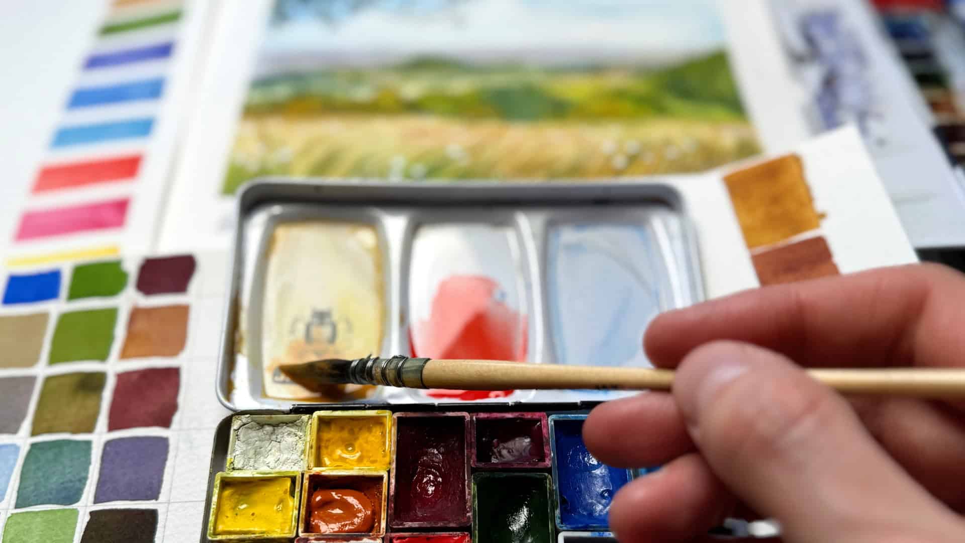
When we think about landscape painting, it’s easy to get overwhelmed by the sheer variety of colors out there.
Today I just want to share a little bit of “behind the scenes” fun that shows my different landscape sketching palettes, and I want to talk about how downsizing your selection of colors can actually lead to more cohesive and atmospheric paintings. We’re going to look at a few different palettes that I keep around to sketch landscapes – from a bigger palette to a fairly minimal setup.
Let’s dive in!
Here’s a video version of this post:
Palette Inspiration – A Look at Different Minimal Landscape Palettes
Big landscape palette (18 colors)
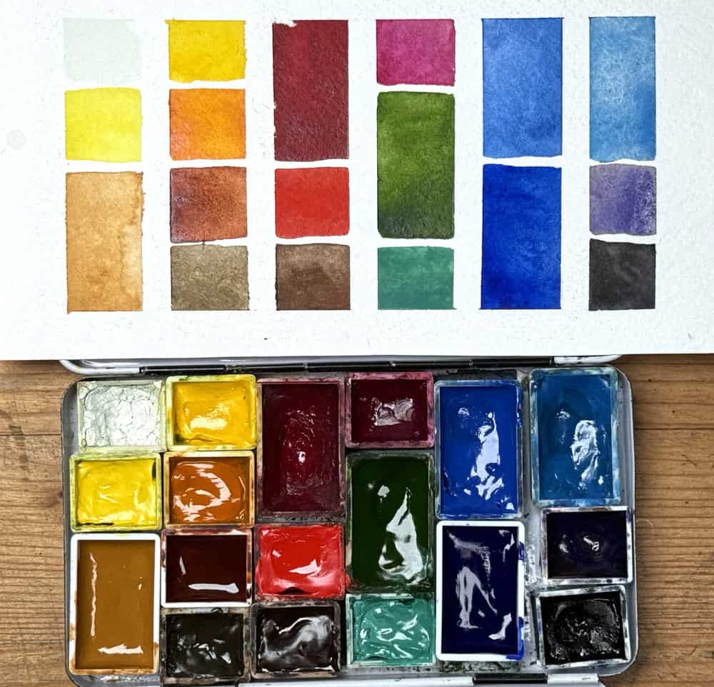
This is really just my everyday sketching kit, and it’s still fairly portable. You might already know this palette if you’ve followed me for a while, if you want to see all of the pigments in this palette, here is a list of all the color choices.
A palette like this is a good allrounder and will work for any kind of subject, not just landscapes. It is based on the split-primary palette in which you add a warm and a cool version of each primary color (yellow, red and blue), and it has a few extras like earth colors, green, orange, turquoise and violet. Note that you are encouraged to remove the black from any landscape palette, but since I use this small palette for all kinds of subjects, I just leave it in.
This palette has some additions that I could mix from the other colors instead, like the cool green (turquoise) or the orange. But I like that I can have quick access to these colors without the need to mix them first, this gives me extra flexibility and mixing takes up a bit less time. Plus the pure pigments are a bit more vibrant than what I can mix. My goal with this palette isn’t just to have ‘every color,’ but to have specific shortcuts.
- You have room for several earth tones like ochre, sienna, and umbers, which are a good base for natural looking landscapes.
- Convenience Greens: I love mixing greens, but having one stable green like sap green saves a lot of time. I almost always modify the green I have.
- The benefit of a larger palette is that you have almost any light situation covered, but of courses you’ll also have more choices for mixing and need some practice to choose the mixes that work.
Small landscape palette (9 colors)
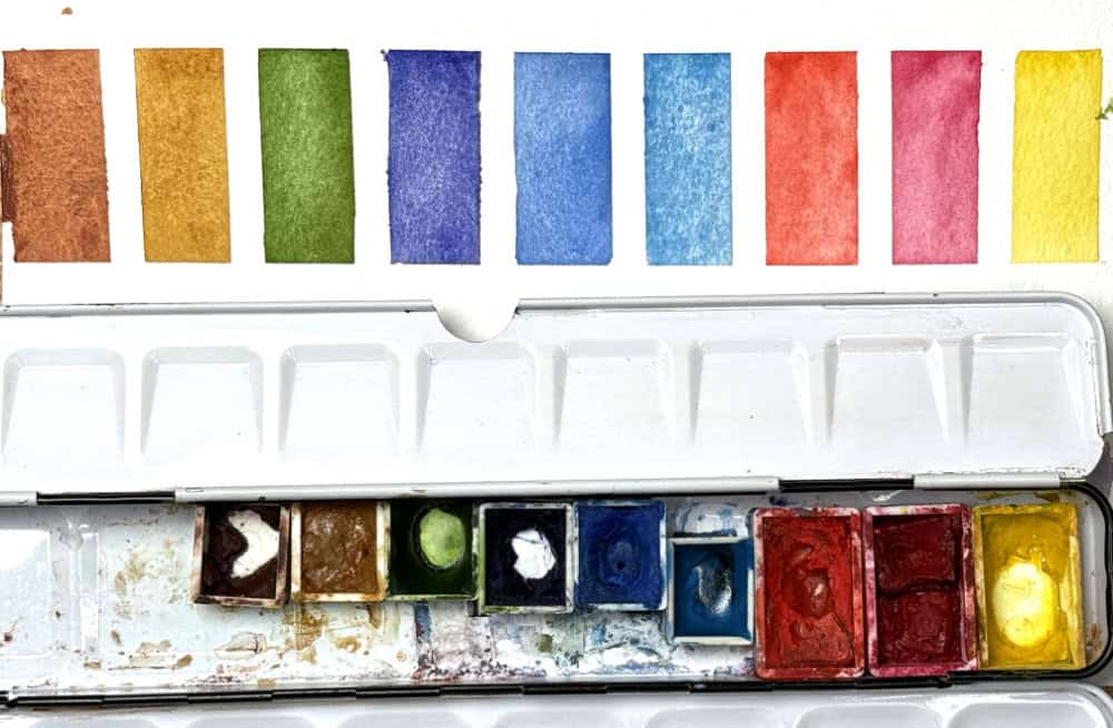
Next is a 9-color palette. This is the palette I’ve used for my upcoming short class about luminous landscapes (you can see I need to refill it). It still loosely follows the split primary-setup. The palette has one fairly balanced yellow, a cool pink and a warm red, a cooler and a warmer blue, and I’ve thrown in a violet and a green for more convenience, plus two earth colors: yellow ochre and burnt sienna, both are classics for landscape palettes. The yellow ochre has a double duty as the warm yellow here.
With this palette, you have all the ingredients for most landscape scenes – at least for the kind of light and landscape I encounter here in Germany.
- Why it works: This palette forces you to mix, but still offers enough mixing options to get a harmonious, balanced landscape sketch, because the same base colors appear throughout your sketch.
- It still has pigments that are distinct from each other so that they can stand out and create color contrasts, and different values and color temperatures.
Minimal landscape palette (4-5 colors)
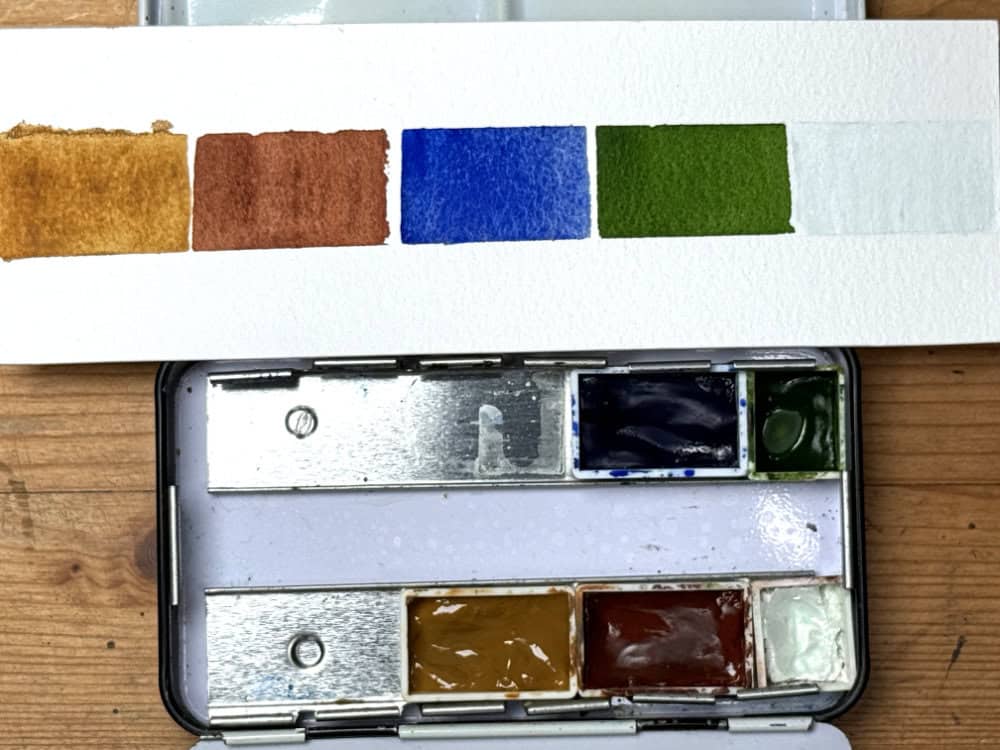
If you want to minimize it even further, stick to a primary triad of yellow, red and blue. You will get a lot of mixing miles with this one.
I usually pick:
- A warm blue (like Ultramarine or cobalt blue)
- An earth yellow (like Raw Sienna or Yellow Ochre)
- An earth red (like Burnt Sienna or Transparent Iron Oxide)
- A sap green
- Titanium white (optional)
My pigment choices here seem a bit limiting at first, because my yellow (yellow ochre) and red (burnt sienna) are dull earth colors, but they are great mixers with the ultramarine blue, and they serve a purpose: by limiting the brightness of this palette, the overall range (or gamut) of this triad is more natural. There are many subdued, neutral colors in a landscape.
I’ve added in a sap green to satisfy the wish for a more vivid option to show greens, and added a Titanium white so that you can change the saturation and create more soft mixes, or have white highlights. You could also leave out the white entirely – it isn’t strictly necessary.
This very limited palette is great for beginning landscape painters, because it will allow you to explore color in a safe way that doesn’t make it too overwhelming: there aren’t too many huge color contrasts or highly saturated colors to combine, just a very balanced selection of pigments that work beautifully together to create a natural-looking landscape sketch.
Of course you can change any of the components here to adapt this limited palette: raw sienna instead of yellow ochre, any earth red instead of burnt sienna, or cobalt blue instead of ultramarine blue. There is also a variety of sap greens and other convenience green mixes out there.
“Absolute Essentials” palette (1 color)
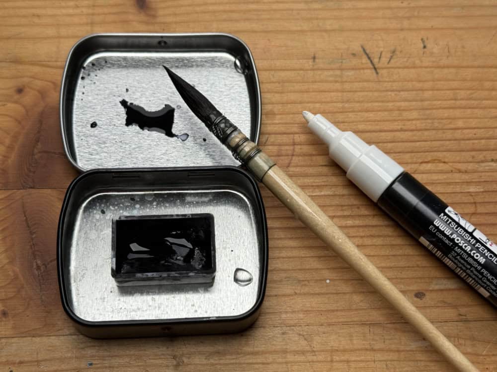
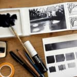
If you really want to explore the essentials of painting, you can absolutely sketch a quick landscape study with one color only, no matter which pigment or which medium (watercolor, ink, pencil). The result you will have might even be more useful than a sketch in full color, because you’ll essentially have a value study, and a good value structure is what holds every sketch together.
Of course it makes sense to use a fairly dark pigment here, like an indigo blue, or a neutral tint, so that you can show the full value range from very dark to very light. But you can also paint beautiful value studies with dark red, or even a turquoise.
For a while, I brought an ink-filled brush pen plus a water brush everywhere with me to do these small value sketches. It’s kind of fun to reduce the scope and focus fully on contrasts and values instead of colors.
Of course, you can also throw in a white (either white gouache or an acrylic marker) to have more options for highlights.
A thought about ready-made landscape palettes
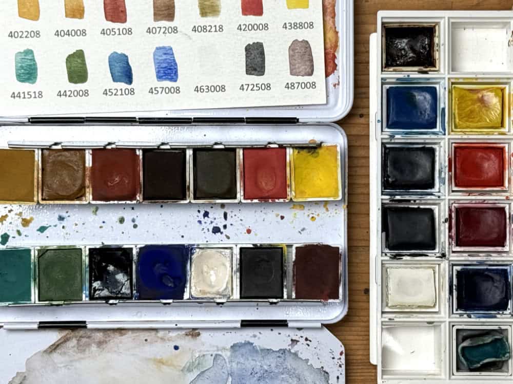
Before we wrap up, I wanted to share a thought on ‘ready-made’ watercolor sets that are marketed as “landscape”-themed.
While they are often high quality and some of these are a good starting point, I often find they include colors you might never use, so make sure you understand what you are looking for in a palette you want to use for landscape sketching.
I would always opt for a palette that includes some mixable combination of primary colors (yellow red blue, as seen above these can vary!), or even a split primary setup, and of course it makes sense to have a few natural, slightly muted colors in the mix: earth pigments are always great for mixing, but overall a mix of bright and muted colors is favorable. The tough part is to know which ones these are. And I’ve also seen amazing landscape palettes that were put together with very bright, vivid pigments. It’s all about knowing which pigments you can combine with each other to create pleasing mixes that will work for your painting.
So my advice for these ready-made palettes is to use those sets as a starting point. Ideally your palette should let you make flexible mixing choices, and not limit you to paint the same kind of tinted sketch over and over.
In the above picture I’ve shown the Kremer landscape palette and the W&N Cotman skyscape palette (I’ve linked my reviews to these palettes). Both of these work reasonably well, the Cotman palette has free spots for you to add your own pans, and the Kremer pigment is a unique and very harmonious palette in itself.
I hope this gave you some inspiration to look at your own palette with fresh eye and see if you need some changes. Which of these setups do you prefer? Do you enjoy the challenge of a minimal setup, or do you like to bring all the colors? Let me know in the comments.
If you want to learn more about picking colors for your palette, check out my post on Setting up a watercolor palette from scratch.
Hi Julia,
I regularly visit your page and always look forward to seeing what new ideas you share. Your approach to watercolor — especially your thoughtful use of the smallest palettes for landscape painting — is truly inspiring.
I’m fascinated by how intentionally you curate your color selections. The way you limit yourself to compact color boxes and still achieve such richness and harmony says so much about your understanding of color and composition. It’s a beautiful reminder that creativity often grows through thoughtful limitation.
Thank you for sharing your ideas and insights so generously — they are both encouraging and motivating.
Kind regards,
Leander
Leander, this is really kind feedback, I really appreciate it! I’m always trying to make these posts well thought-out but also practical. I’m glad to hear this resonates with you. Color and palettes are a fascinating topic with never-ending possibilities, and this kind of limitation is what helps me to make sense of it. Best wishes and happy sketching!
Hello Julia,
I’m interested to hear your thoughts about Perylene Maroon which is one that I haven’t used but am interested to try. How do you use it and why do you prefer it over other similar pigments?
Thanks,
Melanie
Thanks for all your information. I was wondering what the real flexible nib is that you used. I think you said something like Browser?
Hi Julia, You are always an inspiration! Thank you for the time you invest in creating your blog and videos.
Why do you include a white watercolor? Do you use it to desaturate color? I have white gouache in my palette that I rarely use, and then only as a highlight. I removed the white from a Winsor and Newton Cotman set that I share with folks who come to my nature journal club. What do you do with white?
I use it to have the option to add white highlights (which you could also do with a white marker) and to create softer desaturated colors. You can also add more water to achieve this effect, though sometimes it’s useful because the white adds a bit of opacity. But yeah it’s definitely optional. :)