

I’ve recently shared my current palette setup, and I thought it might be interesting to share what the logic behind my color choices is, why I typically change only certain colors while others stay the same, and how you can build a palette from scratch yourself.
Whether you want to set up your first palette from scratch or change your current palette, let’s nerd out about colors and pigments here for a bit. And I think this is also worth a read if you just have a premade palette – manufacturers follow a certain logic too when create their palettes (at least one hopes they do), so this can help you to understand why a certain selection was made in the first place, and what you can maybe tweak and change.
Here’s a video version of this post:
Setting up a watercolor palette from scratch – how to pick colors (Youtube)
Choosing the palette itself
When we talk about palettes we typically mean the paint setup, but of course you’ll need something so hold the paints, and often the term palette encompasses both.
Choose the actual paintbox based on your needs – should it be portable, or spacious, or lightweight, have plenty of mixing space? I know, ideally all of the above.
I’m very boring in this aspect because I typically use the same type of palette – a small metal tin in black and white that holds between 12 and 24 colors. These portable metal palettes have worked well for me both in the field and in the studio, and although I also have bigger palettes I find myself returning to this compact, robust setup.

There are many different types and sizes of palettes out there, if you’re just getting started, I wouldn’t overthink it and get something inexpensive, with several mixing areas, easy to clean. If you already have a palette, even one that’s been prefilled – great, let’s take a look at the color selection.
Selecting colors for your palette
I’ll talk you through the setup that I choose every time I set up a new palette.
A classic setup for a balanced all-rounder palette could be called an extended split primary palette. Sounds complicated, but it’s actually quite simple.
The term split primary means that you take two variants of each primary color (yellow, red, blue) as your base.
The two variants are chosen based on color theory:
colors can be grouped by temperature into warm and cool colors (not actual temperatures, but how we perceive them), and you’ll take a warm and cool version of each of your primaries to have a good base to mix from.
So we already have six color in our palette:
- warm primaries: warm yellow, warm red, warm blue
- cool primaries: cool yellow, cool red, cool blue
It’s helpful to imagine these on a color wheel (a way to visualize color relationships), as you can see these six colors cover a lot of ground.
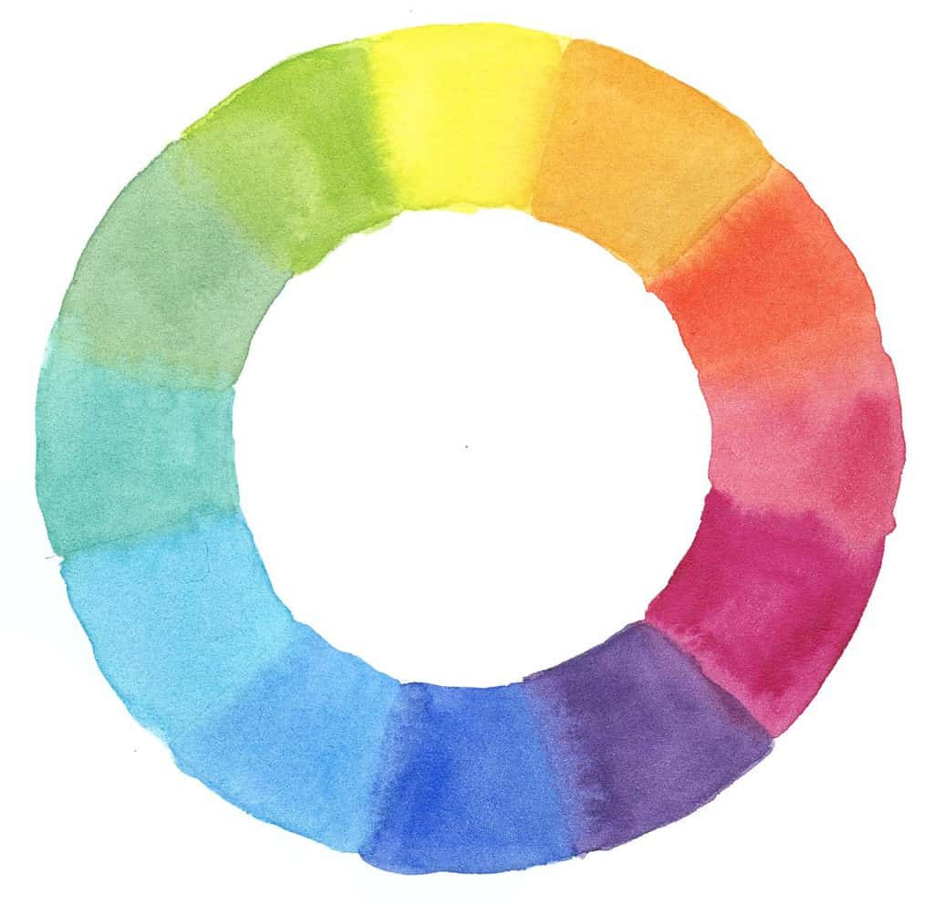
With the primaries alone you can already mix quite a big range. However, it’s not always convenient to mix everything from scratch, so we can add a few more colors, this is the extended part of the palette.
I typically add earth tones, not only because they’re a classic addition to any painter’s palette, but because they can create natural and beautiful mixes, especially neutrals. Think of them as slightly muted, less saturated versions of your primary colors (a yellow ochre is a slightly muted yellow, a burnt sienna is a muted orange/red).
I also add more variation to primary colors if I want more variety: I often include a third (or even fourth) blue to the mix, because I know I will use it frequently for my skies, or another red for mixing.
There are colors that technically could be mixed but are convenient to have around (green) and are maybe brighter as a single pigment as opposed to a mixed one (often orange, purple).
Note that these are not absolutes, it always depends on your pigment choices and on your needs. If you don’t need orange very often and can mix one you like from your yellow and red, great, save the spot for another color.
I have a white and a black in my palette, the white for adding highlights and the black for items that are truly black. This is also a color that can be omitted if you don’t need it often.
And this is basically the framework for an extended split primary palette, it can be changed depending on your needs, for example I used to paint lots of botanical sketches one year, so I needed additional magenta and purple pigments.
You will notice that you will use certain colors a lot – these are the backbone of your palette, and others maybe not so much – these are the flexible elements that can change over time.
I tend to have a slightly larger number of colors in my palette (between 18-22), some painters prefer a smaller number of colors, this will give your sketches a very unified, harmonious look.
Suggested colors
Over the years, I’ve always come back to this basic setup.
Here’s my most recent palette (as of 2025), it’s a good allrounder for all kinds of subjects, but I’m painting a lot of landscapes right now and find it well-balanced for that.
I’ve added the pigment number for each color because paint companies like to make us mad with their random color names that can mean different hues for each brand. Always refer to the pigment rather than the name. Pigments aren’t always consistent either, but the chance is better than going by the name of colors.

Warm primary colors:
warm yellow: Winsor Yellow (PY154)
warm red: Schmincke Vermilion (PR255)
warm blue: Schmincke Ultramarine Finest (PB29)
Cool primary colors:
cool yellow: Winsor Lemon Yellow (PY175)
cool red #1: Schmincke Ruby Red or WN Permanent Rose (PV19)
cool red #2: Schmincke Perylene Maroon (PR 179)
cool blue #1: Winsor & Newton Cerulean Blue (PB35)
cool blue #2: Winsor & Newton Cobalt Blue (PB28)
Earth tones:
Schmincke Raw Sienna (PY42, PY43)
Schmincke Burnt Sienna (PR101, PBk9)
Schmincke Green Umber (PBr7)
Schmincke Burnt Umber (PBr7)
Convenience colors:
Winsor & Newton Sap Green (PG36, PY110) (one of the sap greens that doesn’t hurt my eyes when I use it without mixing something in)
Holbein Isoindolinone Yellow Deep (PY110) (a warm deep yellow/orange)
Additional colors:
Titanium White PW6 (great for highlights or pastel hues)
Winsor & Newton Cobalt Green (PG50) (a cool blue-green)
Schmincke Delft Blue or Holbein Royal Blue (PB60) (another warm, very dark blue)
Schmincke Payne’s Gray (PR101, PB29, Pbk7) – almost expendable, I keep it around in case I need to paint crows
Fine-tuning: selecting pigments
For each of these pigments, there’s at least one great alternative that you could use instead (except maybe Ultramarine blue), so you see there are a lot of possibilities to put together your palette. Paint companies usually have documentation and sometimes also mention if the color is warm or cool, and there are great resources like Jane Blundell’s blog or handprint.com where you can take a deep dive and learn more about the properties of different watercolor pigments.
When selecting colors, ask yourself: what do I typically paint, what are colors I gravitate toward, what colors do I want to experiment with, what subjects to I paint (nature, city, people?).
Practical aspects
- Placement: I typically arrange the colors in my palette so that similar colors sit next to each other and aren’t contaminated as much when picking up paint – so yellow next to ochre, or blues next to each other. That’s not always possible with such a compact palette though, so it’s a compromise.
- half pans or full pans: colors I use often tend to go in full pans, exceptions happen frequently because I might still have an existing pan of I color I want to use up. This I why I have this huge perylene maroon full pan in my palette, I certainly don’t need that much of it and I always pick up way too much.
- I’ve removed the metal holder from the palette so that I have more space inside, and stick magnet tape on the bottom of my pans. Magnets with a sticky side for non-magnetic stuff – the best of both worlds!
- I note the name and/or number of the pigment on the side of the pan because yes we all forget this kind of stuff. I have a few mystery pans that I forgot to label, and I never paint with them.
- I like a clean palette and clean mixes, so I remove the muddy mixes and the gunk on top of the pans from time to time (this means: almost every day). Especially when I need a clear yellow. Keep your yellow clean.
I hope you enjoyed these additional thoughts about palette building! Even more tips are here:
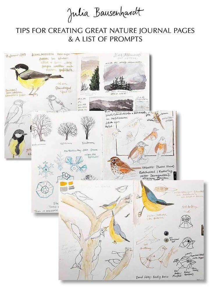
Basic tips for setting up palettes


Thank you, Julia. I am trying to work with fewer colors and a more harmonious palette. I have much to learn :)
Dear Julia, thank you so much for taking the time to share, explain, write out and make pictures of your color palette. For me, this was very helpful and thorough and I’m going to save it for future art classes that I may teach.
Thank you so much for this very useful information. Your blog is always full of helpful tidbits. Thanks!
thank you for this info–i love reading about palettes and colors and figuring out how to fill mine ( I have several). a freshly filled palette is a thing of beauty!
Ha! I love happenstance!
I have been studying handprint(dot)com for a couple of months. I just read about the split-primary theory this morning and was interested in seeing the results of a colorwheel made with two of each primary colors.
Thank you for mentioning that one color should be warm and the other cool– I did not get read about that. That makes the split primary idea make much more sense to me now.
Thank you!