
Recently I’ve been exploring more ways to use the new pigments I’m testing, and a great way to see how they perform is to paint skies and cloudscapes with them – typically you use lots of water and wet-into-wet techniques for those. Here’s the post on the specific pigments in case you missed it.
Skies are often kept light and integrated into a landscape sketch so that they don’t take away too much from the actual subject, so it’s nice when you can spend some time painting the sky itself. I like painting skyscapes, it’s very calming. Plus you can learn a lot about how your pigments work together with a lot of water.
For these two pages, I painted two different versions of a partly cloudy sky: one with visible fluffy gray clouds, and one with a more solid gray cloud layer and a bit of blue peaking through.
I find that when painting skies it pays off to be decisive and use big brush strokes, fussing a lot with small details will take away some of the flow and lightness of the paint. That matters more to me than the correct shape of each individual cloud – they change all the time anyway. So if possible, try to paint with decisive brush strokes (that doesn’t mean too quick or careless) and then leave the paint alone. That tends to give me the best results.
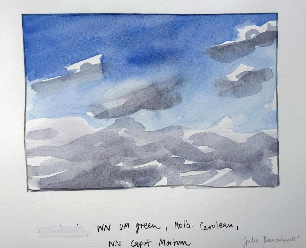
For the first sketch, I tried out Winsor Ultramarine Blue green shade, as a replacement for my usual Schmincke Ultramarine Finest. Both are non-granulating versions of the very useful Ultramarine blue, they essentially look the same for me.
I started with a darker, more concentrated wash and let it fade out near the bottom, and then used a mix of ultramarine, cerulean blue and Winsor Caput Mortuum for the gray of the clouds. Caput Mortuum is an interesting dark relatively brown earth color that works great for clouds and neutrals.
Overall, I’m not particularly excited about my way of painting these fluffy gray clouds, I have to find an approach that I like for this. But that’s fine, it’s an explorative process for me.

The other sketch shows a more cloudy gray sky with just a hint of blue, I used way more water for this, but I’m far happier with the outcome. I used Ultramarine blue, Cerulean blue, Perylene Red deep (a moderately dark cool red offered by Schmincke), and Winsor Yellow Ochre. I just added a few dots of the darker blue here and there near the bottom, and mixed the gray clouds from cerulean blue, red and ochre – this mix is very versatile and creates very pleasing, interesting cloud colors. Due to the cerulean blue and the high amount of water in my mix the colors separate slightly.
I didn’t define the cloud shapes a lot, and I find this helps to preserve the loose character of the skyscape.
I hope you’ve enjoyed this insight into how I like to sketch skies and clouds!


This was inspiring! I generally hold my breath when I paint clouds. I’m going to try some of your ideas. Thanks.
Yeah I know that feeling. But then I remind myself it’s only paint and paper, and I can start over. Calling everything a sketch helps me a lot!
I am Mrs. Sneads student and we are so inspired by all of your work. <3 Please keep posting!!!
Thank you, I will!
I m ready to try these colors. Thank you for sharing your artistic process.
This post reminds me of the class you hosted for a Nature Journaling event several years ago, it was how to paint clouds and it was very interesting and therapeutic to watch and participate in, very much like this blogpost.