I was asked if I could do a post about my favorite colors for landscape sketching. I have talked about the colors on my watercolor palette before, but this got me thinking: do I have any favorite colors?
Here’s a video version of this post:
My favorite colors for landscape sketching (video)
I’m a bit hesitant to say this, but my favorite colors are probably very boring, because they’re fairly classic choices that a lot of landscapes painters make when they put together their watercolor palette. I like and frequently use standard palette colors like Ultramarine Blue, Cerulean Blue, Yellow Ochre, and Burnt Sienna.
For me, these are great versatile pigments that can be useful in almost any landscape. Cerulean Blue is great for skies, Ultramarine Blue is great for mixing cool tones into greens, for mixing interesting neutrals with the Earth tones. Two of these, Yellow Ochre and Burnt Sienna, are also featured in almost any palette you’ll come across. That’s because they are great for mixing, and they also represent a lot of nature’s colors. Yellow Ochre (or Raw Sienna, depending on what you have) for fields, nice subdued mixes, warm areas; Burnt Sienna (or similar colors like English Red, Venetian Red, even Burnt Umber) will add an earthy, natural red color that can be mixed to strong darks with a blue.
Apart from that, I mainly use Cerulean Blue for my skies. It is a wonderful soft, granulating color, and it matches the sky color I see here quite often. Depending on where you live, you might want to use another blue as a go-to sky blue: Cobalt blue, Ultramarine, or even a more turquoise blue.
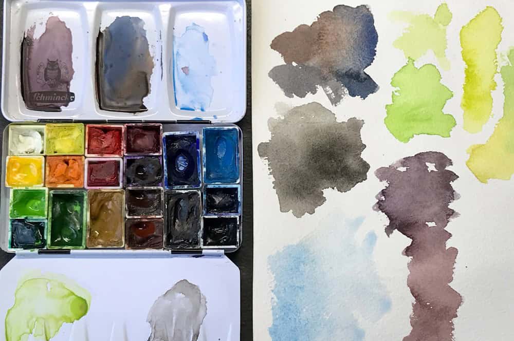
I frequently use Sepia to tone down colors and render them more natural. This cool brown will let me mix convincing dark, neutral areas more easily (alternative: Van Dyke Brown, Raw Umber).
Another color that I use sometimes for shadows is Dioxazine violet. It has to be used with care, because it is very intense, but it’s a good shortcut for cool shadow areas. As an alternative you can mix Ultramarine blue with a cool red like Madder Red Deep or Permanent Alizarin Crimson. Dioxazine Violet is also nice to mix with Burnt Siena for a very natural warm brown.
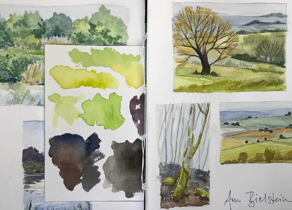
A color choice I particularly find useful in spring is May Green by Schmincke. This is a light, warm green that’s available in different names from other manufacturers (sometimes as Phthalo Green Yellow, Permanent Green Light, etc.). It is very bright and I usually tone it down a bit, but I like it as my standard light green.
Another beautiful pigment that I enjoy every time I use it, but that’s not in my standard palette is Green Gold (by W&N). It produces a lovely glow to all areas you use it in.
Looking at all of these favorites I realize I may have to switch some colors on my palette for a change. Go-to colors and shortcuts can produce routine, and it’s a good choice to revisit and change up routines from time to time to keep your sketching interesting. I’m very happy with my current palette right now, but maybe I’ll assemble a small kit with colors I don’t use as frequently, to see what I can get out of them. Experiments like this keep sketching fresh and interesting for me.
What are your preferred colors for landscape sketching?


So informative Julia..thank you! Eventually spring/summer will arrive in Minnesota so getting out and painting will be in the future and the use of the mixed colors you mentioned!
I’m very much looking forward to painting in the warmer season, too!
Loved watching you mix your favorite landscape colors. I also find that the mix of ultramarine and burnt sienna or yellow ochre works really well because it is so different depending on how much of each you use. The cerulean blue made me think of your great Skillshare sky class. Thanks again for your generosity in all that you do.
Thank you for your video on landscape colors in your palette. It really helped me to determine one colors to use.