
A common problem in landscape sketches is that they can end up looking flat, like there is no depth to them and it’s hard to see what’s in the foreground and what’s in the distance. This is because we need to consciously place cues for depth and volume on our two-dimensional paper to create the effect of a three-dimensional place on it.
And we can get help with this: by a natural effect called atmospheric perspective.
Atmospheric perspective, also called aerial perspective, can be observed in nature. If you’ve ever noticed how distant mountains often look a bit hazy, lighter and washed out compared to objects closer to you, this is because of atmospheric perspective. It’s caused by particles in the air that scatter light. The farther away you look, the more particles are there, and the objects in the distance appear lighter and less distinct.
Atmospheric perspective influences different elements of our sketches:
- Value: Objects that are farther away appear lighter in value
- Detail: Objects appear less distinct in the distance
- Color: Objects farther away have more blue in them
You can see this on most days when you look into the distance, but also in photographs.
The good news is, we can also use this effect in our landscape sketches to create the illusion of depth. In fact, we should do this to add more realism to our sketches.
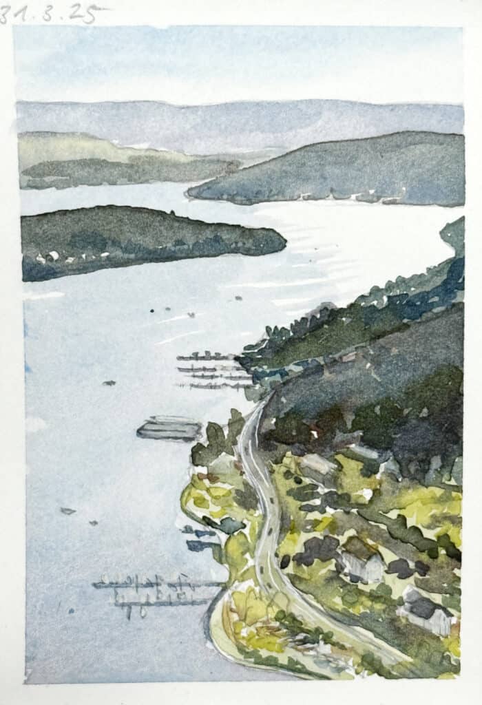
By using lighter values for distant objects and darker values for closer ones, we can create a sense of depth and distance. You can easily achieve this with watercolors by diluting your wash with water. In the sketch above, I used the same mix for the hills in the distance, but added more water.
The layers you add for distant elements should also have less detail. I like to use a brush that’s as big as possible so that I don’t get tempted to noodle in too many small elements. A few small dots that can stand for houses or trees is fine though. You can also switch to a smaller brush to add a few finishing touches, mainly on the foreground.
The colors that are dominant in the background are often the cool variants of colors: blue, green blue, purple. Of course there are exceptions and special light situations – think of sunsets.
In the sketch below, I added light a light sky with cerulean blue, it gets lighter near the horizon. Note that the clouds also are dran in smaller closer to the horizon, this also adds a sense of depth. I used a light, very watery wash of cobalt violet for the hills in the back, and added in more pigment layer by layer, a slightly cool (bluish) green for the hills in the middle ground. There are a few more interesting details to see here, I added a bunch of wiggly brush strokes for tree lines, settlements, and fields.

The further I got to the foreground, the more I introduced warmer colors: sap green, yellow ochre, benzi yellow. I also mixed slightly more concentrated washes.
In the foreground, I added very concentrated brush strokes to show grasses in different ochre, green and brown tones, and lots of small highlights in white with an acrylic marker.

By understanding atmospheric perspective and applying it in the different areas of your sketch, you can add lots of depth cues and give a sense of realism to your sketches.
Give it a try in your own sketches!


Julia, I love your landscapes. Thank you for the great tips! And thank you so much for the extensive sketching resources!
Thank you, I’m very happy to hear my resources are helpful to you!
I was apart of Sketchbook revival challenge. I enjoyed your class on watercolor. As an oil painter and getting too old for plein aire I found this very helpful for getting outside to paint. Thank you.
Thank you Laurie! Yes, watercolor is a bit more manageable outside.
This was such a good review and lesson about creating atmospheric perspective. The type of Brushstrokes and colors used, I’m saving this post for my future classes. Thanks Julia!
This idea was very helpful to me. Thanks for the info. enjoy your blog.
Julia, thank you for the resource on the Getting Started with Landscaping guide. Very much enjoyed your class in the Sketchbook Revival. I am new to most any kind of art media, so I am sopping up all the information like a sponge. Looking forward to continued learning from you.
Dear Julia, thank you for this very useful post. Of course, the fact that we see more distant objects in a landscape as more blurred is rather obvious and easy to notice – but another thing is – how to render this perspective on paper :) And there your step by step explanation on using washes and colour shades to achieve the effect was indeed very helpful and valuable for me.
I am very busy at the moment at work, but so eager to try this out, especially with all the fresh spring growth emerging around us.
I hope you are well and enjoying the spring weather and freshness, too.
I loved you simple (not complicated!) class in Sketchbook Revival and am looking forward to diving into some of your offerings. I am a painter 0f 50 some years but am a novice with watercolors. Your instructions should be most helpful to set me on the right paths. Thanks for all the printed material. I don’t like to have to read everything online. My eyes are too old!
I love your landscapes too and look forward to your blog posts. I like the way you explain things – simple but direct to the point.
Julia, I, too, love your landscapes and learn so much just by looking at each one to see what you did. I recently tackled a BIG landscape (a view of over 100 miles in my home state of Pennsylvania, USA), and I thought of your landscapes and how you simplify what you see. I especially like your tip of using a big brush for distant elements so that you aren’t tempted to put in the little details, a problem of mine. I think those tiny homes should be there and they don’t need to be. It’ll be a big brush from now on! What an excellent and easy idea! Thank you for inspiring me!
I have just completed lesson 8
Of my course and enjoyed every hour spent right from the basics to the end and now plan to follow your advice and practice practice. Practice before starting a new course. It’s spring in Australia so plan to try water colours on flowers and birds and I I have loved creating a whole page of small animals you are an inspiring teacher
That’s wonderful to hear Janet and thank you for your kind words! I really hope that spring time will give you lots and lots of exciting subjects. That way the practice almost happens on its own!