

I’ve been testing a few new pigments for landscape sketching in the small Compuzzle palette that I showed in the last post (not a recommendation by the way). But for these small amounts of paint the palette was nice. To see the pigments that I usually use for all of my sketching (including landscapes), here’s a post about the most recent iteration of my small field sketching palette.
The pigments I tested range from interesting but seldomly used colors (like Nickel Titanate Yellow, Cobalt Violet and Rose Doré), to new earth tones I’ve been wanting to test more (Caput Mortuum, some Holbein and Winsor earth colors), and I’ve topped up the rest with a few more familiar choices to round out the palette and turn it into something that gives me a wide enough range for landscape work (for everyday sketching I still have my everyday palette).
Thoughts about the pigments:

Winsor & Newton Raw Sienna & WN Yellow Ochre: The raw Sienna is lovely because of its transparency, but it’s apparently a pigment mix? The yellow ochre is less yellow and I think that makes it slightly more useful for mixes (skies, fields, stone color of buildings). I’ll have to experiment more.
WN Nickel Titanate Lemon Yellow: A slightly weird niche yellow that I wanted to try out because it seems similar to Naples Yellow and Jaune brilliant. It’s opaque. Creates nice light slightly muted greens and soft yellows that are lovely in skies, and far away elements. I created a pastel yellow from this together with white that I liked to use for a while, apart from that it seems expendable.

WN Rose Doré: This is a light rose pigment with a touch of yellow. I like this for botanical work (think back to the apple blossoms) and wanted to see if it’s useful for landscapes. It can create subtle light earth and brown mixes, and it’s interesting with yellow ochre and for neutralizing sap green, but I’m not completely convinced yet.
Holbein Cobalt Violet: This is a fun and useful violet and almost wish I had included this into my regular palette when filming my landscape class. Oh well. You can totally paint without it and mix a similar color from Quinacridone Rose and Cobalt/Cerulean Blue. Lovely as a shadow in greens, and for mixing neutrals. Great with Yellow Ochre and Cerulean Blue.
WN Ultramarine Blue green shade: I mainly wanted to see if this performs similarly to the Schmincke Ultramarine finest (non-granulating UM blue), so far I’m happy with it. I’ll stay with whatever paint I can get for less money.

WN Burnt Sienna & Holbein Light Red: these two are similar, both of them are made from PR101 – synthetic red iron oxide – a transparent, intense earth orange that’s great for mixing dark neutrals (with ultramarine blue) and all kinds of natural hues for landscapes. Very reliable. The light red is a bit more intense and more red.
WN Caput Mortuum & Holbein Imidazolone Brown: These earth colors creates really dramatic purple mixes with ultramarine blue, the Caput Mortuum is more brown and very opaque which makes it a bit less flexible for me. But I like the color on its own. The Imidazolone Brown creates very interesting subtle neutrals when mixed with cerulean blue – interesting for skies. Also nice with sap green for muted greens. I have to paint more with all of these.
Holbein Umber, Holbein Sap Green, Holbein Benzi Yellow, Holbein Cerulean Blue, Schmincke Perylene Red: basically just used these to fill up some color spots to create a more well-rounded palette. All very stable, well-performing pigments.
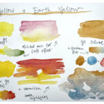
Here are some mixing examples that create lovely neutrals and muted colors – with yellow earth colors for a warmer mix, and the red earths mixed with blue for more neutral grays:

Here are some mixes with Rose Dore (top row), variations with Cobalt Violet (second row), and neutrals with the different red earth pigments and ultramarine blue:

These are my recent experiments so far, I hope some of this is of interest to you and maybe helpful when choosing colors for a palette, particularly for landscapes (I’ll share a landscape I’ll painted with these colors soon!).
I usually don’t switch out my standard colors if I don’t see a huge benefit from a new pigment, but testing and exploring pigments is fun on its own from time to time.


Really awesome blog posting!!! I appreciate the informative research you share with us. Thank you.
You’re very welcome Joshua! :)
Hi Julia,
Thank you for your blog post! It is very interesting to read about your experiences with different pigments and to see your mixing results.
I’ve taken your wonderful Botanical Sketching course four times. Using a palette closely matched to yours gave me a good start without getting caught up in too many details. This is the first summer that I have ventured beyond. Right now I’m enjoying Transparent Red Oxide (especially the range of greys when mixed with WN Ultramarine GS) and Titanium Gold Ochre (Schmincke PBr24) especially the muted grey greens when mixed with lavender.
I’m looking forward to your landscape class!
Kindest regards,
Laura
Hey Laura, great to hear you’ve ventured out and discovered more beautiful pigments – those earth tones sound very useful, I’ll have to look into them at some point (there are so many earth colors!).
Hi Julia. I have several of those colors too. I tried to replace burnt sienna with Holbein Imidazolone Brown, but I didn’t like it as much. It has such a nice reddish/pinkish undertone, especially when diluted though; I’ve used it for birds. It makes great darks mixed with PB16 too. I’m also testing their sap green. Not sure if i like it better than the Winsor & Newton’s one. It’s brighter for sure. And the raw sienna I use more as a yellow and with a violet it make a great buff titanium dupe. Personally I don’t see much difference between the ultramarine Green shade and the finest. I have both.
The perylene red looks like a cool red a bit like ruby red deep. Is it similar?
Thanks for this blog post anyway, I always love reading about colors and pigments.
Have a great day. :)
Ohh, that’s interesting I’ll have to try out the Imidaz Brown for birds, too.
I like the slightly muted WN Sap Green a bit better than the Holbein, and both of these are way better than the Schmincke. Sorry Schmincke your sap green sucks!
And yes I also use Raw Sienna way more as a rich yellow, for mixing neutrals I like Yellow Ochre better. But with all these earth pigments it really depends on the specific ones.
I also can’t really see a difference between the UM blues.
Yes, the Perylene Red is a cool red, rather opaque and intense. The Ruby Red deep is slightly darker even even cooler (more blue) I think.
Great you enjoy these pigment posts, they’re fun to put together!
Hi Julia,
Hope you are doing well, thank you for another great post. Your monthly newsletters are fleshing and encouraging because, even though I often like to jump in, the way you practice color studies encourages me to stop and sometimes try some myself, and compare colors together.
Thank you Jenny! I think it’s great you have the motivation to just jump into sketching, so definitely keep that. :)
Hi Julia,
I always enjoy color studies. I think the cerulean blue and the imidazolone brown make a nice shadowy flesh tone. I really like the caput mortuum for its purplish undertone.
Autumn
Hi Julia
I agree that Nickel Titanate yellow mixes nicely for muted greens; I use the Daniel Smith
tube version but cost of another tube will lead me to try the WN version. Another use for any Nickel Titanate yellow is the final overpainting of dried grass blades in the foreground of rainless summer landscapes near me. This opaque color shows much better than other yellows.
Keep testing and blogging; I read and appreciate all of it and I’ll remember your test results when I need new paints.