
More apple blossoms!
Every spring I sketch the variety of apple blossoms from nearby gardens and parks. They are in bloom just for a few days each year, and I love seeing the explosive dots of white and pink from afar, and the beauty and delicacy of the individual twigs.
In my recent Q&A and also in the current group of my botanical sketching course, you’ve asked a lot of questions centered around how to paint these type of blossoms, choosing shadow colors, keeping white blossoms light enough, differences between pigments and palettes, so I thought I’d dive into this a bit more.
Choosing colors for the white and pink blossoms
Most apple blossoms are white with a touch of pink, there are also darker pink varieties, and of course there are pink cherry blossoms (sakura), and all kinds of white varieties. I’ve recently learnt there even are green cherry blossoms.
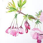
The key to adding color to all of these is to use very diluted mixes, and to leave lots of white areas (highlights). I start with a light pencil sketch and then mix up a soft pink – usually pure Quinacridone Red/Pink (PV19) or a bit of Yellow (PY154) mixed in. I sometimes add in yellow accents in the center of the flower where the stamen is located, if the pink layers are still wet you will get lovely wet in wet effects.
The buds usually have a stronger pink, I use a more concentrated PV19 mix here and make sure I leave a few highlights. Here are a few more ideas for mixing those light colors:

Adding shadows to white blossoms
Shadows can be tricky too add for such delicate flowers, here are a few considerations:
- I keep my shadow colors very diluted, the color itself doesn’t matter as much as the light value
- I paint around the highlights, leaving a lot of white and just adding a touch of color/shadow here and there seems to work best. Think of it as letting the flowers breathe.
- I have used (diluted mixes of) blue, yellow ochre, pink and gray mixes for shadows. A few ideas for interesting gray mixes are: cobalt blue and vermilion red, cobalt blue and yellow ochre and quin red, cobalt blue and burnt sienna and vermilion.
- The key to this is really to add so much water you almost have no color left
- I prefer non-granulating pigments for this, since the flowers are so soft
- I squint to see where the shadows need to go: squinting helps to see in values (light and dark). It’s kind of the built-in black and white mode of your eyes. You could also use your phone camera, but be aware that it is probably too detailed. I add dark accents in the areas that appear darkest when I squint. The twig itself is usually the darkest value, then the leaves and buds.
- I try to keep the light to dark value range of the flowers very simple: white paper for highlights, a middle value for some pink, and then more pink or a soft shadow color for the creases and slight shadows you see. I aim to keep the blossoms themselves lighter than the leaves and twig.
- it helps to apply the shadows with decisive brush strokes, not too prominent, since the blossoms look very delicate, thin strokes or dots will be fine
- if I’ve put down too much pigment on the page (too dark, to intense) I immediately pick it up again with my brush, or blot it away with a rag (sometimes you can salvage it later with a white marker, as described below, but it’s not the best solution)
I don’t have general rules for adding shadows, and sometimes I add warm (yellowish) and cool (blue) shadows or accent colors in the same drawing. I decide on what I like visually. I have also a growing collection of blossom paintings that I’m not happy with: shadows to dark, overworked blossoms, paint application too thick, disappearing highlights. It’s a constant process. But keeping the paint mixtures light and restraining oneself from overworking („just another touch of paint, oh no what have I done?“) seems to work best.

Color differences across palettes
One of the paintings I posted was, as some of you remarked, labelled „Holbein“. I have a palette with Holbein paints that I use from time to time. They’re very transparent and well-behaved pigments that layer well. That also means they’re quite intense and can be difficult to control, especially when you don’t paint with them every day.
I found my blossom painting with those Holbein paints ended up too intense. This is not a fault of the pigments, it’s because I’m not used to paint with them. That’s another great reason to really get to know your palette.
Here’s the Holbein sketch after I finished the first round, it features some dark blue shadows that I painted with Phthalo Blue and Prussian Blue.

In hindsight it’s not even that bad, but I wasn’t happy with how dark the shadows were making the blossoms overall, and also found the blue itself a bit too much, so I went over then shadow areas with white marker to remove a bit of the saturation. The paper now looks a bit rough, but the shadow is a bit more muted.

I didn’t encounter those problems when I used my every day palette, this is very likely because I’m simply used to the pigments and know how to achieve a certain mix.
Here’s the full page after I filled it up with more blossoms in varying tones of pink. I tried out slightly different shadow colors: light pink/yellow, gray, and darker pink.

I hope this can give an insight into how I approach sketching these beautiful flowers. I’ve also gotten many questions about mixing greens, so that will be the next post.
Hello Julia, this is a great article. I found very useful the inclusion of the picture with pigment numbers and the result of their mix. I will use this hint to remember the mix I have used, maybe writing them directly next to the sketch.
In addition to this, thank you for posting also those sketches that “you are not happy with” and suggesting the ways of correcting.
Look forward for the next post. Thank you a lot.
I tend to forget the documentation too, but it’s great to have a reminder how you’ve put together a mix in the past! I actually try to keep a separate mixing sketchbook for this. Glad to hear this is useful, it was fun putting together this page!
Wonderful and helpful post! I also love the idea of a mixing sketchbook.
Good morning, Julia – This is such a helpful post / tutorial. Seeing your labelled swatches with brand and pigment info really amplifies the learning opportunities. Would you be willing to post your Holbein palette for us? I have just put together a few HOL paints to try; i’m liking them and would be interested in expanding to a working palette. Thank you for your generous gift of time and experience. -karen.
Hello, Julia – Karen again. I searched your blog and found your April 2021 post re a 26-colour Holbein palette you created. I wonder if that’s the palette you refer to in your post today, or if, over the years, you have modified it to harmonise more closely with your lovely German landscape and botanicals. Further info re your HOL palette would be grand. Thank you.
Yes, that’s exactly the palette, good sleuthing Karen! Sorry I didn’t have time to link to it earlier.
I would maybe choose a few pigments differently today, but not many. I’d choose single pigment reds, would get rid of the Cadmium orange (never use it), lose the Phathlo blue and green (bamboo green). Don’t care a lot about the cobalt violet (lovely color, but graulating, weird for botanical work, but interesting for landscape stuff). I don’t know why I didn’t get a Holbein cobalt blue, I’m planning to try that out soon. I’ve only added a Payne’s Gray to it.
The paint is great, very transparent and mostly non-granulating (which I like), and the palette is very flexible since it has 26 colors – huge! I love the selection of Holbein earth reds, love the yellows and that weird leaf green. The sap green is also nice. They overall have an interesting mix of high quality single pigments and a few weird pigments choices that are not lightfast – like every paint company. If you’re interested about the pigments they use, there is this hard to find chart: https://holbeinartistmaterials.com/wp-content/uploads/2020/12/HWCTDS.pdf
I don’t paint with these paints often enough, you can definitely put together a great palette with them. I’d love to hear which pigments you chose in the end!
Thank you, Julia for this post. I cannot wait to try my own attempt at your blossoms. How did you achieve the beautiful reddish brown for the bark? It’s a gorgeous color.
Thanks for sharing so much!
Judy
It’s a mix of Ultramarine blue, Burnt Umber and a touch of Perylene Red. It can be modified to a more neutral, brown or even blue hue.
Thank you Julia for this excellent blog and examples of how you arrived at the different colors. I am constantly trying different mixes to see what I come up with, some good and some not so good, but such a helpful experience. I follow you and always look forward to your ideas and thoughts.