
In the last step by step, I showed a quick approach with ink. There’s also a more detailed way for approaching botanical sketches. For this demonstration, I’ll show how I use pencil and watercolor to create a balanced combination of precise linework, flowing watercolor washes and a few defining textures. I call this method “loose but precise” in my course, and it’s a great way to render detailed botanical sketches without having to spend hours on layering washes, but still get a recognizable result. As much as I love really tight, photo-realistic botanical illustrations, in the sketchbook I very often want to follow a more playful, quick approach, and watercolor works great for this (actually for both techniques).
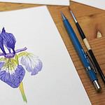
Loose but precise botanical sketching, step by step
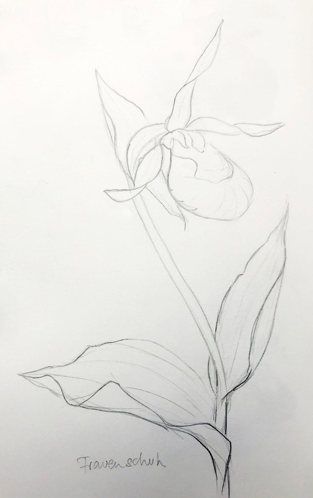
The first few steps are similar to the process I’ve shown in my recent step by step for botanical sketching – building up the drawing by drawing in basic shapes and volumes, and measuring angles and distances.
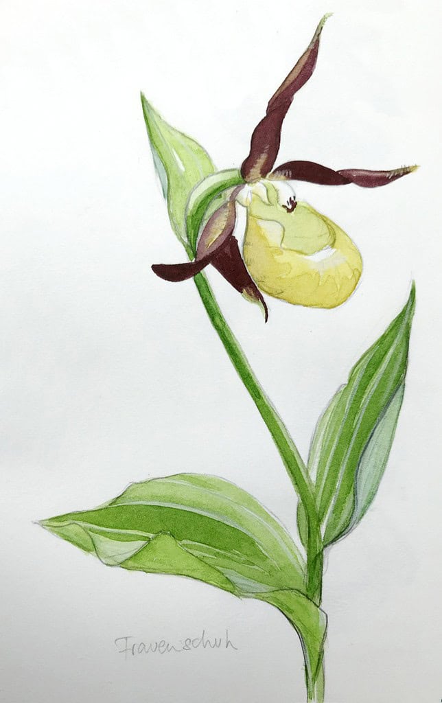
For the lady’s slipper orchid here, the leaves follow a fairly long and broad shape with a few bends, and the flower itself has a big round yellow lip (indeed slightly reminiscent of an old-fashioned slipper), with several petals twisting like long bands around it. The stalk is bent like a walking stick.
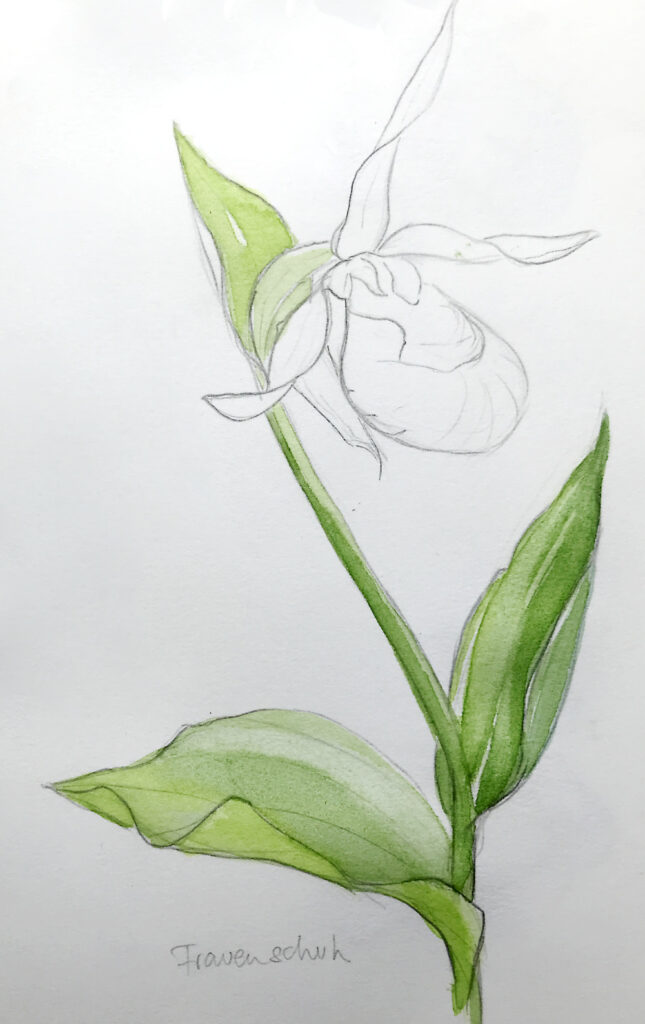
With the drawing in place, I can immediately jump to color. I add a layer of bright fresh green, leaving a few highlights (right leaf) and pushing the pigment into the darker areas, while carefully removing a bit of pigment with the brush again (lower left leaf).
While the green is drying, I mix a bright yellow and paint the lip – the inner walls have a slightly green tinge, and there’s a highlight at the front. I also add a bit of yellow ochre and light green on the base and tips of the petals. As the first layer of green is dry, I go over it with a slightly darker mix (a bit of cobalt blue mixed into my sap green) and restate the darker areas. It’s important not to fiddle around with the brush too much here, apply the layer preferably in one stroke, and then leave the pigment alone. This takes a bit of practice, and I often spend more time observing my subject and making the decision where to add paint (squinting helps), than the process of painting itself.
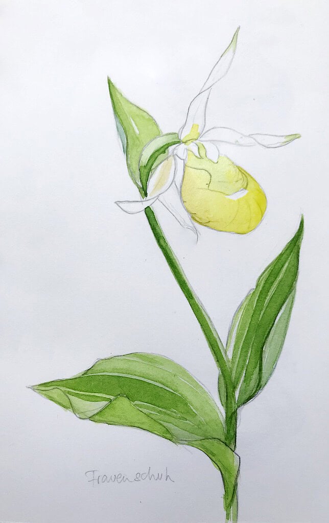
I now add perylene violet to the petals, in a fairly strong mix in the darker areas, and a bit lighter at the base and tips where the color fades to yellow. I also add a second yellow layer to the lip, intensifying the color in the shadow areas. For botanical sketches, it’s best to use the same base color for shadows, and not resorting to blue or violet shadows. In the same way, I add another layer of green to the side of the stalk, giving it a bit more roundness that way.
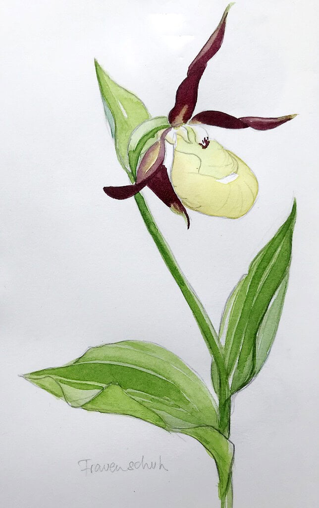
The last step are slight adjustments, I add a few textures around the lip with pencil to show the indentations in the form, and just a few strokes with white colored pencil to add back highlights on a folded leaf (lower right) and on the petal’s tips. It’s important to keep these accents subtle, as much fun as they are to sketch.
All in all, what takes away the most time is actually not immediately visible in the sketch – the observation and the decisions that happen before pencil or brush are placed on paper. Taking time to explore a plant thoroughly will result in a better drawing, and this will make it easier to get a loose, but precise botanical sketch in the end.
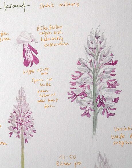
This example was a flower with lots of big shapes that are easy to put into a simple statement. For flowers with lots of small elements (like dense clusters of tiny flowers) I create a much looser drawing, and only draw a few more detailed shapes in the front (or I add a separate enlarged flower as reference).
I hope this insight into my method for loose and precise sketches was interesting.

Julia, this is a great presentation, thank you. It was pleasure to read and observe the development of your drawing.
You’re very welcome Linda, I’m glad you liked it! 🙂
Interesting AND helpful. Your talent AND generosity are appreciated!
Thank you!
Thank you so much Sandy! 🙂