This week in my live botanical sketching course we’re taking a closer look on colors and mixing. It’s useful to know a few basic terms and rules, and to have an understanding of how you can mix colors. These mixes were done with watercolor, but can be produced with all kinds of media.
Primary colors
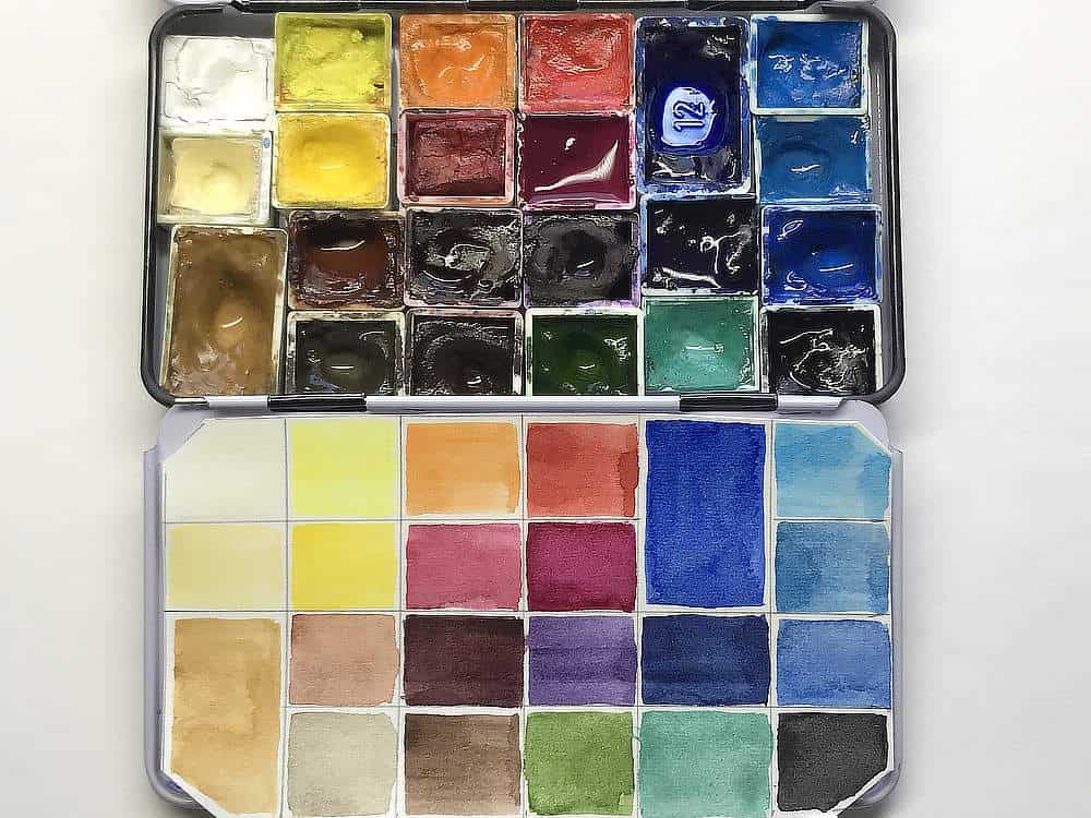
My palette follows the classical setup: a cool and a warm yellow, red and blue plus a few extras for convenience. Warm and cool describes how the color temperature for these colors is perceived by the human brain (blue = ice, cold; red = fire, heat).
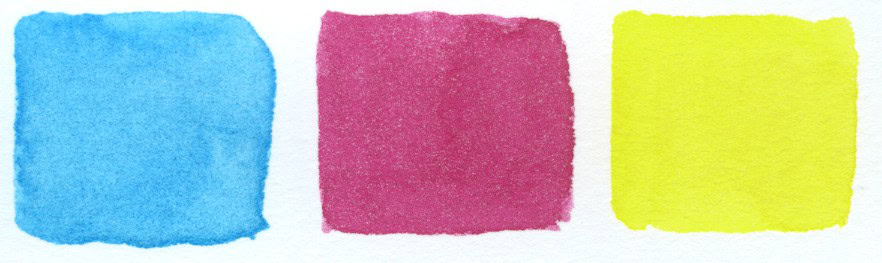
The cool primaries cyan, magenta and yellow are highly vibrant and are used as primary colors in all modern printing processes.
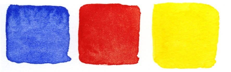
The warm primaries blue, red and yellow are considered the classic artist primaries, but you can’t mix clear greens and violets with them.
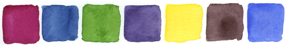
Combining cool and warm primaries in a palette and having a few extras like greens and earth tones is a good way to achieve versatility plus it means you don’t have to mix everything from scratch. A small but versatile sketching palette can have between 12 and 20 colors.
I typically mix colors by starting with the color that’s closest to what I want, and then modify it. Mixing charts or color swatches can help with memorizing more unusual combinations.
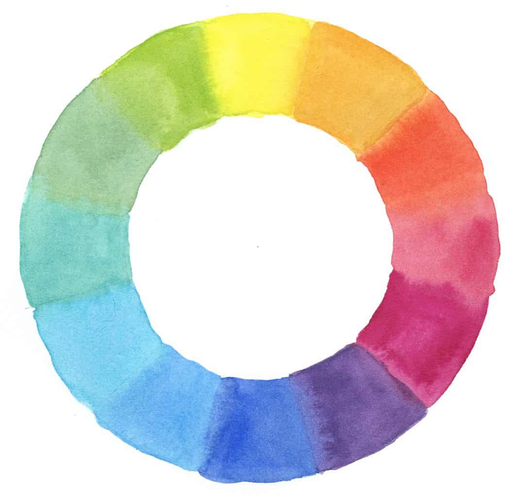
Color wheel
To visualize how colors relate to each other and how they can be modified, it’s helpful to arrange them on a color wheel. On the color wheel, the cool color spectrum (blues and greens) and the warm color spectrum (oranges and reds) are opposite. Note however that relative color temperature can differ. A blue, which is generally a cool color, can have red in it and tend towards the warmer side (like Ultramarine blue). So Ultramarine can be described as a warm blue, even though it’s overall still a cool color. Similarly, although reds are on the warm side of the spectrum, there are cool reds like Magenta and Permanent Rose that have a purple or blue undertone. Don’t let the commercial color name mislead you, always go by how the pigment actually appears on paper and how well it mixes.

Attributes of Color
Each color has specific attributes that can be described in terms of hue, value/lightness, and saturation/intensity.
Hue/Color
The actual name of the color, like red, yellow, magenta, cyan, blue, green. We typically can describe more warm hues than cool ones.
Value/Lightness
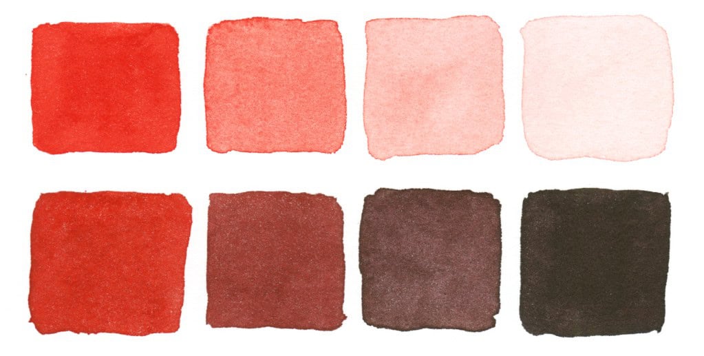
Value describes the lightness (or darkness) of a color. If you take a red and let it fade to white, you create a value scale. With watercolor, this is easy to do: just add water. Adding a darker hue or adding black will darken a color, but also change the vibrancy and the hue.
Saturation/Intensity
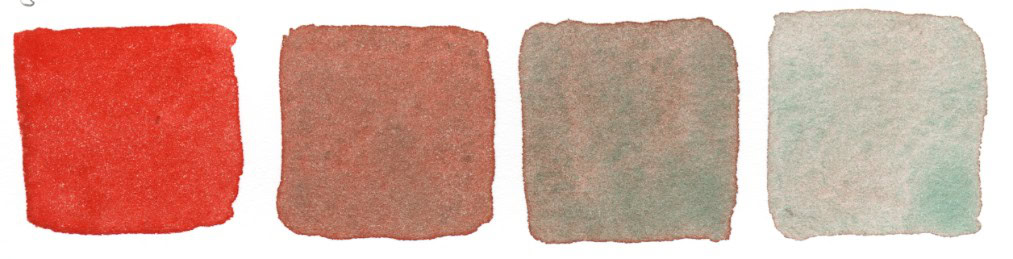
Saturation or intensity describes how colorful or vibrant the color is when you keep the value (lightness) the same. A very saturated color will seem very vibrant and bright. As you add a complementary color, or a black, you will lower the saturation – it will appear less bright and change to gray the more you add.
Mixing colors
All pigments in your palette have these three attributes, and also other characteristics, like opacity, transparence, staining, granulation, lightfastness. When mixing, take advantage of all the pigments in your palette, and learn about their properties. Get to know your materials. Experiment with your pigments and see how they behave in different combinations. Always take notes so that you can recreate mixes!
Examples for color mixing
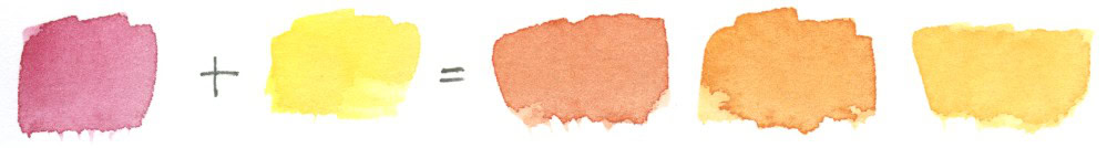
Magenta and Yellow
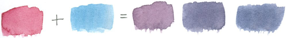
Magenta and Cyan
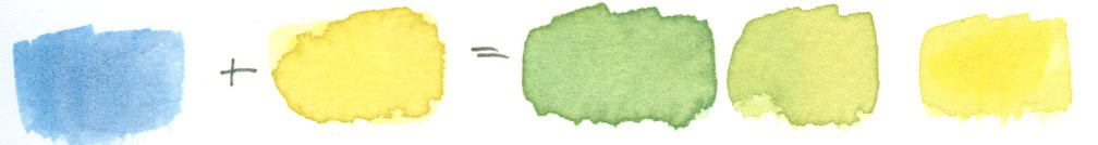
Cyan and Yellow
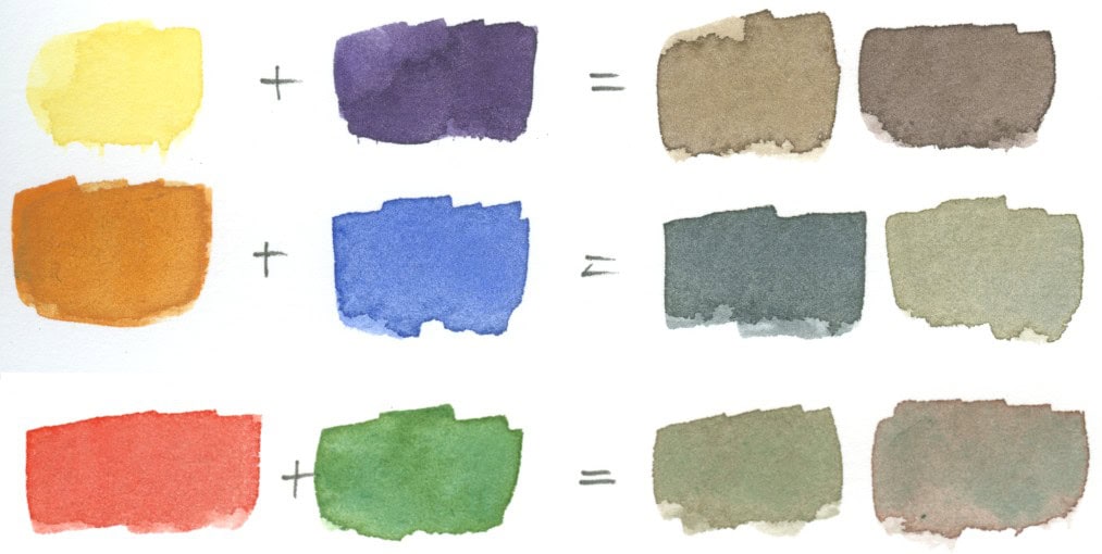
All primary colors mixed together create neutrals or browns

Complementary Colors
You can achieve interesting neutrals and browns by combining complementary colors (colors on the opposite end on the color wheel). In the same way, you can take (too much) vibrancy away from colors when they are more muted in nature than in your palette: just add a bit of the complementary color. Greens can often benefit from this – just add a bit of orange, brown or red.

This is really helpful, I always need to refer back to colours and hues and tones to remind myself of the differences!
Thank you Celia!
Super Aufschlüsselung und Zusammenfassung 🙂 ♥ Danke Julia
Sehr gerne. <3
Thankyou Julia
Looking forward to getting my Watercolours out again
Best wishes from Harriet i Denmark
Enjoy your painting time Harriet! 🙂
Thank you for posting this wonderful overview. It’s good for me to read this information over and over. Every time I read information like this, one more tidbit sticks in my brain. (color is not easy for me 🙂 )