

While reorganizing my art supply drawers recently I stumbled upon the small W&N Cotman palette I’ve used for a while last winter, and I realized I never wrote a blog post about how I perceive the differences between student and artist grade paint, and whether I find student grade paint is worth using especially for sketching beginners. So I thought it would be intersting to write about this.
My (maybe surprising) conclusion would be: yes, but with a caveat. Let’s see why.
Differences between student and artist-grade paint
Student-grade watercolor paint is typically marketed at beginners or hobbyists, and because it’s inexpensive it’s the most accessible option for those new to painting. Student grade paints typically contain less pigment and more fillers or binders, which can make the colors appear less vibrant and harder to activate and paint with compared to artist-grade paints. There are huge differences between student grade paints, from really cheap kits to actually well-formulated paints.
Artist-grade paints are made with higher-quality pigments, resulting in more intense, easier to pick up colors with (often) higher lightfastness, and of course a higher price point. Although you could debate that, because you will typically need more paint if it’s diluted with fillers, so you will probably get more bang for your buck from artist-grade paint.
Artist-grade watercolors often has better documentation, too, it typically has some information about the pigments used in the paint, which is really important to assess lightfastness – an aspect that plays a role for many professional painters (I know this might be overwhelming for beginners, but at some point it can be pretty useful to educate yourself about pigment properties).
The W&N Cotman student set I got is a notable exception here as they list all of the pigments they put into their paints, and the palette is also well-built (and fantastically light!). Even the little brush is usable. And the paint itself is actually not that bad for a student kit.
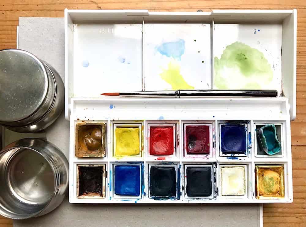
Last time I used this Cotman palette I added 4 additional pans to make it a more generalist palette, the 8 pans in the middle are the original ones (I’m going to review only the original pans today):
Comparing student grade paint and artist grade paint
Here’s a comparison between the Cotman skyscape set I got and comparable paints from my current palette which is a mix of W&N Professional and Schmincke Horadam. I chose the closest hue I had available, and had to improvise because I don’t seem to have Indigo blue around (I used a Holbein Royal Blue instead).
Anyway, for this comparison it’s not about the hue (color) itself, but more about the intensity and vibrancy of the paints. I added the same amount of water to my brush before picking up the paint, and tried to move my brush with the same pressure. It was definitely notable that I was able to pick up more color from the pro paints, and the wash felt less chalky. It’s a bit hard to show this in a photo, but here you go.
Cotman student paints at the top, artist grade paints at the bottom:

As expected the student grade paints are slightly lighter and less vibrant, but they’re not completely unusable. With a bit more brush work you will be able to get more intense colors from these paints, too, and if you know how to mix them you will get solid results. But these are aspects that particularly beginners aren’t always aware about.
The colors I sampled are of course limited because the skyscape set only has a smaller selection of colors. I actually found the slightly washed out look interesting for painting during the winter months, they gave a nice muted effect.
And of course I did a few skyscapes and found that the colors were put together well for that. I still noticed that I had to work my brush more to pick up paint, I had to go back several times to drop paint into my washes, and the paints had a more chalky feel to them. For beginners, this kind of paint manipulation might be hard to pull off.

In this summer skyscape, I found it a bit hard to mix a green that’s not dull, that’s partly due to the selection of colors in the palette, and partly due to the paint quality.

I think there’s definitely a place for student grade paints, and that is for exploring painting when you are on a tight budget, for learning basic watercolor techniques, for experimentation with the medium. Finding out if you like it at all can of course backfire if the paints don’t perform well, so it’s a double edged sword.
Well, at least the weight of that little Cotman palette is great, I seriously enjoy that it is so light and portable. You can of course replace the paints in your student kit with high quality artist paints, if you find you like watercolor and continue to paint. This particular palette comes with empty pans, so it’s great for adding additional paints – which I definitely did last year.
To summarize my thoughts:
Student grade paint pros
- inexpensive, good for trying out watercolor and learning absolute basics
- light palette (at least this one), very nice as a field kit or for traveling
- sufficient if your sketching style doesn’t rely on painting
Student grade paint cons
- less pigmented paint, colors are often a bit flat or dull
- you have to pick up a lot of paint for intense colors, the paints need work
- the price advantage probably isn’t as big because you use up more paint to get the same vibrancy
- it can be harder to learn proper watercolor techniques
- ability to use more advanced painting techniques like layering is harder
I’ve omitted aspects like lightfastness issues and pigment info because they’re often not as important for beginners anyway, plus some artist quality paints aren’t to great at this either!
My Conclusion
Student kits like this are an option when you want to try out watercolor and are on a budget, and you can upgrade to artist grade paint bit by bit, if you find that you enjoy painting. I find the Winsor & Newton Cotman paints are a relatively decent choice for sketching beginners who don’t want to spend much, although you can get a small selection of artist grade paints for a similar or slightly higher price, sometimes in a similar configuration where you buy a palette with some paint pans and empty slots you can fill up over time.
Starting with a smaller selection of paints can be very useful to learn about mixing, color harmony and pigment properties, so I’d highly recommend considering artist quality paints from the start. There are great readymade palettes, but if you’re interested in putting together your own, I even have a small course on that.

You can definitely learn the basics of color mixing, color theory, and basic painting techniques with student grade paints, although some advanced techniques may actually be harder to learn with low-pigments paints. It’s just easier to pick up paint and get intense mixes with highly pigmented artist grade paint, and layering will be easier, too.
Then again, I too painted with student grade paints for the first few years of my watercolor journey and I learned a lot about mixing and water control and the properties of color. I think it was a much bigger deal that I used crappy cellulose paper when I was trying to learn glazing techniques, which hindered my progress.
If you’re interested in stuff like botanical painting, or generally very detailed, tightly rendered paintings, you’ll need to learn layering techniques. And if you have to choose between getting better paints and getting decent (cotton) paper, get the paper first. I couldn’t have painted this illustration on cellulose paper:

But if you have a loose style, or don’t tend to add much color to your pencil or ink sketches, you might actually get away with those less pigmented paints. Just don’t expect wonders – be prepared to work a bit harder to get more intense colors. A good trick is to add a bit of water to your paints a few minutes before you start painting, that softens the pans.
I personally think it always pays off to use artist grade paints if you enjoy pushing paint around, and it might even have a flatter learning curve because the paint just performs well. Invest in yourself if you enjoy this.
The bottom line is, if you know what you’re doing, you can get nice results with student grade paints, I know illustration colleagues who create professional work with Cotman paints. Winsor & Newton Cotman palettes are still a better choice than no-name cheap kits, and I think these days it even reflects in the price – in some stores they’re priced not that far away from the artist grade paints. If you’re starting out, you probably won’t go wrong with most of the big brands student line (WN Cotman, Schmincke Akademie, Sennelier La petite aquarelle, Van Gogh, White Nights). I would stay away from no-name stuff even if it’s sold in art supply stores, but especially when it’s sold in supermarkets, or really cheap sets, chinese no-name palettes, and generally all palettes that aren’t produced by an established paint manufacturer.
As you can see in this post I used the Cotman skyscape set to paint lots of skies. It’s great for that and it was a lot of fun.
If you want to explore painting skies with me, I’ve shared my techniques in this course: Painting clouds and skies in watercolor I find myself painting more skyscapes especially in autumn and winter, when there’s not so much else going on and the cold weather creates amazing colorful sunsets. I find painting these quick skies very relaxing and a way to really bring out the strength of watercolors – no matter if it’s student or artist quality paint, they both work beautifully for expressive skies.

I’d love to hear from you:
What did you start with, student grad or artist quality paints? Have you switched or are you considering an upgrade? What kind of paint do your prefer?

Hi Julia, that’s interesting!
I started with WN Cotman about 1,5 years ago and still use it. It was a bit frustrating to not be able to achieve the same results I saw in the pictures of other people. Of course, it’s not only the colours but also me ;)
I invested in better paper and this was wonderful! It is so much easier now. I think I would not have started with watercolor at all if there were no student grade colours since I was happy to not have to pay too much for getting started.
Now slowly I consider to invest in also better quality colours and I am looking forward to it, but I still have fun with WN Cotman :)
Love your art – as always :)
Best, Jasmin
Absolutely, better paper makes so much more of a difference than expensive paint. Great to hear you’re still happy with the Cotman paints!
I took an adult-ed. watercolor class in which the instructor specifically had us purchase artist-grade paint (Winsor & Newton was the only brand available to me at the time in our town—no internet yet!) and paper (Arches in full sheets). I left the learning chute with a bang! and painted several paintings (of my own composition and choosing my own techniques from those she was teaching) that even today, 35 years later, I am proud of (barring the wonky perspective, of course). ;)
Then I was enticed by the cute factor of one of the Cotman boxes (no artist-grade chiclet sets were to be had in our town). Amazingly, I found them too garish and artificial-looking, but I persevered until I could get soft washes. (I got rid of the tractor green, white, and black, BTW.). I could not make them do in small size (sketchbook and small sheets of paper what I could make my basic artist set in larger palette do. The experiences I had with them set my practice back quite a lot. I had emerged from the adult class feeling empowered, and now a little set was beating me up!
I know now, from lots of sketchbook and field work, that the problem was not just in the Cotmans. I was also using a cellulose sketchbook, and the small sheets of paper were from a Strathmore tablet. Paper is very important to the equation of success. So, too, is painting large enough to be able to create beautiful brush strokes and achieve some of the techniques I learned properly.
I still use a cellulose sketchbook often (now Stillman & Birn Beta), and I have had to alter some basic watercolor techniques to make the paper in it work well for me. I can make a Cotman set do my bidding now, and I agree with what you said about certain things being more difficult with Cotman. You didn’t mention one particular important fact: Using up the Cotmans can take a LONG time, if one’s game plan is to use them up and THEN sub in artist-grade paints. I am grateful to my first instructor, who insisted on artist-grade materials from the get-go. Within ones means, of course, I would purchase a few artist-grade paints and good paper rather than going with student quality.
Thanks for sharing your experience, Dottie! I agree it can feel so different (and difficult) to change materials half-way through your learning curve, it’s almost like switching to a new medium. Especially cellulose paper can be notoriously difficult to paint on – but then I know quite a few sketchers who love the effect they get from it with watercolors, so it’s always a question of style.
And you’re right, it can take a while to use up those small pans.
Hi all,
I like all of the comments above. I can add here an additional caution about how cellulose paper often darkens; Strathmorepaper that started out plain white about 35 years ago is now light brown. Paper materials matter, although I do have a small mixed recycled sketchbook for daypack use in the field–Canson XL Mixed Media. I just
remind myself when I pull it out that this paper has limitations.
I started with Cotman watercolors, but as soon I discovered better quality I left them behind. For portability, I have a Sennelier Aqua-Mini set of pans that I bring when I have to carry my water into the field. I like them a lot better than Cotman. Gradually I’m replacing the Sennelier watercolors with Winsor & Newton pans. Best of all I like Daniel Smith watercolors but find that I need to be near a water spigot; I just can’t manage packing in 1/2 gallon of water and then packing out the waste water to avoid contaminating soil.
That’s a good point, if we use cellulose paper it should at least say “acid-free” on the packaging, as that is what will contribute to the paper becoming dark and brittle.
I too find it challenging to manage water supplies because of weight. What has helped me is to have two rather small brush rinsing containers and accept that one of them will be very muddy all the time, and then reserving the other one for picking up clean water.
Hi Julia,
What a thought-provoking blog post!! I agree with everything that you said. I bought my WN Cotman palette a long time ago (almost 10+ years ago) and it’s still “going!” I’ve only used up 3 pans from the original set and I replaced them with professional grade WN of the same color. I even use the Cotman brand for client works and they never know the difference. I use it to paint and for calligraphy work.
Recently, I took a class in certificate engraving from a master-engraver who still does everything by hand. To my absolute surprised, he used a very affordable, American-brand (relatively “unknown”) gouache for all his work. Mind you, his work includes those issued for national societies, universities, governmental departments, etc. namely: very serious clients of high prestiges. He said, when he’s an artist with that much volume of work, he always care about his bottomline profit and these cheaper gouache were light-fast and his client never knew the difference. He absolutely saved money every way possible, including substituting his certificate papers to something else that are more affordable but still produce a good result. He encouraged us to do the same.
Since that experience, I never second-guess using products that are more affordable but offer the best quality for the job that I need done. And if the professional master-engraver used a $2/15 mL-tube gouache and delivered top-notch job, then I think there’s a lot to be said about more seriously considering affordable options. And your blog post is really on-point on that issue!!
Thank you for sharing!
It’s really funny how many of us started with one of those small Cotman palettes!
And absolutely, as long as the materials perform well and hold up to the demands (lightfastness etc.) I think it’s perfectly reasonable to use a less expensive solution. Back when I did more illustration jobs I didn’t even think about the quality of paint at all, because the work was going to be digitized anyway and I often threw away my drawings anyway.
Hi Julia,
I love your blog!
I started with artist-grade paints. I had no clue what I was doing and no art instruction whatever, but I knew I wanted to try watercolor in my nature journal. After much online research (which said not to skimp on cheap color) I bought a palette of Davinci watercolor and I was pleased with it. However, I admired John Muir Laws’ palette and the hues he had in it (Daniel Smith watercolor) and I “graduated” to that. I can’t say enough about using high quality watercolor! That said, I lead a nature journal club in my community and I wanted to have a set of watercolors for anyone who wanted to give painting a try. I chose the exact set of Winsor and Newton Cotman that you have, relatively inexpensive, and I was pleasantly surprised when I tried it out. I thought for a cheap set the color was good, and it performs well. Someone in my club then bought a set after using it. And yes, the paper you use means alot. I had read that if money for art supplies is limited, spend the most on paper.
Thanks for sharing!
Dear Julia
for some reason the student grade paints have the best ligh-weight travel pallettes. I got the Sennelier la petite set (https://www.sennelier-colors.com/en/Aquarelle-petite-aquarelle_85.html) which can be attached to many things.
One colour in this set is more chalk than anything else (the cobalt hue), but even that I was able to use for petals (very diluted).
Because the pigments are not good for the environment, for sketching outside I use waterbrushes.
Best regards, Cornelia
Yes, I’ve noticed that, too – student palettes always come in these nice light plastic palettes, very handy. That Sennelier palette is interesting, does it come with the arm? Saves one from glueing magnets and clamps to the gear (which I’ve done in the past with mixed results). Great that you enjoy the colors overall.
I usually take my painting water back home with me, that way I can use a few other brushes too. But the waterbrush is also a good lightweight tool!
Hi Julia!
I’m very much on the beginner side of things, but since I started painting this spring, I’ve bought both a variety of student paints (including the cheap Mont Marte tubes from TK Maxx, I know, I know), and professional paints. I know that there’s a quality difference, but I value the cheapo paints (some of which, like Schmincke, are actually not that cheap) for different reasons.
The cheap paints are great for just making a mess with — doing little abstract sketches to get a mood out, mixing tube colours in a half-pan to see what it’s like when I try to make my own convenience shades, you name it. It’s just pure play, which is really important to me right now. I also enjoy the pro paints, but find I have to work myself up to using them — and even more so for the better quality paper, though I’m really noticing what a huge difference it makes.
(Would also like to put in a word for Van Gogh paints, which are bright and transparent and from what I’ve read online, pretty colorfast. And so so cheap for the quality!)
Thank you for sharing, Irina! I too think that student grade paints absolutely have their use – and if they help with creative exploration and playing around, mixing experiments, what’s not to like. I’ve heard from so many people who feel inhibited by all their nice, expensive art supplies, because they don’t want to waste them on silly experiments or less than perfect work. I know the feeling.
And very probably, you will come to a point where you notice you fight against the materials and wish for better ones – at that point get out your expensive paints.
And yeah Schmincke is pricey even for the student grade stuff. They can get away with it because of their cute owl logo.
I think I haven’t painted with the Van Gogh paints yet, but Talens (the company behind it) also has a pro watercolor line (Rembrandt?) that’s pretty good and not too expensive. Daler Rowney also has pretty good inexpensive paints, but they can be hard to get.
Hi Julia,
I again started on Cotman with their little pans, and have now ditched the half pans and have filled the palette with W & N watercolours. I have used another Cotman palette for gouache. Its just so much easier not having a tiny half pan that can get lost so easily, and without the pans, you can pack a lot more paint into those palettes. I also ditched the black and the white watercolours, and have a gouache white and silver instead in the watercolour palette.
That’s a great modification for this little palette Caroline. I agree you usually don’t need black and white (especially if it’s one that’s not as opaque). I’m curious what do you use the silver for?