Every few months, I do a few tweaks to my field sketching palette. Roughly every year, I do an update on the blog about it. I thought it might be fun to take a look at what I’ve changed lately.
You can get a handy PDF of my current palette if you sign up for my newsletter.
Here’s a video version of this post:
What colors are in my palette
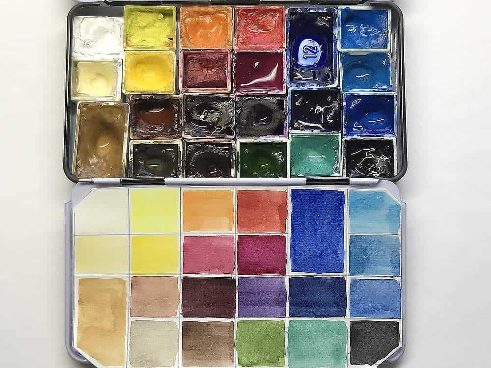
For a detailed description of some of the pigments see the posts at the end of this post.
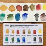
- Titanium White PW6
- Schmincke Jaune Brilliant Dark (PW6, PY53, PBr24)
- Schmincke Lemon Yellow (PY3) or Winsor Lemon Yellow (PY175)
- Schmincke Pure Yellow or Winsor Yellow (PY154)
- Schmincke Chromium Orange Hue or Winsor Orange (PO62)
- Schmincke Vermilion (PR255)
- Schmincke Ruby Red or WN Permanent Rose (PV19)
- Schmincke/WN Perylene Violet (PV29)
- Schmincke Purple Magenta/WN Quin Magenta (PR122)
- Winsor & Newton Dioxazine Violet (PV23)
- Winsor & Newton Indanthrene Blue (PB60)
- Schmincke Ultramarine Finest (PB29)
- Winsor & Newton Cobalt Blue (PB28)
- Winsor & Newton Cerulean Blue (PB35)
- Winsor & Newton Manganese Blue Hue (PB15)
- Winsor & Newton Sap Green (PG36, PY110)
- Winsor & Newton Cobalt Green (PG50)
- Schmincke Yellow Ochre (PY42, PY43)
- Schmincke Green Umber (PBr7)
- Schmincke Burnt Sienna (PR101, PBk9)
- Schmincke Burnt Umber (PBr7)
- Schmincke Payne’s Gray (PR101, PB29, Pbk7)
I’ve noticed a few problems with my stored tubes from Schmincke lately, it might just be the batch, but the binder tends to separate a lot (lots of yellow goo comes out before the paint itself). I’ve switched to Winsor for restocking new paints, and I give my tubes a good massage before filling up pans. I like the quality of both paint brands generally, and the price range is the same for me. I exclusively use honey-free watercolor paints after noticing how sticky the honey-based paints tend to be – it’s not practical for field sketching.
What has changed in my palette since summer 2022
I’ve introduced a few new colors to my palette since last summer. I’ve added Dioxazine Violet back in, and added Indanthrene Blue and Manganese Blue. I’ve also added Jaune Brilliant. I’ve removed Quinacridone Violet, Cobalt Violet and Buff Titanium. My thoughts about the changes:
- I really like Dioxazine Violet for mixing, and I prefer it to the cobalt or ultramarine violet because of less granulation (I prefer smooth washes). It’s powerful stuff, though, so a little goes a long way.
- I’ve added two new blues because I like how flexible this makes me in mixing greens, and also for different sky colors. I didn’t use more than my typical three blues (Ultramarine, Cobalt, Cerulean) for my new cloud painting course, though. I want to keep it accessible and not everyone wants to put five blues into their palette (but you totally can, and it’s great!).
- Manganese blue hue is just a wonderful color that makes me happy. The “hue” indicates it’s not made from the original pigment (PB33, not available anymore due to health risks), but from PB15 – but it’s the same clear azure blue color as the original. Almost always too intense for my German sky, but I can dream about Southern Europe this way, and it’s a great, non-granulating mixer, lovely for light cool greens!
- Indanthrene Blue is a great dark, warm blue. Very dramatic and intense. New for me, I’ve never done a lot with it, but I sure love the color. Amazing for dark skies.
- I’ve removed Buff Titanium and added Jaune brilliant dark instead. I mainly use this for skies and for cream-colored flowers, and the Jaune brilliant performs much better, it’s more yellow and brighter. Buff titanium produces slightly more muddy mixes, plus it granulates, and for bird feathers (the other application I was using it for) I can also mix a bit of Umber into the Jaune brilliant. None of this is really necessary in the end when you have white in the palette, it’s just a shortcut.
- Quinacridone Violet and Cobalt Violet were very nice additions last summer when I sketched lots of flowers and especially bright pink orchids, but I found I can get by with the Quinacridone Magenta.
Other changes
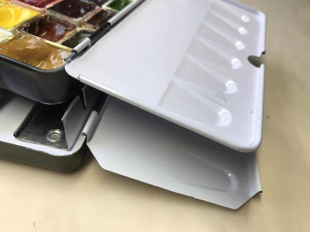
Another interesting change to my palette are that I’ve also switched the tin. I’ve kept the small metal palette model because it’s optimal for me (love it for field sketching, love it in the studio, three wells in the lid means more space for mixing), but I’ve gone from a Schmincke-branded small metal palette to a no-name palette that has the same layout and mixing areas. It came at a third of the price and is very well made.
What’s different in this one is that the metal edges aren’t as sharp as on the Schmincke model. I accidentally smashed my hand into that sharp edge a few times on that one (it doesn’t cut any fingers, but I’m clumsy and it’s painful), so I appreciate the bended edges. It also means that the paint is contained a bit better in the lower part of the palette now and it can’t run off. It’s the little things that count.
I also like that I don’t run around like a brand ambassador for Schmincke with that logo showing everywhere, because I’m not. They make really good products, have a nice customer service and I like buying local supplies, but I also dislike showing brand logos all the time when I film, plus I don’t think they need more free marketing, since they’re already pretty good at advertising their products. 😉
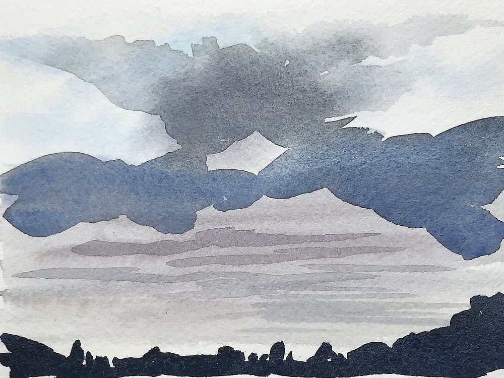
All in all, I’d say my favorite combination right now is cobalt blue and burnt sienna – I’ve rediscovered that one while painting clouds. It produces a lovely soft middle grey with very subtle granulation that can be adjusted to look more blue or more brownish. I like to use it for dense low clouds and for delicate shadow areas, or for background trees or fog.
What does your current palette look like? What’s your favorite pigment or mix right now?
Further reading for pigment nerds
My previous palettes:

I, too, find the binder is always squeezing out first. Enough so that I’ve stopped buying them. I love their granulation but don’t like the binder issue. I have taken a toothpick to mix them in the tube so the paint is not dry from a lack of binder. Love your update!
Glad to hear I’m not the only one. Does this happen for you with certain paints/brands only? I will try the toothpick method with half-empty tubes, thanks Linda!
Hi Julia.
I’ve never had a problem with the binder separating from my Schmincke tubes, but until recently I only had small 5ml tubes. Do you think it only happens with the bigger ones? Actually I just bought two 15ml tubes and now I’m a little worried.
As for the colours, I really like the Indanthrene Blue, but I’ve very rarely used it, it’s a shame. I’m debating whether or not to put sap green back into my palette.
Personally I like a bit of granulation and maybe you don’t because you seem to use hot press paper more? I’ve noticed granulating colours behave differently on that type of paper and I don’t enjoy it a lot on it.
Hey Aline,
don’t worry too much about the 15ml tubes, as far as I know, this is more likely to happen with certain colors (Cerulean Blue is especially notorious, Potters Pink too) and it will probably happen more often when you’ve stored the paint for a while. Tips I got ranged from stirring the paint with a toothpick, to putting it into a bag and spinning it a few times before opening the tube. In any case, I think it’s best to try and mix the binder back in.
I’ve had this internal sap green discussion too! I removed all greens for a while and learned how to mix any green from my blues and yellows, and when I brought the sap green back (as a base color that can be modified) I chose one that is not as artificial looking as some of the vivid greens out there. The Winsor sap green works well for me right now.
I probably tend to non-granulating paints because I can’t really use it when I create scientific illustrations, I need predictable washes for that. And you’re right, it might also be the HP paper, it seems more uncontrolled. I sort of like granulation here and there for skies, though. All in moderation. 🙂
I’m so intrigued by your choices!! I live in southern Florida so Manganese is the color of our skies. I tend to not use cerulean too much. The brands I have of it seem very weak? Also, buff titanium is the color of our sandy beaches but I did purchase that brilliant yellow too but have yet to experiment with it. I used to have brown umber as my brown but found the DS brand dries so hard that it is very difficult to re-wet so I got sepia. But I read that sepia is not fully transparent and can make mud. I don’t mind some granulation but am enjoying transparent colors more. What is all the talk about using only single pigments to avoid mud? I have traditionally only use Hansa Yellow Med as my yellow and maybe in gold or gamboge for something warmer. I am a little confused about the differences between yellow ochre, raw sienna, and monte amiata. Also that flap on your palette tin, is there a way to make it not flap down, to make it stay upright more? These are probably too many questions. Your blog posts really get me thinking and inspired. Thank you Julia!!
Oh I can imagine how beautiful your skies must look, Betty! Just lovely to live in an area with azure sky and warm weather (I’m writing this as we disappear in a wall of snow over here). Cerulean is a bit more subdued and weaker, you’re right. It’s also the paint that provides me with the most separated binder, how nice. 😉
I too have a tube of DS umber, I think raw umber? Lovely brown color, but indeed it dries hard as a rock. Sepia often has black in it, that might cause mud or reduced brilliance, too.
My experience with single pigment paints is that you’re not safe from mud if you use them, it’s maybe a bit less likely, but ultimately it comes down to the color combinations themselves. Mixes with single pigments can cause mud, and mixes with combined pigments can produce clear colors. And some single pigments are more likely to produce slightly chalky mixes, like ochres, cerulean blue, a lot of warm reds, and opaque pigments. Anything with white, too. I find the finer a pigment is milled the less potential mud it produces.
Yellow ochre, raw sienna and all of the other “marketing name” ochres are basically the same thing: PY42 (synthetic iron oxide) or PY43 (natural iron oxide – directly made from yellow earths). Very lightfast and stable, the colors can vary, and I think the biggest difference is how each one behaves in a mix.
I haven’t found a solution for that loose flap, unfortunately, maybe a bit of kneadable eraser or bluetack can hold it in place? Or a strategically positioned magnet?
I love your questions and could chat about this all day! :-))
I have not started working with watercolour yet but I so enjoy all of your blogs/emails. You are very talented. I am hoping to start exploring watercolour this summer when I am off work from teaching. Thank you for sharing these blogs.
Sheena, that’s so nice to hear, I really appreciate it! Great to have you here. 🙂 Summer will definitely come, and you’ll have something to look forward to with watercolor – I hope you’ll like it!
This was a very interesting video, for sure! Thank you for demonstrating burnt sienna and cobalt blue. I will use it when I paint this afternoon. I am also not a fan of granulating paints, and learning a new mix for colors already on my palette seems to free up a well I can use for something else.
Thanks, that’s good to hear there are others out there who aren’t fans of granulating paints. 🙂 I hope you enjoy your mixing session, Julie!
Thank you so much for this post. I have a solution for the sharp edges on the schminke tin.. I took some clear bathtub, caulking, one with a very small applicator and put it around the edge. That seems to have solved the problem!
Great tip Amanda, thank you!