I find winter is a great season to get started with painting skies and clouds – you can often see such intensive colors. With watercolor, painting skies can both be a very quick or a slow process – quick when you just add a few brush strokes to show a bit of blue, slow when you need (or want) several washes of paint to show cloud layers. Watercolor is a great medium to paint skies. You can play around with colors, intensity and edges. It can also be difficult not to overwork sky paintings, because it’s fun to mess around in wet paint.
My approach to sketching skies has changed slightly over the years, and I’d like to show my findings in this post. Many people like expressive, wild skies – I do too, but I find they often turn out awful when I attempt to paint them, overpowering the landscape below them. If the sky is not the subject, then I mostly keep my skies simple these days, with only very little experimentation. Sometimes I even leave them out entirely, which can look very interesting. And if the sky is the subject…I paint it very simply, too.
I’d like to use this post as a starting point to overhaul my existing online course on painting clouds and skies – I think it could use a decent remake. So if you have any questions or requests on sketching and painting skies or clouds after reading this post, definitely let me know and I’ll see how I can integrate it into the course. (The course is now published, see here).
My main ingredients for getting a nice watercolor sky are: not overworking the washes (always a good tip for watercolor), choosing the right colors that make for good mixes, and knowing a few tricks that keep your cloud paintings believable.
Choosing your blues
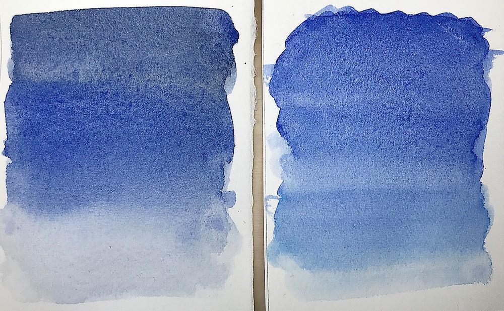
Most palettes have different choices for blue in them, and that can be useful. Skies don’t always have the same blue, so choosing a darker or lighter blue depending on the color outside is the first step. I personally always have Ultramarine Blue, Cobalt Blue and Cerulean Blue in my standard palette, and I use them all for skies (I have more blues in my kit currently, but I consider those three my basics). Sometimes the blue sky can look like a gradient, dark blue overhead, and lighter and warmer towards the horizon (often you see even a slightly yellow band at the horizon). Using different blues in a graded wash can look very convincing. Just make sure you mix enough paint before you start, otherwise you wash can get streaky.
Finding the right mixes for clouds
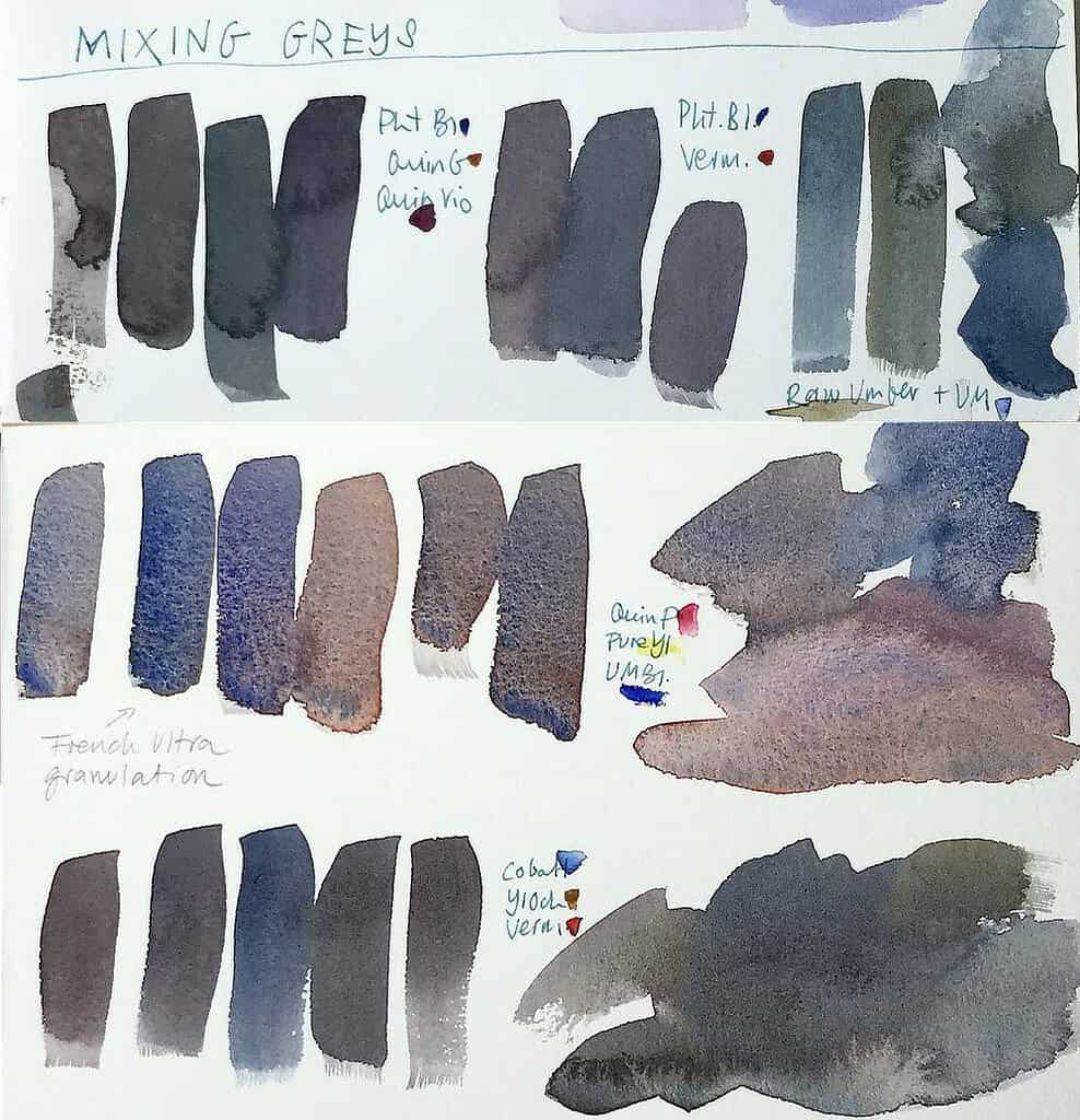
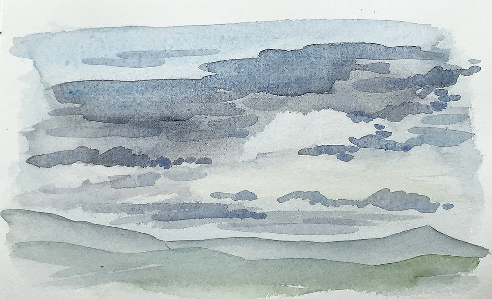
For grey skies and clouds you will often need a grey, and you will have to mix that. Cloud colors can range from blue over grey to purple or red, and of course the sky itself comes in many shades of blue, and is sometimes pink, yellow or orange. I’d suggest testing out your paints to see if you can get nice sky colors from them (and take notes so you can replicate what you did!), before you wet your paper for that big sky painting you’re planning. I just mention that because it’s something I often forget, too. One help can be a mixing chart, or mixing stripes you create from different pigment combinations, but for your most-used combinations it’s good to just know them by heart. One of those would be the all-time favorite of many watercolor painters, ultramarine and burnt sienna. You can get lighter mixed if you switch the ultramarine for lighter blues, or the burnt sienna for a lighter earth pigment, or for a light red. Not all mixes will give you a neutral grey though, some will have a green cast, or tend towards purple – based on what you want to achieve, that may be useful. So it’s good to do many mixing experiments.
To see examples for a few more mixes, see this post: How to mix interesting neutrals and greys with watercolor
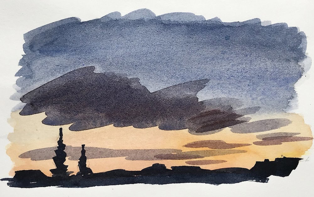
Another thing I add for graded washes in skies when I can see it is to add a yellow band (near the sun and horizon) I let the blue wash dry, and apply a very light layer of yellow or raw siena. Don’t overlap the two colors, otherwise it can turn green (with the exception of the North Light, the sky will rarely turn green).
Fluffy clouds and painting around whites
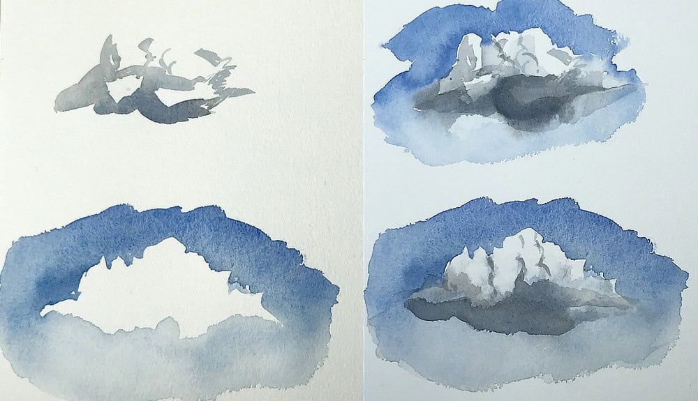
For big white fluffy clouds I like to paint around the white areas, since this looks more convincing than painting everything and blotting out paint – but for fixing small areas you can do this too. Wait for the wash to dry a bit and tap the moist paint gently with a paper towel or rag. When you paint around the white, you can either pre-wet the paper (or certain areas) to get a soft edge, or paint defined edges and loosen them up with a clean brush. Make sure you still apply the blue in a gradient, darker at the top, lighter near the horizon. When the paper is dry, you can go back and add some cloud shadows. You can wet the white areas, or apply the color first and then soften it. My most-used grey mix is indeed UM blue and burnt sienna, mixed to a very pale wash with lots of water.
Wax resist
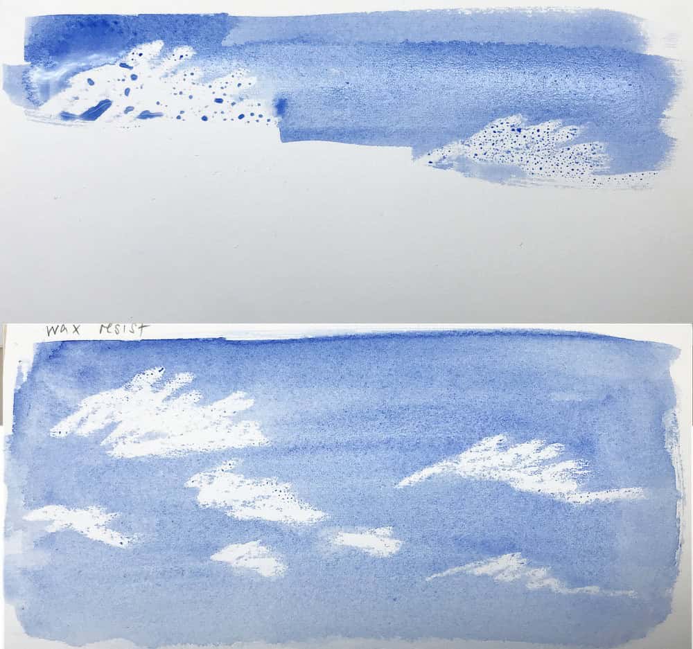
In a sketchbook you could also experiment with techniques like wax-resist. For this, use a small candle stump and rub it over the page where you want your white cloud to be, and paint over it with your blue – instant clouds. It’s not always easy to see where you have applied wax, but for small sketches it works surprisingly well. If you want cloud shadows, you need to paint those in first, let them dry, apply wax over everything, and then you can add your blue wash.
I really like this approach of putting in cloud shadows first, even without the wax candle. That way it feels like I can plan my cloud areas a bit better.
The right amount of brushwork
This is a delicate matter across all painting techniques, and generally I find it most challenging in watercolor, because it’s so easy to overwork a wash. You often get the best results when you go in with your paint, place a few broad strokes, and then leave the paint alone until it’s dry. I know this is so hard to do. There are a few cases when it can really look nice if you drop in more paint into your still wet wash, but you have to do it at the right time and with the right amount of paint and water on your brush. So learning how watercolor works is essential for that. You will get unsightly blooms and backruns if you ignore it, or dull chalky areas with far too much pigment. This can look interesting, and for a sketch I think it’s often fine, but I still like to avoid it.
Watercolor sky renditions are an area where less is often more. I will touch up an area sometimes if I dare, but I try to get in and out with as few brushstrokes as possible. This means making decisions and planning ahead (like where to leave white space for big fluffy clouds – as I said, placing cloud shadows first can help here, or a very light pencil outline), but also leaving a wash alone when it’s already drying (as opposed to being shiny and moist). I’ve destroyed many sketches by fiddling around too much, but at last I’m learning not to do this. If a wash is almost dry, any marks you make will likely look unintended. I like to remind myself it’s ok if a cloud shape doesn’t look exactly like I saw it, because clouds are morphing and moving all the time, and it’s more about capturing the feel of a scene than about being exact.
Multiple layers
If you see a lot of overlapping clouds in the sky it can make sense to add another layer of clouds. Let the previous washes dry completely before you go over them again. I find no matter how dark clouds are, it looks nicer to paint them in a bit paler. Otherwise it’s almost as if more pigment weighs them down. An exception are scenes which need a lot of contrast, like sunsets.
All in all, this is how I paint clouds these days. Skies are often not the main focus of a sketch, so I like so keep them simple. But when I want to include a sky, it’s always helpful to have a few good mixing combinations at hand.
P.S. I’m sharing all of my cloud sketching techniques in my course Painting Clouds and Skies in Watercolor.

Hi Julia,
Thank you for sharing your experience of learning more about watercolour techniques. Your explanation here is detailed. It must have taken a lot of thought and practice to get to this stage. As a student I feel encouraged by this to keep trying with my own art. Your honest and open communications are always helpful. Thank you.
I am looking forward to your new course on clouds. You have covered many of my own concerns here. All the best with the filming.
Hi Sandra,
thank you!
Definitely keep practicing, it’s worth it. If you put in the brush miles and review your work from time to time, it will show. I’ve noticed that whenever I’m frustrated and ready to give up, I’m very close to mastering the next step. Watercolor can be so maddening, especially when you’re dealing with lots of water, and the best way to learn about it is to paint a lot and create lots of awful paintings, and then less awful paintings, and then actually quite decent ones. 😉
Filming is going well so far, I really like how the cloud paintings are turning out!
Hi Julia,
This is an extremely helpful article and reminded me that I need to practice more cloud painting. Fluffy clouds are still a challenge for me, and when they turn out well it’s exciting! Your first class on Painting Clouds was very thorough and I’m curious to see what you add to the new version. I’m looking forward to a new “Julia” class!
Since painting so many clouds lately for the course it came back to me why I like it so much – it is so relaxing, and it doesn’t have to be complex. Fluffy clouds are definitely a challenge, I will show a few different ways to approach them. The difference from the last class will be that this one has a few more short cuts – less noodling and layering and just getting the essentials down on paper in a beginner-friendly way. I hope it’ll be fun!
I’m new to nature journaling and also painting. I’m starting to understand how to ‘look’ differently when attempting to draw & color. I will look forward to a cloud/sky tutorial. Practice makes perfect. Pencil miles is the journey!
Yes, pencil and brush miles make all the difference! And enjoying the journey. 🙂
Hi Julia,
I have wanted to draw and paint my whole life. I’m 74. The pandemic provided me the perfect opportunity. On line tutorials have been wonderful.
I started my own sketchbook 10 days ago after having the good luck to see your Nature Painting tutorial. Thank you.
I’m looking forward to more lessons about skies.
Judy
You did a phenomenal job!!!