There are a few different ways you can mix neutral colors. You can get interesting greys and browns with just the slightest hint of their base colors by adding complementary colors together, or simply use the muddy parts on your palette to add neutral areas. Other possibilities are using premixed greys (there are a couple useful ones), or using a single pigment grey.
Here’s the video version of this post: How to mix interesting neutrals and greys with watercolor (video)
I add grey and other neutrals depending on the situation. I try to be careful with premade darks, because they can destroy the luminosity of a painting. It’s often better to mix neutrals yourself, particularly for field-sketching. When it comes to detailed renderings of animals or plants, greys and blacks have their place. As a rule of thumb, I try to stick with real grey/black when the local color of the object is also grey/black. Local color is the color of the object itself, without taking light or contrast into account.
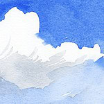
For a stormy sky, I often find that adding a bit of Burnt Siena or Raw Siena to my sky blue (Ultramarine or Cerulean) gives lovely results, particularly when the blue is granulating – the pigment particles will group together on the paper and produce an interesting texture.
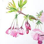
For shadow areas, you can try out a muted violet, and mix it from a tiny touch of purple or violet with whatever mud has assembled on my palette. If the palette is clean, I use burnt umber, sepia or a grey. Some subjects like yellow or red flowers will look more vivid if you add a slightly darker shade of the same color as the shadow though. On the other hand, have you tried to paint a banana with a dark shadow and spots in brown or black? Try using violet instead.
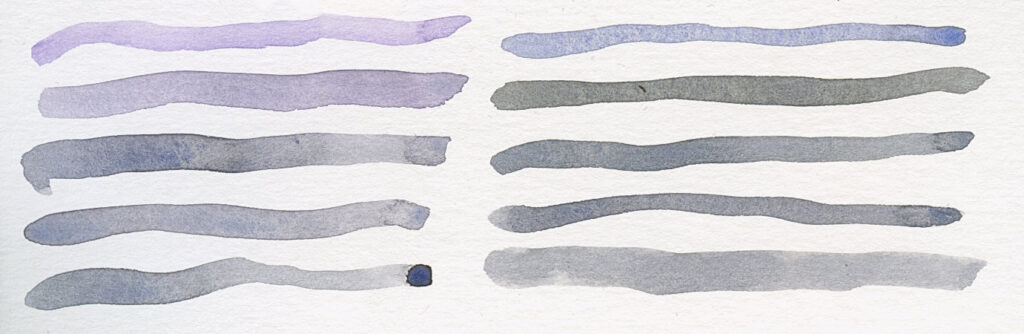
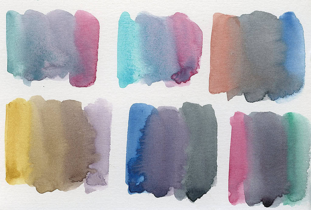
Let’s look at what describes a neutral tone in the first place. It’s a color of reduced intensity. The easiest way to reduce the intensity of a color, is by adding in its complementary color. These are the colors that are on the opposite on the color wheel. Red and green, blue and orange, yellow and violet are complements. Mixing complementary colors can give a vast range of neutrals and greys – it’s worth to give these color pairs on your palette a try. Start by mixing in just a little of the complement and see how the color changes (a useful trick to reduce the intensity of tube greens is to mix in a bit of red to take away the often very pure, almost artificial color that rarely can be observed in nature). If you add more of the complement, you will neutralize the color to the point where it will produce a dull grey or brown mix. These are actually very useful colors that are everywhere in nature. So try mixing red and green, orange and blue, and yellow and purple and see what happens. Also try less obvious mixes, like pink and turquoise, red earth tones and blues, or yellow earth tones and violet. Vibrant pigments with a high intensity (chroma) will get you strong greys, whereas less clear, low-chroma colors will produce lovely subdued mixes.
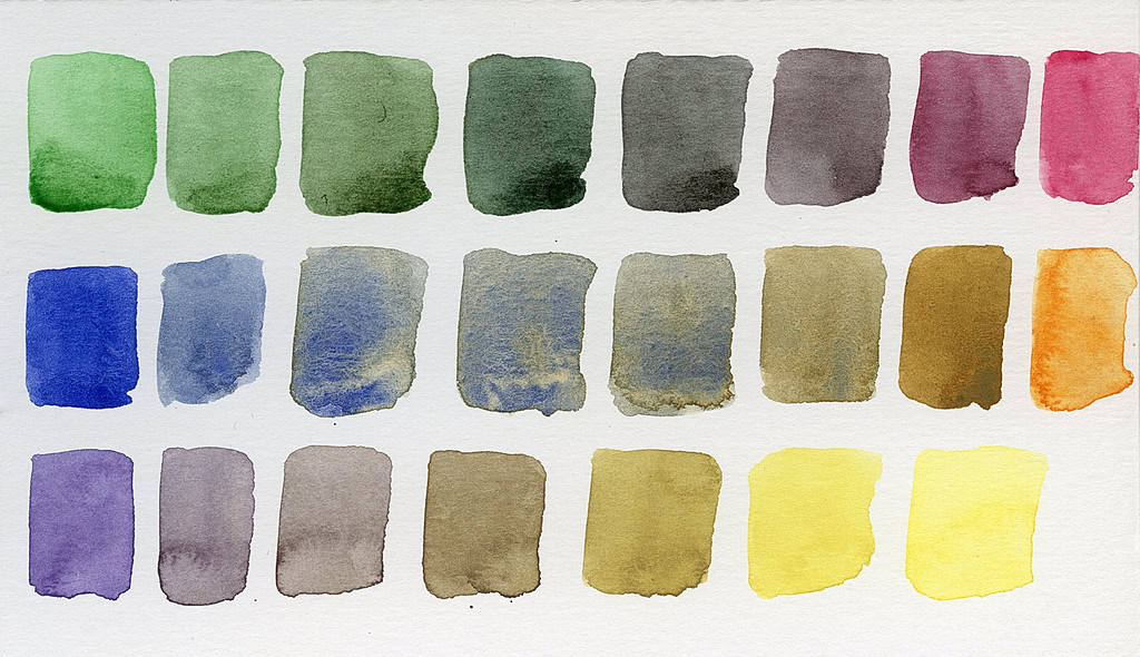
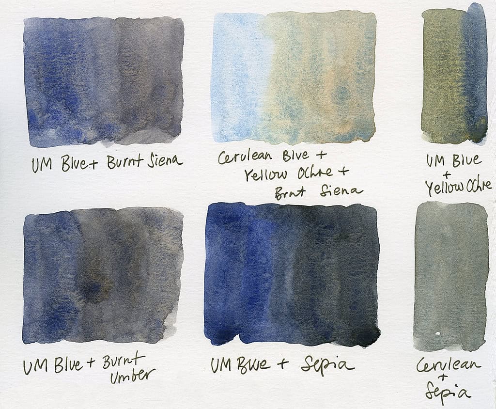
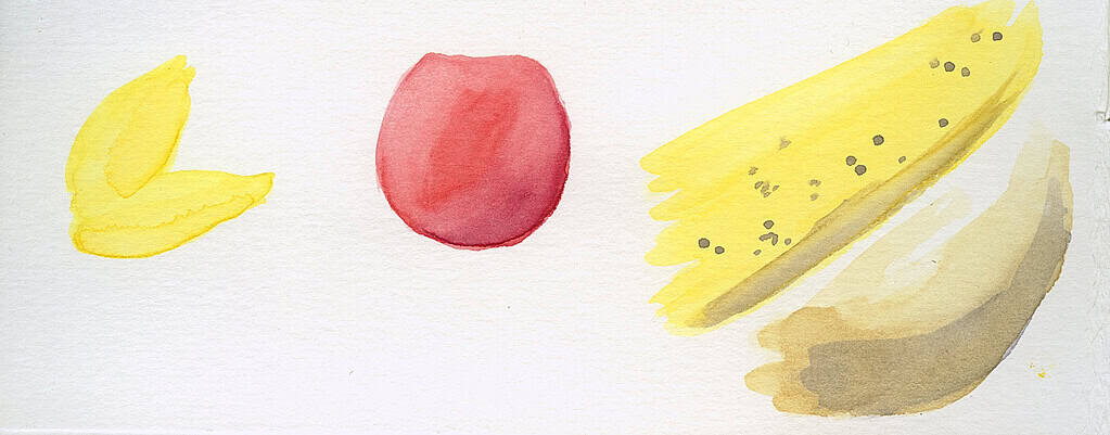
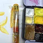
I particularly like the intense dark grey that can be produced from Quinacridone Rose (PV19) and Phthalo Green (PG7) or, for a softer granulating variant, Viridian (PG18). A lovely purplish dark is a mix of Vermilion (or any warm, orange red) and Phthalo Blue (PB15). And of course, there’s the classic landscape painters grey that can be produced by mixing Ultramarine Blue (PB29) and Burnt Siena (usually PR101 or PBr7, the stronger orange version makes for a darker grey). I use that mix all the time, like many other painters. A softer pairing that uses colors with reduced chroma is Cerulean Blue with Yellow Ochre or Burnt Siena – this lighter blue makes mixes more muted and soft. You can see both of these mixes in the first image.
Usually, if you add just a touch more of one of the warmer color (yellows, reds, earth tones), you will get an interesting brown hue. Mixing earth tones or yellows with a dark blue, violet or red color will produce interesting browns, and you can modify your existing earth colors with them.
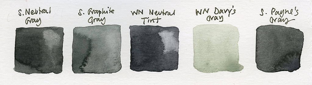
As for pre-mixed greys, I mainly use these instead of black in my sketches, and I sometimes do tonal studies with one color, and that’s usually black or grey. I find Payne’s Gray and Neutral Tint to be the most useful pre-mixed greys. Both can differ a bit depending on the manufacturer. Ivory black (or any other black) can also be toned down to grey – but be careful, black can be intense and make your painting flat if you mix it in everywhere.
There are a few single pigment darks that I find interesting, but not essential, like Graphite Grey (a lovely delicate tone) or Mars Black (based on Hematite – this one is granulating nicely) – but I don’t use these on a regular basis and it’s unlikely that I will buy them again. I’m most likely to use these pigments in cloud studies, and their effects can also be achieved with other pigments.
True black or grey with black pigment mixed in can be very useful for botanical or animal studies where you actually have black as a local color (the black feathers of a bird, or black berries on a plant), but as a shadow color in a landscape, it usually doesn’t work so well. Try using a complementary neutral mix as described above, it will look much more natural, and the subtle colors that shine through will produce a more naturalistic looking shadow. My advice for beginning painters would be to throw out the black and mix your own darks, until you understand and can control the intensity of a true black color.
Shadows will look much better if you use violets or blues, or just a cooler, bluer version of the color that the object has in sunlight, instead of painting in black for all shadow areas. There is color in shadows. Try it out. Another quick way to get realistic shadows on any subject is to add the shadows with muted violet or blue first, let that layer dry, and then put a thin color layer on top – it will look as if you built up a lot of layers, when in fact this is a very quick way to work. It will also help a lot if your subject moves – simply add the shadows first from observation, you can always add a color layer later (very useful for birds).
All in all I often find myself drawn to the intensity and variety of color itself (who can resist a vibrant primary palette that looks like candy?), but I find the neutrals that I get from mixing these intense colors much more useful in my sketches. When you put a single intense color against a bunch of neutrals, the color will stand out a lot more than if you put it next to very intense high-chroma colors.
These are just some of my strategies for adding a variety of greys and neutrals to my sketchbook, and for handling color when I paint. What mixes do you like, did I forget anything? I’d love to hear about your favorite grey mixes, and how you use neutrals in your sketchbook.

I loved this post on neutrals. I’m really just starting to explore watercolors myself but I like the ultramarine and burnt sienna combo and I use Payne’s gray quite a bit. I’ll have to try the cerulean combos though. I have watched some of your YouTube videos but do you offer classes at all?
Hi Amy, thanks! Definitely try out making mixes with cerulean blue, they will be more muted and have slight granulation. And thanks for your interest in classes, I do indeed offer a few here. You can get them directly on my website or through Skillshare: https://juliabausenhardt.com/courses/
Hope you’ll find something that interests you! 🙂
Hi Julia,
Thanks for sharing your thoughts on mixing neutrals, very helpful. In the segment regarding Sap Green and Pthalo Green what other paints are you blending in? I especially like the Pthalo Green, which as you say is, best blended with other hues.
Nancy
Hi Nancy,
I’m mixing the Sap green with Yellow Ochre, Burnt Sienna, Vermilion; and the Pthalo Green with Burnt Sienna, Chrome Orange, Sepia, and other red and Earth tones in my palette. Hope that helps!
Thanks so much, Julia. That helps.