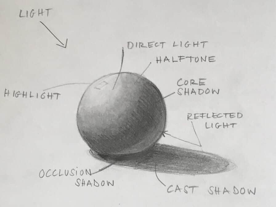
Shadows are a great way to show the form of your subject, they can help to make a sketch appear more three-dimensional. With light and shadow, you can shape and sculpt your drawing. So adding values (the degree of lightness or darkness of an object) is almost always a good idea. How do I add light and dark in my sketches, and how do I decide on a shadow color?
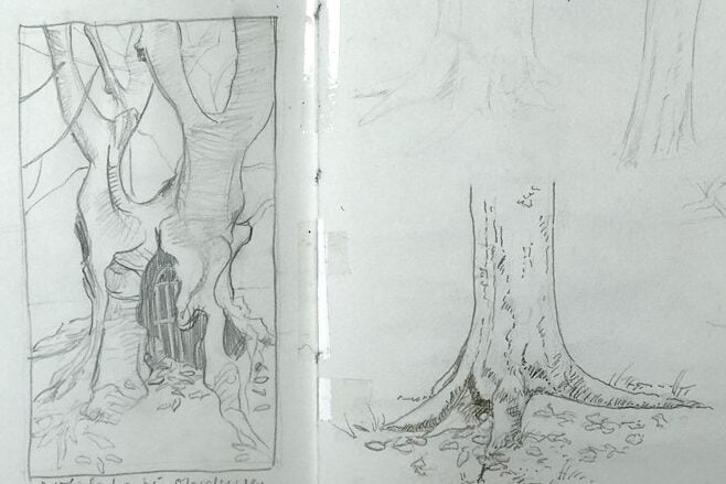
After getting your basic proportions, shapes and volumes right in a sketch, you can show that your subject occupies physical space by adding light and dark. There will always be a light source in any drawing, else it would be dark. Shadows, highlights and half-tones (middle values) can be an effective addition to your sketch.
First, a quick overview on understanding how light changes and models an object.
Understanding values, light and shadows
By adding values, you show where light falls on an object, and where it doesn’t. This might sound obvious, but the brain is really good at putting this together and deciding if the information you add makes sense. This is why carefully added and observed values make for a good drawing, and highlights and shadows without an understanding of how light interacts with your subject usually are less convincing.
You want each of your values to be distinct from each other. You can add different values to your drawing with a pencil (cross-hatching or scribbling darker areas), or you can use watercolor to add darker areas. Highlights are usually spots which are left blank in watercolor, since the paper is the lightest value you can achieve. Sometimes you need to go over an area you already painted. In that case, you can get very effective highlights with a white colored pencil, white ink or paint.
You can use lines and hatching to indicate the planes of your subject. I often like to add a few different values before I go over everything with paint, as I find both techniques go well together. It can be helpful to squint your eyes when you’re trying to get the value structure of a scene or subject sorted out. Value is not related to color, it’s strictly related to the light and dark areas of the scene.
Form and cast shadows
There are two different types of shadows: Form shadow and cast shadow. The shadow of form is found on the object itself, you add it so that you can sculpt the object and render it three dimensional. The cast shadow falls from the object onto the surrounding. It helps to place the object in the environment. A shadow, whether form shadow or cast shadow is never just a dark block. Since it’s connected to light, it will be darkest in one place and then fade from there, depending on the light. Soft light will produce soft shadows, strong light will produce harsh shadows. There is more to be mindful of when you add shadow, such as the amount of detail and texture, and concepts like reflected light and the position of the light source.
I explain the concept and practical aspects of sketching light and shadow and values in more detail in my course Sketching Fundamentals.
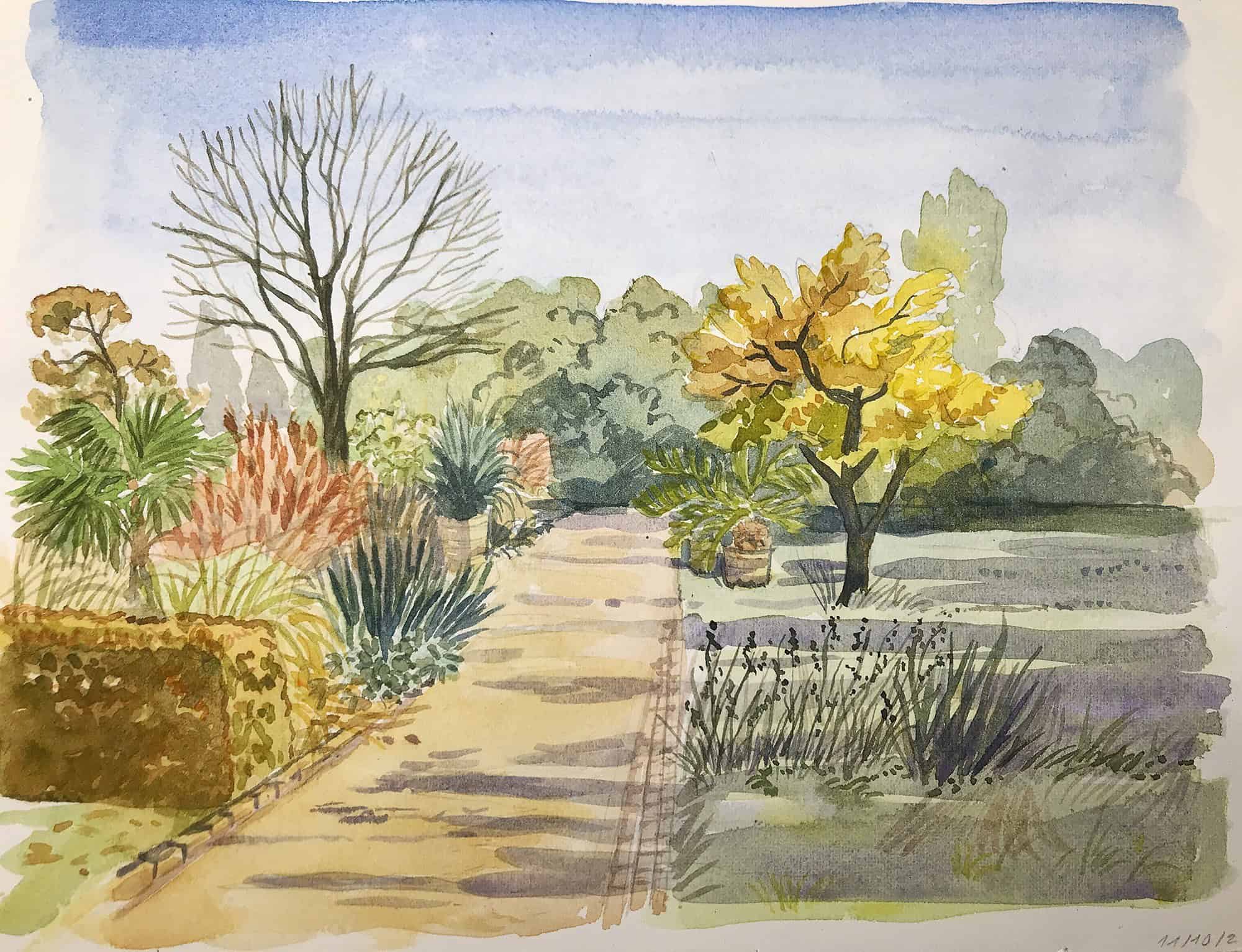
Showing light and shadow with watercolor
You can emphasize light and shadow beautifully with watercolor. I usually start with a basic pencil drawing, that makes it easier to add a shadow. For very quick sketches and light subjects, I often add the shadow color directly, this creates nice study pages that explore light and dark.
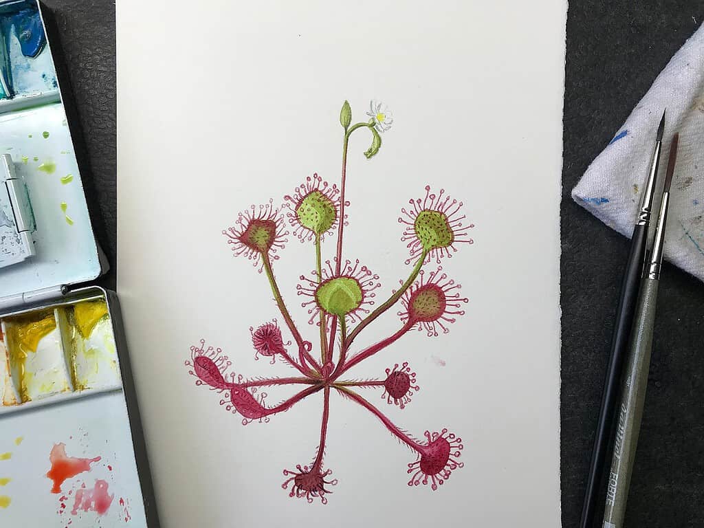
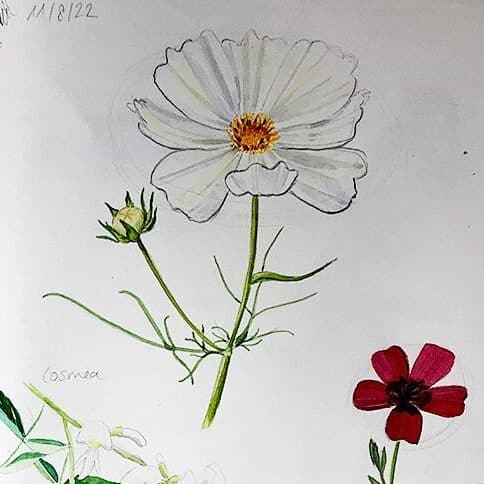
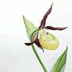
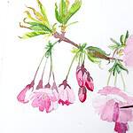
For detailed botanical sketches, I often lay in the base color, and then add a darker version of that color as a shadow (like a magenta and a darker purple, or a light blue and a darker blue). It’s worth noting that for some colors you can make unusual choices that make convincing shadow color. Yellow can often benefit from strong purples as a shadow color, instead of a dark orange or brown. If you’re not looking for realism, you can get away with a lot of interesting color choices for darker values, as we established adding a shadow is about the value (darkness, lightness) of a color, not its hue. It’s more important to have correct values than to have correct colors. Of course, well-chosen colors will make for a very pleasing sketch, and convincing colors will also make your sketch more readable for the human eye.
Should shadows be blue?
Shadows are often shown as blue or violet – where does that come from? On a sunny day, a cast shadow will typically appear blue because it gets blue light from the sky. Elements hit by direct sunlight will have a warm cast, and elements in shadow will appear bluer. When more clouds you have in the sky, your shadows get grayer.
Shadow color can pick up the reflected light from surrounding objects, so a shadow can be warm (brown, reddish, red violet) if it picks up reflected light from the ground, or from a warm object nearby. For most sketching activities, you don’t need these details, but it can be an interesting thing to notice.
On overcast days with diffused lighting, you will get very subtle, almost non-existent shadows, and they will be similar to the colors surrounding them, since there is no effect from warm sunlight or blue skylight. This is also the kind of lighting we use for scientific illustrations: you want to show form, but not distort the colors of your subject with warm or cool light sources.
So there’s no „right“ color for a shadow, it always depends on the light situation, the local color of your subject, and the surrounding elements and their color. Nevertheless, most of us will see and understand a blue or violet layer in a sketch as a shadow, since these colors are the most common associations for shadow colors. But don’t be afraid to experiment with shadow colors.

How do I choose shadow colors?
I choose shadow colors usually based on my palette. Either I choose a darker color in the same color family as the lighter hue (as described above), or I reach for a diluted blue or purple or violet, sometimes mixed with a bit or a neutralizer like Burnt Sienna.
Soft violets like Ultramarine violet or Cobalt Violet make beautiful shadow colors on their own or in mixes for very delicate subjects, like white flowers. I apply them in a very thin layer and sometimes add a second layer in areas that need to have a darker value.
Some artists also use pinks, greens or turquoise very successfully as shadow colors.
Why I don’t use black pigment for shadow areas
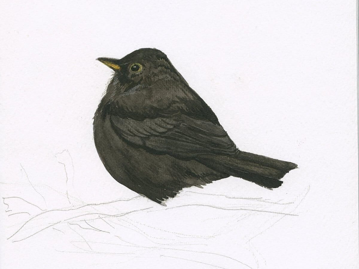
Shadows are dark, so why not use black? Black pigments can have the unwanted effect of flattening an area and killing the illusion of depth, and we need this to give our subject volume. Black in shadows will often look very unnatural and somehow “dead”, as if there’s no light at all in that spot. This is not what we want to achieve. I’m always very careful with adding black pigment into any of my mixes.
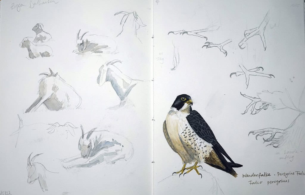
The only exception are truly black objects, that is, objects whose local color is black – dark beetles, birds or black berries. Even then I try to keep as much luminosity as I can in my painting, and often I have an underpainting of different colors. Sometimes black things in nature are iridescent, and it’s nice to show that by carefully adding black over the shimmering colors. With watercolors you have to be careful not to “paint away” the light and volume by adding too many dark areas.
Finding practical shortcuts
As watercolor sketchers, we need to find shortcuts for the complex light and color relationships that we see in nature, and very often this can be achieved by rendering a shadow with a violet or blue color. But if you like, also consider the actual color and light relationships, reflected light and sky color, and how that affects the shadow you’re painting. You can also experiment – turquoise (a blue green) or magenta (a cool red) can make for very interesting, unusual shadow colors. Give it a try.
For botanical studies or scientific illustration it’s best to keep the lighting neutral and not picture excessive shadows or unusual light situations, since it’s about showing the typical appearance of a plant or animal.
What are your favorite ways to add a shadow? What shadow colors do you like? Do you pay much attention to the value structure in your sketches? Do you paint with light colors and relationships in mind?

oh Julia. how nice of you to give this complimentary art lesson. And yes, we need to bring our art up a few notches with the simple addition of value. When I taught visual art value was always a given. I like your explanation of it making it very do-able. Thanx again!
Thank you Roksanna! Yes, value is often overlooked, but such a game changer.
yes, again ty for covering it.
Thanks so much for this very informative blog article ❣️
You’re welcome. 🙂
Hi Julia. I’m just starting out with sketching and your article is so helpful. Thank you
That’s wonderful to hear Melanie. Happy sketching!
this is very helpful to hear
I am learning so much, thank you
You’re welcome Katrina. 🙂
Hi Julia,
You have answered all my questions.
I am learning so much.
Thank you.
You’re welcome Anne! 🙂
Thank you again Julia for your helpful hints. I will certainly be applying this advice in my botanical sketching and watercolour painting journey.
Jennifer