You might be perfectly happy with the pre-made pan set that you got from the art store – and that’s perfectly fine. I was happy with my Winsor & Newton Cotman paint for many years, until it fell apart. However, if you want to tweak your palette a little bit, or start from scratch with better pigments, here are some aspects to think of when putting together your palette.
Setting up your palette
- You don’t need a lot of colors. At the end of the day, you will probably be happy with 12 to 18 colors in your palette. It’s better to know a few pigments well, than to have too many choices and ending up not knowing why you should pick one pigment over another. Think about the weight, too. It makes much more sense to bring a small palette if you want to take it with you.
- Get to know your paints and your painting habits first before you invest in new ones. Think about the subjects you paint most. There’s no point in getting 5 different pinks if you rarely paint pink flowers, dramatic skies, or a lot of skin tones. For natural subjects I’ve found that having several blues will always come in handy, and a selection of different Earth tones. I don’t use a lot of red or violet.
- Familiarize yourself with the characteristics of different pigments. They can have a similar color (hue), but look quite different on the page. Some are opaque, some are transparent. There are granulating pigments, staining pigments, and even slightly toxic pigments made from heavy metals. Depending on your needs and technique, inform yourself and choose what you will be needing most. I tend to prefer transparent pigments that don’t stain (or only moderately), are great for mixing and don’t granulate too much.
- Pre-made sets usually come in student quality, which has more filler and makes the paints slightly duller. Consider getting professional paint when you refill, even though these paints seem more expensive, they have a much better value – more pigment, brighter colors, and better mixing characteristics.
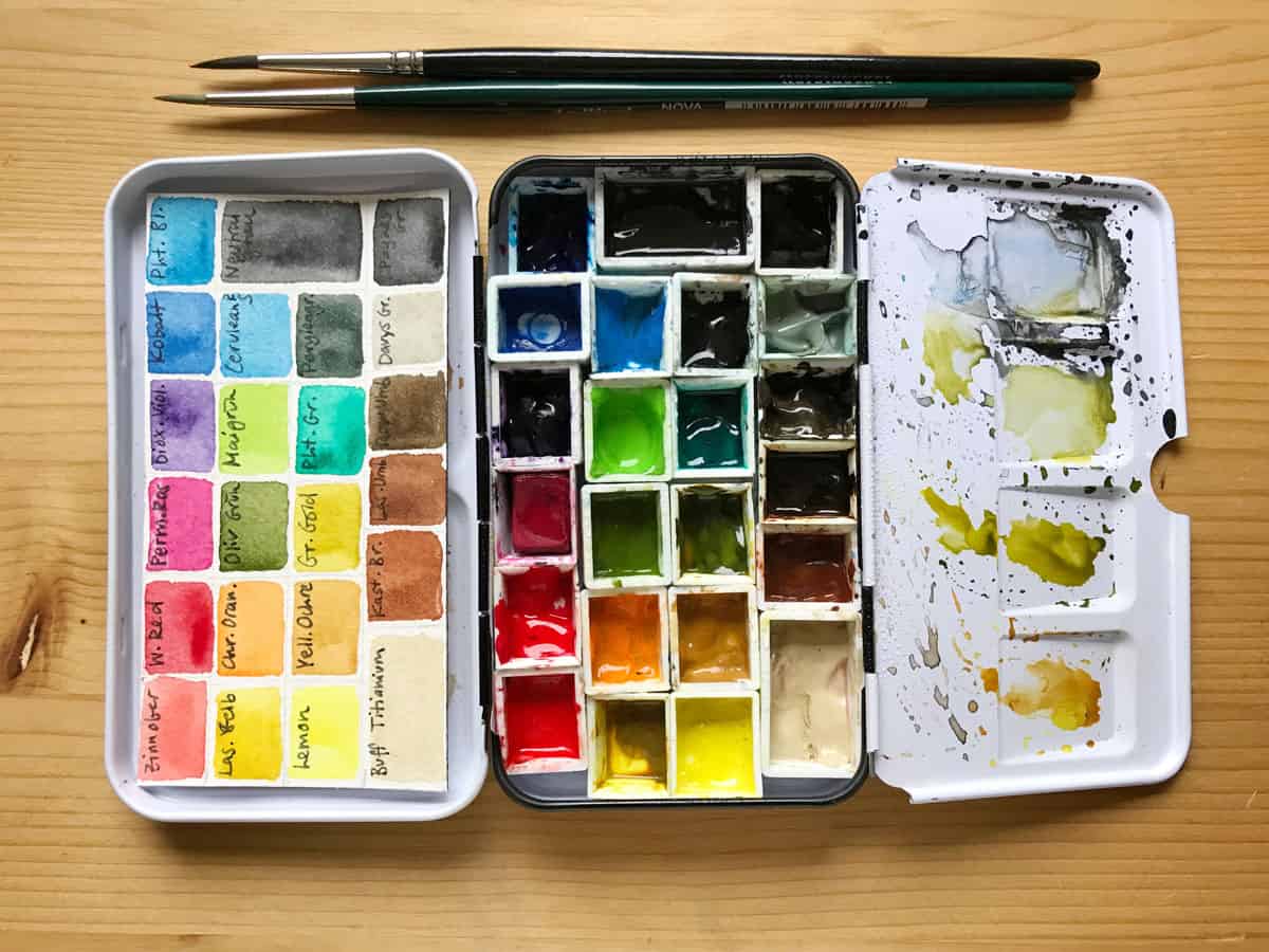
- Think about the layout of your paints in the palette. Group similar colors together. I like to arrange my colors from light to dark, going from yellow, red, blue over to green, to the earth tones and finally grey.
- A lot of pre-made sets have white and black. While I like to have white around (I bring a small set of gouache with white in it, or a gel pen) I don’t have a black in my palette – I find it a bit too strong and opaque for most natural subjects, and I can achieve the same value with a dark grey, or with a marker or pen.
- I really like filling small pan sets with tube color, it’s an economic and lightweight way to fill your palette. I take out the metal insert, fix the pans on the bottom with Blu Tack, and let the pans dry for at least a day after filling them with the slightly more moist tube paint. There are also nice plastic field kits by different manufacturers, or slightly bigger palettes with wells that you can squeeze the paint into directly – these have bigger mixing areas and are more suited to pick up paint with a big brush, but they also make your palette bigger. Try out what suits you best.
- Also think about how practical a particular palette will be when you take it with you outside. I really love mixing on ceramic plates, but I wouldn’t bring one with me in the field. Always consider weight, sturdiness, ease of use, and reusability when choosing a palette.
Using your palette and mixing tips:
- Make a small mixing chart with all your palette colors. You will be surprised how many different hues you can get out of a few basic colors, and learn a lot about mixing while you do it.
- For my more detailed illustrations done at my desk, I actually use my same small field kit, very rarely I reach for my bigger palette with the specialty colors. A small kit can give you a vast range of colors.
- I like to make a small color chart (pure colors, no mixes) and stick it into the palette, so that I have a reference, since a lot of paints look just dark when they’re dry. If you don’t change your palette often, you could paint it into your sketchbook.
- Keep your yellow clean. That’s really the most important rule. The other paints usually can take a bit of mud, but your yellow will not react well to it. Consider keeping a bit of yellow in your mixing area for mixes, and going to the pan only when you need pure yellow.
- It’s normal to switch out single colors from time to time, it’s what makes your palette unique and useful to your style of painting. It’s also fun to try out new paints from time to time. If you love to experiment with different pigments, it’s best to introduce them one at a time and spend a bit of time with each, so that you can get to know its characteristics.
- There are different philosophies out there about the amount of „mud“ your palette should have. I like to wipe my mixing area clean from time to time, so that I can paint with strong, bright colors and can choose how I mix them. But you can also get beautiful gray and brown hues from the dirt in your mixing area.
- As a beginner, all of the above might sound slightly confusing and overwhelming. It doesn’t have to be. Simply choose a nice pre-made pan set and make your first steps. You can always adapt and change it later. Have fun while you explore!
For a more detailed guide on how to set up your watercolor palette, take a look at my online class Setting up a custom sketching palette with watercolors.
What does your palette look like? Do you have more useful tips? I’d love to hear it in the comments!

Thanks for your useful tips. I did not realize that yellow needs to be kept clean. I will tuck that info into my mind. Have a great day.
Olá, Julia
Fiz seu curso na skillshare e adorei. Obrigada por isso.
Então estou aqui, seguindo sempre suas preciosas dicas. Obrigada por isso também.
Tenho algumas paletas (compradas) da W&N e no ano passado comprei uma confession.
Ainda tenho que praticar muito para aprender a controlar a água, mas um dia chego lá.
Parabéns por seu trabalho e obrigada por compartilhar com tanto carinho.
beijos
Pagu
Thank you Pagu, I don’t speak Spanish(?), but from what I was able to translate: thank you for your nice feedback! Have fun painting. 🙂
My palette is half pans, mostly Sennelier, and a few QOR that I’m trying. I also have a single WN pink (Opera Rose) that I love.
I love using pans. I generally have no problem mixing enough of a certain color for a painting because I love the subtle differences that occur when I change it up. Because I refill my pans with tubes, I always have enough paint available to me if I really need a large amount for a single smooth wash.
I had never thought to keep a bit of yellow aside for mixing. That is a great take-away!
Thanks so much, Becky
That sounds like a great setup, Becky, and it makes absolute sense. I’ve never painted with QOR (hard to get here), but I’ve heard good things about it. Thanks for sharing!
Very helpful Thanks
You’re welcome!