I recently got a small landscape-themed palette from Kremer Pigments and today I’m going to test it and paint a small landscape sketch with it.
Kremer is a family-owned German company for pigments, paints and all kinds of materials for the restoration of traditional artworks. They specialize in historical and rare pigments, like real lapislazuli, smalt blue, genuine alizarin crimson, or historic vermilion (included in the set I’ll show).
They have a big collection of historical paint recipes and a very impressive catalogue of pigments and tools you didn’t even know existed. I’ve had plans for a long time to visit their “color mill” (the building that houses their headquarters is an old grain mill) in Southern Germany, since they also offer workshops on how to make paint, but somehow my plans always fell through (pandemic, etc.) and now I just bought one of their beautiful small palettes with handmade watercolors.
Here’s an accompanying video with my painting process:
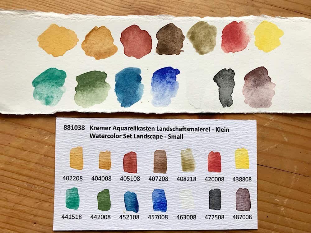
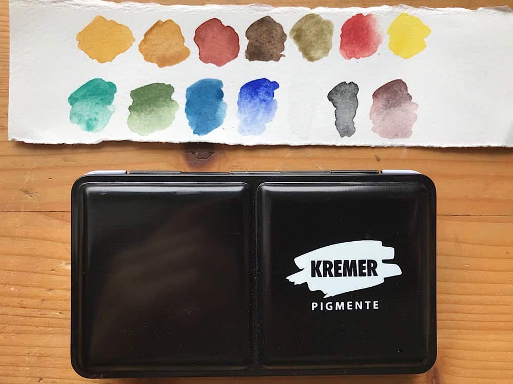
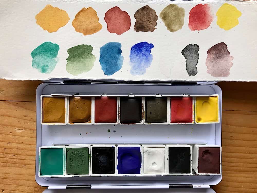
Their small landscape palette comes with 14 colors in half pans in a metal palette.
The Kremer watercolors handle a bit differently than your classic watercolor paint, Kremer states they’re all handmade, and made with gum arabic and honey and glycerin (as binder and humectant), and I assume the pigments are not as finely milled as some of the industrial grade pigments one is used to from other brands.
The paints feel a bit coarser on the brush and are slightly opaque – a bit like diluted gouache paint. They activate very easily, and after one painting session I can already see which paints I used – the coarser pigments seem to be used up more quickly.
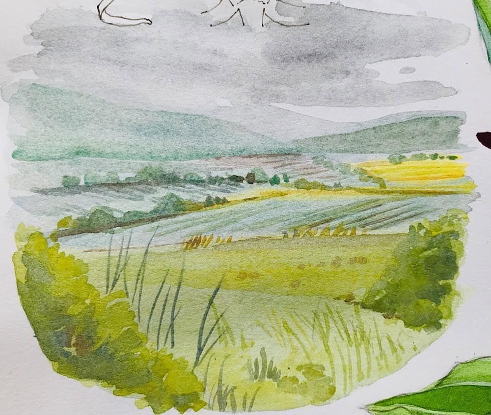
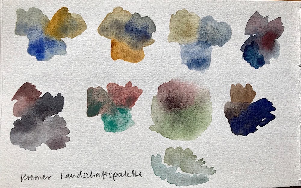
I chose a small landscape sketch (10x10cm) to try the paints out, and they produced a really interesting result. As with all new paints, it always takes a bit of time to get used to them. I had a bit of trouble with the first brush strokes to get subtle layers with not too much paint. The paints are really quite opaque if you don’t thin them enough. But I actually liked this effect for elements in the foreground. Brush strokes often felt a bit hard and dry, this might have to do with the coarser pigments or with the binder.
I found the palette choice for this landscape set really interesting:
- There are plenty of choises for yellows: two raw sienna/yellow ochre colors, and another light yellow with a pigment (PY159) that’s rarely used commercially.
- I could live without their choice to include a black and white pigment, but those seem to be added to each of these themed palettes (I’ve since then used the zinc white in mixes for a cloudscape and really loved the effect! I would still exchange the black.)
- One blue is a Prussian Blue (PB27, here called Paris Blue), which I usually don’t use because the pigment itself is not entirely lightfast (it will fade a bit in sunlight). But I think for sketchbook work it’ll be fine. An alternative for cool blue like Prussian Blue is Phthalo Blue.
- The Vermilion red they included is the genuine stuff: the historic PR106 pigment, which is mercury sulfide. This sounds potentially dangerous and poisonous, and indeed handprint.com states that this pigment is toxic, but I did a bit of research in my literature and found out that this is actually one of the few mercury compounds that’s not toxic. Wikipedia concurs. So since mercury II sulfide, the chemical compound that is cinnabar red, is highly inert and almost non-soluble in water, it should be safe to use and you won’t poison yourself when you paint with it. As long as you don’t heat it, it’s stable. I wouldn’t eat it or put it on my skin, but I don’t do this with cobalt or cadmium or nickel pigments either. However, you still might want to avoid this pigment, the tested vermilion on Handprint turned out not be be very lightfast and changed to a dull brown after a few weeks in direct sunlight. I’m currently running my own tests to see how the Kremer vermilion will hold up.
This sounds like a lot of criticism, but I actually like the palette. It is a bit unusual to paint with, but there are a few nice pigments in it.
- The dark cobalt blue is wonderful for skies, and together with the Caput Mortuum (a reddish brown) it will make granulation fans very happy. I don’t use granulating pigments often, but I still love seeing how they separate on paper. Great for skies and cloudscapes.
- I also like the choices for muted natural greens and browns (cobalt green, chrome oxide green, green earth), they are often hard to come by even in landscape sets and they give you options for very subtle greens. Brighter greens can be easily mixed with the vibrant blues and the intense yellow.
All in all, this is a well-balanced palette for landscapes and I’m sure I will paint more small sketches with it (except maybe with the Vermilion..). I did a few quick mixing experiments and I’m very positively surprised about the combinations.
I consider these paints as specialty paints, so I probably won’t use them every day, but rather reserve them for special occasions or experiments.
Here’s a full list of the pigments in the Kremer landscape palette (they list all the pigment numbers in their brochure and online):
- Italian Gold Ochre
- Raw Sienna
- Venetian Red
- Burnt Umber
- Green Earth
- Vermilion
- Intensive Yellow
- Cobalt Green Bluish
- Chrome Oxide Green
- Paris Blue
- Cobalt Blue Dark
- Zinc White
- Furnace Black
- Caput Mortuum Reddish
I got this from the Kremer Pigments online store, as far as I know they also have a US store, but I’m not sure if you can get their themed palettes there.
In any case, I think Kremer Pigmente is a unique company that shows how important it is to keep traditional and seemingly outdated techniques and products around – they’re still needed. Their products are used for art restoration, on old masterworks in museums, churches or castles, by traditional craftspeople like violin makers and also by contemporary artists. There’s much to learn from those traditional techniques and recipes, and I’m always excited when I receive Kremer’s new catalogue in the mail – even if I don’t order any pigments because I have no need for them. I’m still fascinated by the knowledge the Kremer family have preserved and made into usable paints and products. I sometimes dream that if they had a job opening, I would apply immediately.
Resources:
- Here’s a documentary (German, has english subtitles) about Kremer pigments that shows more about how paint is made at the color mill: https://www.youtube.com/watch?v=zzNIhHgGJQQ
- You can see a bit about how the paints are made in this english brochure (PDF).


Dear Julia,
You are so thoughtful to share your sketches and paintings.
I love your work in the field-birds and the beauty of the natural.
My aunt was an artist and she grew this interest in me. I am so grateful for it.
I appreciate your learning approach always even though you are an accomplished artist.
Thank you very much, Julia. Barbara Frickel Sarasota, Florida
Thank you so much for your kind words Barbara, I really appreciate them! 🙂
Dear Julia,
Thank you so much for doing this. As always, your video is lovely and informative. It is wonderful watching you paint in basically real time, listening to the decisions you make in color mixing, brush size and all the details I’m sure are second nature for you. It is encouraging to watch you trying things out. Thank you for generously sharing your thoughts. I, too, have often ogled the Kremer catalogue. Their speciality in producing pigments used in historical restoration and for various niches such as violin builders and icon painters is really fascinating. Please let us know if you test this set of paints for lightfastness or end up using any of them in your regular palette.
Best wishes,
Laura
Thank you Laura, much appreciated! The Kremer catalogue is so interesting, right? I too love what they do and the specific niche they fill.
I have had paint swatches for this palette in my window for ten days and the Prussian/Paris Blue begins to fade slightly (as expected, but still relatively quick), the other colors are unaffected so far.
You took the words right out of my mouth! This sort of video presentation is more helpful than demos that just whiz through, nary a negative word about anything. I personally would never purchase these paints, but it is interesting to have the detailed descriptions of how they work so that I can recognize similar characteristics in the paints that I do use. Thanks!
Thank you Sheila. I’m happy to hear my way of reviewing paints is helpful. 🙂
Hi Julia,
I found your Kremer video by chance…which is kind of funny since I worked for Kremer in the NYC store for 8 years and developed their watercolor line and medium (which used to have my name on it but of course no longer). They did not have watercolors previously. I developed the line (a full box then was $38 originally!).
Either They simply do not understand color or are saving $$ by putting a black & white in every box – probably both. They asked me to put a ‘landscape’ box together for them and I refused. I was right. They still have no clue how landscapes are painted.
As for chalkiness, I would say the WC paint used to be much more pigmented than most standard WC brands out there and require more water to achieve transparency. I’ve heard the paints have become chalkier more recently, which is sad, like the Cobalt blue pale I bought, (used to be gorgeous). You can find some of the original pigments at S. Fitzpatrick in London. Anyhoo my 2 cents for what its worth ☺️
Very interesting to hear, thank you for sharing and what an amazing job this must have been (at least in my imagination).
I would think they have many interesting pigments and colors for a landscape box in the Kremer catalogue, and each artist probably would choose slightly different ones, but yeah the black and white is a really weird choice. I briefly thought about putting together my own landscape set, but the price of the single pans put me off. Now I wonder who actually puts together these sets, and if they ask painters or sketchers for input from time to time about these things.
I guess a part of the chalkiness also comes from the pigments being a tiny bit coarser? Do they use different pigments now? I was able to get a lovely transparency when I added enough water, but the paint felt a bit gritty on the brush. That said some of the paints looks amazing in mixes, and I love the greens in this palette.