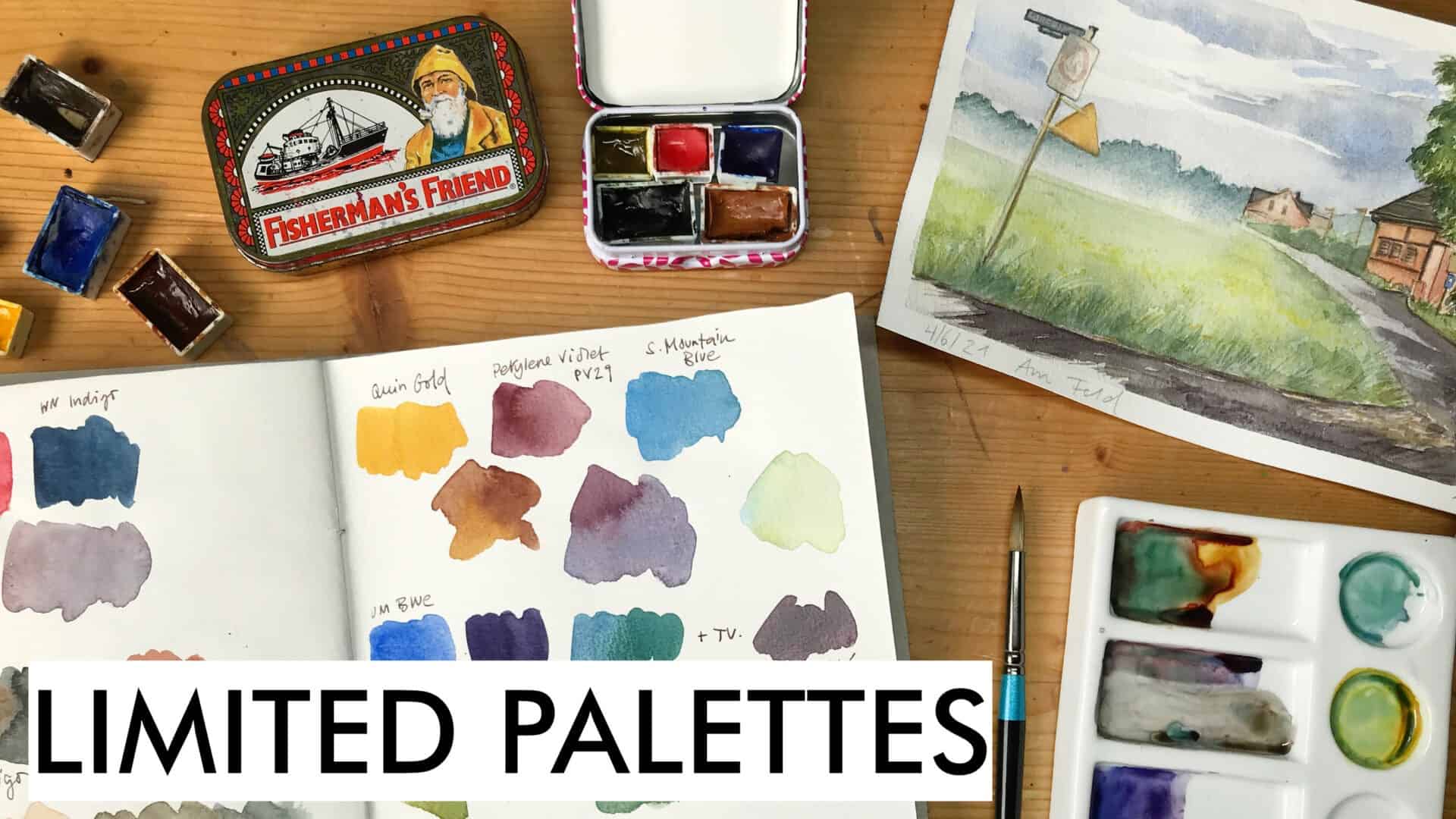
Last week I showed you how effective it can be to limit the colors on your palette for a sketch. I find it can be a good method to get better at mixing, and to really get to know your paints (or some colors that you have lying around that you don’t use enough…) As a side result, you will get more cohesive, harmonious sketches, and you won’t have to wonder which of your 5 blues to use (for example), because you might only have one. So you will learn something about the mixing properties of your colors, and ideally, learn more about color mixing itself. Which is a huge part of painting and sketching in color.
Let’s look at some options and how to put together a mini palette. Here’s a video version of this post:
Building a mini palette with limited colors | watercolor sketching
Small palette options
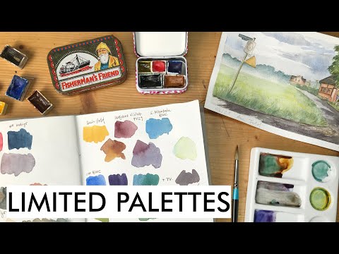
You can use any small palette you already have and remove some paints from it. Or you could use any small tin (there was a time when I only bought tins with mint or candy for the box, which is kind of stupid considering that I do definitely not need more tiny boxes and tins…or eat more candy) and modify it to suit your needs.
I like to fix my pans with Blu Tack, which is similar to putty or a kneaded eraser, it holds half and full pans quite well. There’s also magnetic tape that you can cut into pieces and use in any metal palette. Some artists have reported it gets rusty over time. I like to combine both methods, and haven’t seen any rust yet. The blu tack isn’t a pretty sight either after a while, so decide for yourself.
I usually have enough empty pans to fill tube watercolor into, you can get these in most art supply stores, usually at ridiculously high prices for these little plastic pieces. For “extra” colors that I don’t need so often and that I wanted to fit into my already overflowing palette, I’ve tried to make very small pans from polymer clay. The result is not very neat or pretty, but it works. If some of you have more ideas for creating custom size pans instead of buying more plastic stuff, let me know!
If you want a palette that looks more like a commercial palette, try out covering your metal candy boxes with enamel paint – I’m not good with spray paint, and prefer the kind that comes in small cans, but it’s usually also expensive and messy and stinky. But you can create a nice white mixing area in your tin, and if you give it a coat of black on the outside, it will look like a classic metal palette. I’m usually too impatient for these kind of neat DIY projects, so I look out for tins that have nice vintage logos on the top. A quick alternative mixing area would be to use a piece of tear-of palette that you fix in the lid of your palette.
Color choices for a limited palette
Now we come to the interesting part, what and how many colors should you include in your mini palette?
I usually like to have 4-6 colors in my limited palettes, but you can get very far with three colors only. You’ll just have to mix a lot. If you’ve followed my work for a while, you know that even my small field kit has around 18 colors, I’m a fan of having more colors to choose from so that I don’t have to mix all the time. But that’s not our goal here, for a mini palette we want to explore mixing.
Some go-to combinations to consider would be to include any kind of primary triad, so a red/magenta, blue and yellow, since these are the primary colors we need to consider when we’re mixing paint or other colorful materials (this is called subtractive color mixing).
Now, of course you could choose lemon yellow, magenta and a cyan (cool blue) to maximize your chance to be able to mix any color with very vivid results, but that wouldn’t be very exciting. In my standard palettes, I usually have all of these cool primaries, together with their warm counterparts (a warm yellow, a warm red and a warm blue like ultramarine), and with that combination, you can cover a lot of ground and mix almost every color. But that’s not what we’re going for here. You will want colors that mix well, but that might not be your standard choices.
I like to make sure that I can still get interesting neutrals (brown, grey) and some kind of greens (since I usually paint nature). Now that I think of it, I tend to use these limited palettes mostly for landscapes, not for my other nature sketching activities where I want a closer approximation of the actual color. Usually I start with a bright color (yellow, earth) and then add in a red and a blue to see if I can get a variety of interesting lighter hues, and a green. Depending on how these turn out, I may add another warm, reddish earth, or a cool blue. It can also be interesting to modify your blues with a cool green to get interesting hues for shadow greens. I try to mix at least one grey or brown tone from my small selection.
Another factor I try to think of when putting together colors is their properties – are they more transparent or more opaque? I won’t want a limited palette with opaque-only pigments, because that might give me more chalky, muddy mixes.
So start with the thought of yellow, red and blue and try out a few mixes and see what unusual combinations you’d like to explore. I my painting last week, I had put together this combination of a warm blue and red, a neutral yellow, and a cool green. Of course five colors will give you a wider palette than three.
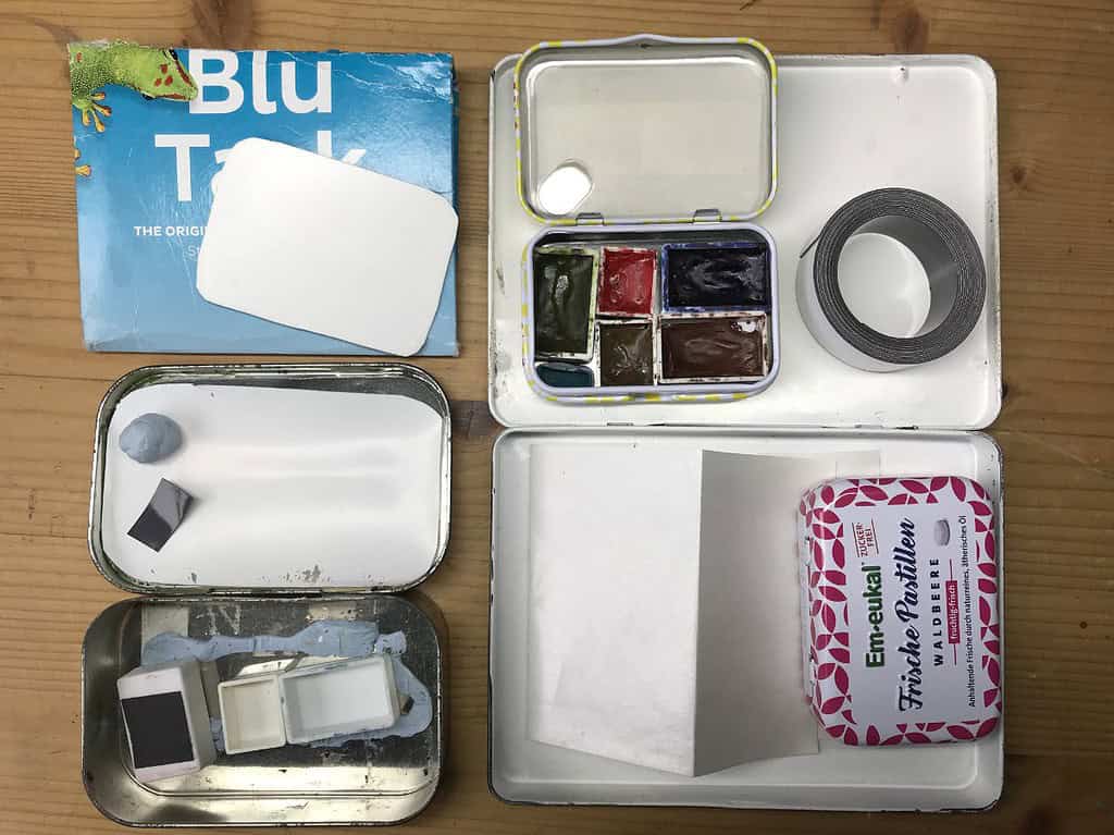
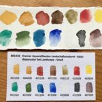
I’ve experimented a bit with my huge stash of watercolor paints that I don’t use daily, and I’ve come up with some interesting combinations. I’ve added pigment numbers and brands (S. = Schmincke, WN = Winsor&Newton, DR = Daler&Rowney).
Limited palette 1:
- S. Chrome Yellow dark (PY65)
- WN Quinacridone Red (PR209)
- WN Cobalt Blue (PB28)
- WN Cobalt Green (PG50)
- S. Mahagoni Brown (PBr33)
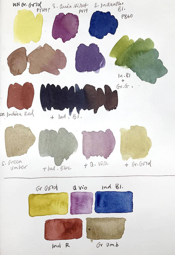
Limited palette 2:
- WN Green Gold (PY129)
- S. Quinacridone Violet (PV19)
- S. Indanthrene Blue (PB60)
- DR Indian Red (PR101)
- S. Green Umber (Pbr7)
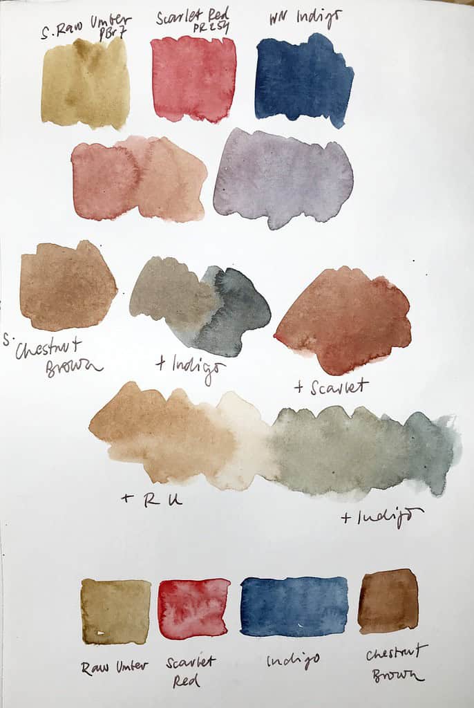
Limited palette 3:
- S. Raw Umber (PBr7)
- S. Scarlet Red (PR254)
- WN Indigo (PB15 PBk6 PV19)
- S. Maroon Brown (PBr7)
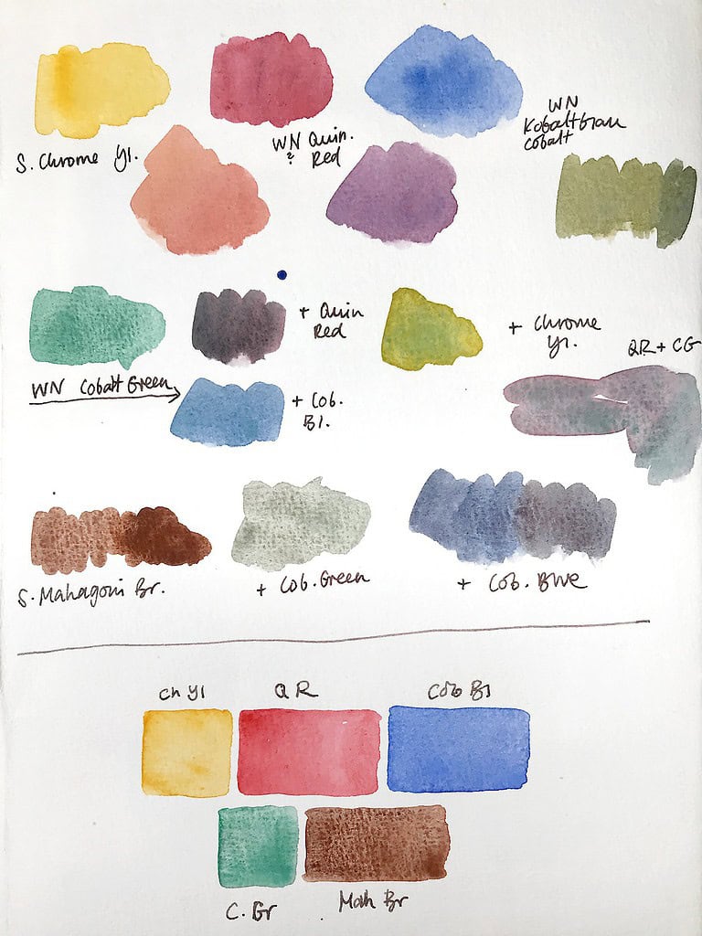
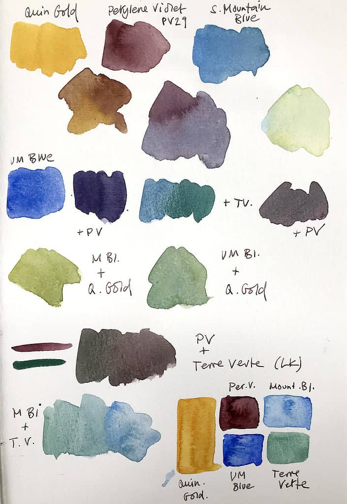
Limited palette 4:
- S. Quinacridone Gold (PY150 PR101)
- S. Perylene Violet (PV29)
- S. Mountain Blue (PW5 PB29 PG7)
- Ultramarine Blue (PB29)
- WN Terre Verte (PG23 PG18 PB28)
Limited palette 5:
Watch the video demo for this landscape sketch
- S. Transparent Yellow (PY150)
- S. Permanent Red (PR242 PO62)
- Ultramarine Blue (PB29)
- Perylene Green (PBk31)
- WN Brown Ochre (PBR7)
You can also decide to leave out one of your primaries to see what color spectrum and mood you can get with the remaining colors. I would consider this for very specific cases (special lighting, night scenes, etc.), not for a permanent palette.
Another idea would be to include colors that you haven’t used much for whatever reason or don’t like, in my case that would be pigments like Indanthrone blue (PB60, a beautiful hue, but too dark for what I usually do), quinacridone gold (a lot of sketchers love this color), or Indian red (PR101, I like it, but the one I have is so intensely opaque that it overpowers everything).
There’s usually a reason why we avoid certain pigments, and getting to know them better in a limited palette might change your view of them. For the record: I still don’t plan to use my Indian red a lot, but I appreciate the dark grey I can get out of it together with UM blue or (my other “unloved” color) Indanthrone blue – great for thundering skies. I’ve planned to put it into a mini landscape palette and use it more when the colors outside match the palette colors more – I’m thinking of rainy landscapes and autumn weather.
I hope this has been an interesting experiment for you. I definitely enjoyed combining some of the pigments I don’t typically use, and I’m planning to do actual sketches with these kind of small palettes more often.
What colors and pigments do you have laying around unexplored? Are there combinations you like but seldomly use? I love talking about mixing and colors, so let’s chat about this in the comments!

My palette hack is a little different but then lockdowns and shop closures will do that. I can’t afford a folio art toolkit palette…
One of my empty Derwent pencil tins (bought as empty steel one with hinged lid and removable tray) was converted pretty easily. Just needed a few things, and an hour or so in front of the TV.
A 100 pack of empty full sized paint pans, a couple of rubbish mail magnets advertising wierd stuff, and some 3M permanent double sided tape. Scissors too. I had all these already.
The Derwent pencil tin is magnetic. But check it with the junk magnets and use the strongest magnets you find.
Measure the base of your full paint pans then mark the top of the magnet which will easily cut with scissors. Peel off the printed junk ads, replace with a piece of tape, and attach empty paint pan.
Arrange as you like in your tin. Fill the pans after you work out your layouts! (Mine are maybe quarter full because I dry the paint angled. Protects my brush tips, plus I like to use half the full pan as a mixing tray, especially if I forget my Etchr travel pans and don’t feel confident mixing on the paper…)
I like the removable tray with 23 full pans and room for my travel brush and stumpy pencil. The bottom is left for pencils, eraser and water syringe. You could leave some paint pans or take more, add a sponge or cloth, add more brushes or any other art stuff. It’s very flexible.
This keeps all my stuff together so I don’t leave it behind. A rubber band or even a plastic bag tightly wrapped will ensure nothing falls out/leaks if that’s your concern. I’ve had neither happen yet!
If I stay home I just add my old ceramic mixing (dinner) plate. It works for me!
Happy hacking your art gear!
Blu Tack was used to set BJD doll’s eyes, but now many collectors use clear silicone ear plugs. I think the same ear plugs would work for holding the paint pans.
Very interesting!
Hello Julia,
I fund this post, when I was looking for inspiration to build a field sketching watercolor palette.
I have my plastic paint pans for “ages” (some for over 40 years still from my father and still like new), so I’ve personally never tried the following: I would try to reuse the metal from tubes like paint (if the metal piece is big enough), mustard, tomato concentrate etc. This metal is quite flexible, coated on the inside, and should be easy to bend or fold into suitable forms. Be careful not to bend too sharp edges or too often, because then the metal could break. Cut metal edges are also very sharp and could damage brushes or cut your fingers, so I would sand the edges. A few art suppliers even offer metal pans, but these are bigger than the normal full size plastic pans.
If round shapes are not an exclusion criterion, you could also look out for (screw) caps, metal or plastic, or any other small and suitable form and reuse them as paint pans …
Regarding your experiments with polymer clay, I’m not quite sure, if this is a plastic free alternative. As far as I know, plastics are comprised of a long chain of polymers or are a specific type of polymer. Air drying or oven drying clays are modified with or build up completely from polymers to let them harden at room or oven temperature. So I don’t believe they are plastic free, even if they bear “clay” in their label. I think the label “clay” refers more to the handling than the ingredients. (I’m sorry …)
I wish you lots of good ideas and successful experiments!