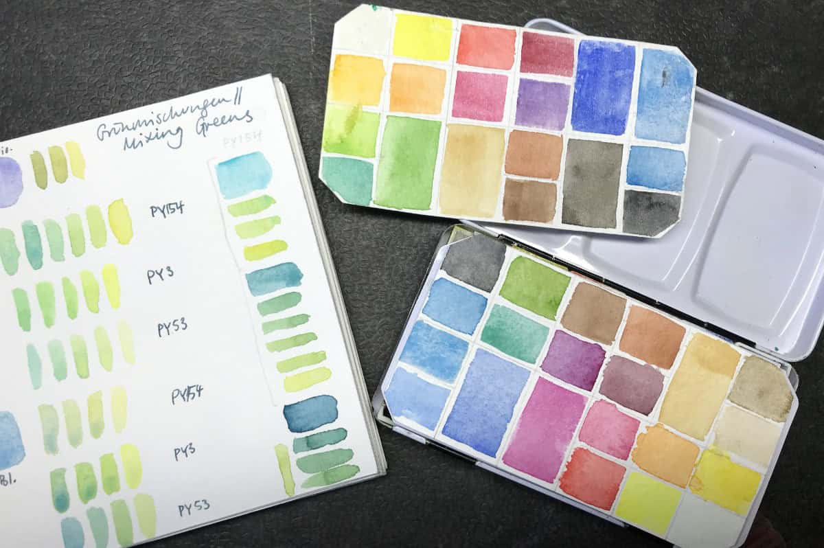
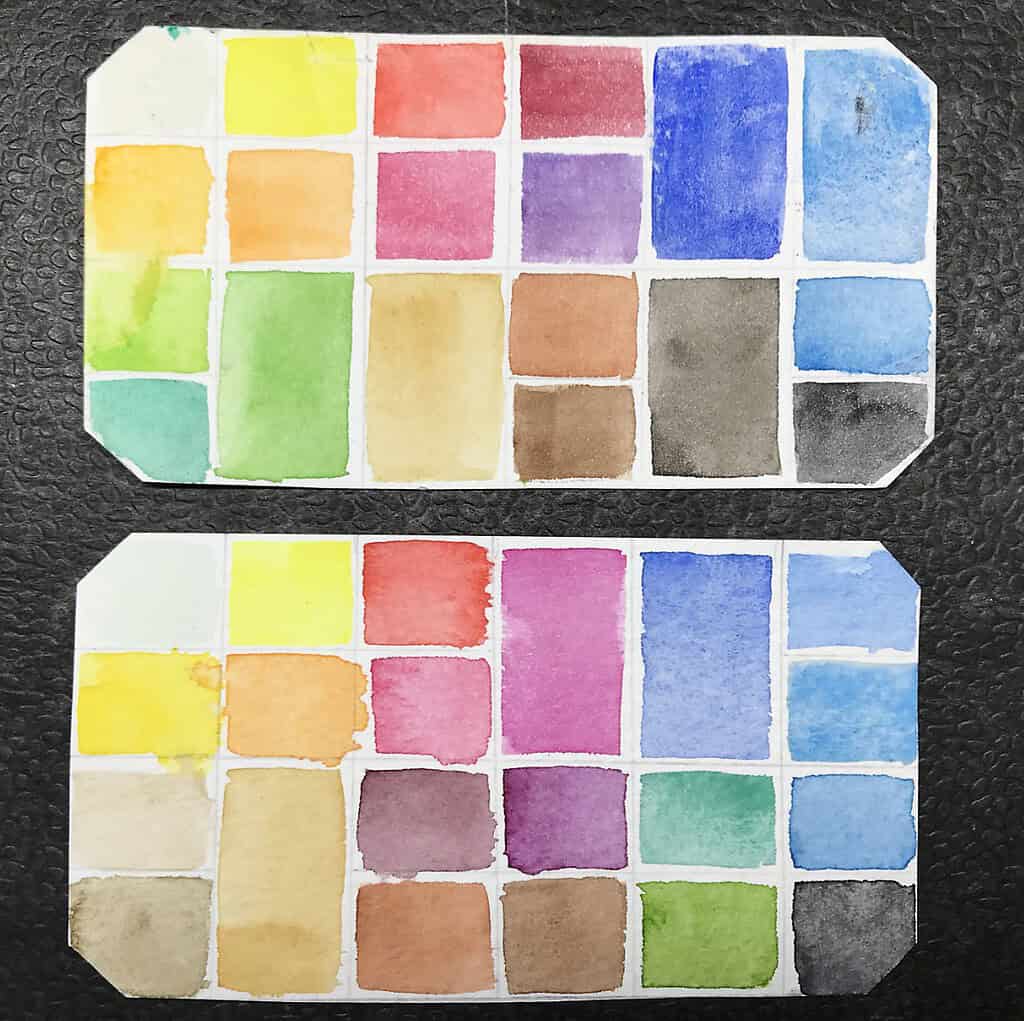
Over the years I have been asked repeatedly if I use different palette colors in different seasons. Usually my answer was no, because I very rarely change the “classic” color on my small palette, and this is a field kit that already has quite the large number of colors (right now: 20).
But this year has brought a few seasonal palette changes in my field sketching palette, that I assume I will partially change again in the fall. I’ve already mentioned this in my orchid sketching video, I felt that my palette was lacking good pigment choices for the very intense purples and magentas that so many wild orchids come in. I noticed this when I was mixing these colors in the field, it took longer than I liked and I didn’t get the bright colors I was looking for (although it is definitely possible with lots of clear water I should say). So as a shortcut, and a means to be able to produce these clear, intense magenta and purple colors of the orchids a lot easier, I put three(!) new red/purple pigments into my palette. I usually don’t use a lot of reds, so this is new for me.
New red and purple pigments:
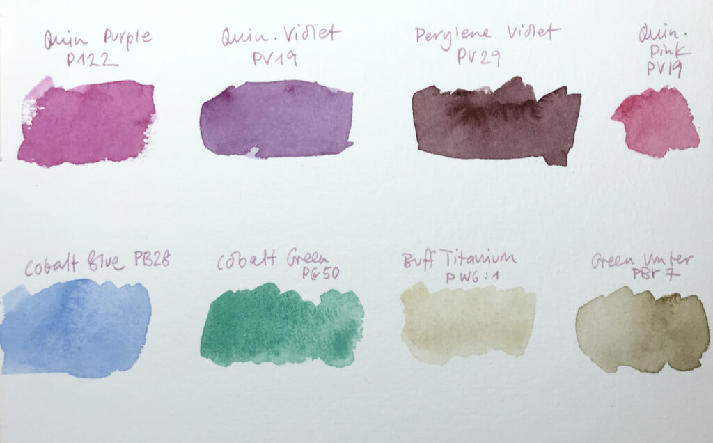
- Quinacridone Magenta (PR122, Schmincke confusingly calls this “Purple Magenta” and has another “Quin. Magenta” hue available) – this is essentially your basic magenta colour, it’s also great for mixing.
- Quinacridone Violet (PV19, called “Permanent Magenta” from Winsor & Newton), a red violet that’s a bit darker than the Q. Magenta
- Perylene Violet (PV29), a dark warm brown violet, similar to wine red, a great shadow color that can be found on the stem of a lot of flowers, including lots of local orchids.
Together with the light Quinacridone Red/Pink (PV19, depending on the brand you will encounter naming differences here too, WN calls it Permanent Rose, Schmincke named it Ruby Red I think) I now have a good selection of lightfast, brilliant pigments that cover all shades of pinks, purples and magentas. And together with my blues, I can also mix a large variety of violets, although I still have to experiment with that. I could probably have managed without the Perylene violet, because it can be mixed from any of the other purples plus a bit of burnt umber, but I figured since I have it in my drawers, why not explore it. It’s a beautiful pigment.
None of these will give you the exact intense magentas that a lot of red flowers have, but I want to use lightfast pigments, so colors like Opera Rose with its fluorescent fading pigment mix is out of the question for me.
All of these are colors that I usually don’t use that often because I’m not a dedicated botanical painter, so I’m not sure what these pigments will be useful for in other subjects.
New blue and green pigments:
- Cobalt blue (PB 28). I find that I really like it for mixing light subtle greens, where it can replace some of the very artificial-looking pre-mixed greens (more on that below). It’s also a wonderful sky blue, so all in all a very useful pigment.
- Cobalt Green (WN, PB 50). I wanted to bring in an entirely new green choice – a very blue green, hopefully useful for landscapes and for mixing cool greens. I’ve never used this pigment much before, so I’m curious to see if it will be useful for me.
New earth tones in my palette:
- Green umber (a variant of raw umber from Schmincke), a light neutral earth tone. I know I like this color for landscapes and for birds and dried seed pods, but I’m not sure how useful it is in summer
- Buff titanium (Daniel Smith), another useful color for many birds.
Colors that I’ve removed from the field kit for now are:
- Dioxazine Violet
- Permanent Alizarin Crimson
- Sepia
- May Green
- Phthalo Green
The dioxazine violet (a blue violet) was a great mixer and will likely return in the fall, but it overpowered all my mixed violets because it’s staining and intense.
The cool red is a traditional palette color and very useful for all kinds of mixes, including landscapes and skies, I guess I can replace it as needed with the quin. magenta or a mix of magenta and vermilion. We’ll see.
The sepia has been a shortcut vice of mine and can easily be replaced by mixing burnt umber and a bit of phthalo blue.
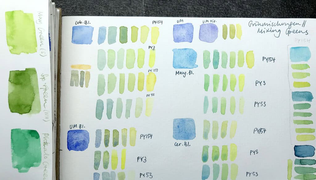
May green and phthalo green were part of the rather huge group of convenience and mixing greens that I carried around. I’m trying to be less dependent on this pre-mixed greens, in comparison with the beautiful mixed greens they don’t stand a chance. May green especially was a color that I used a lot in spring – it looks very much like the fresh green foliage in April and May, but it’s also really garish and artificial. Phthalo green is a pigment that works well in mixes, but I actually didn’t use it a lot. I’ve replaced those two with WN Cobalt Green, which I also expect to use mostly in mixes. I’m curious to see how useful it will be.
Colors that I’m thinking of removing:
- Sap green
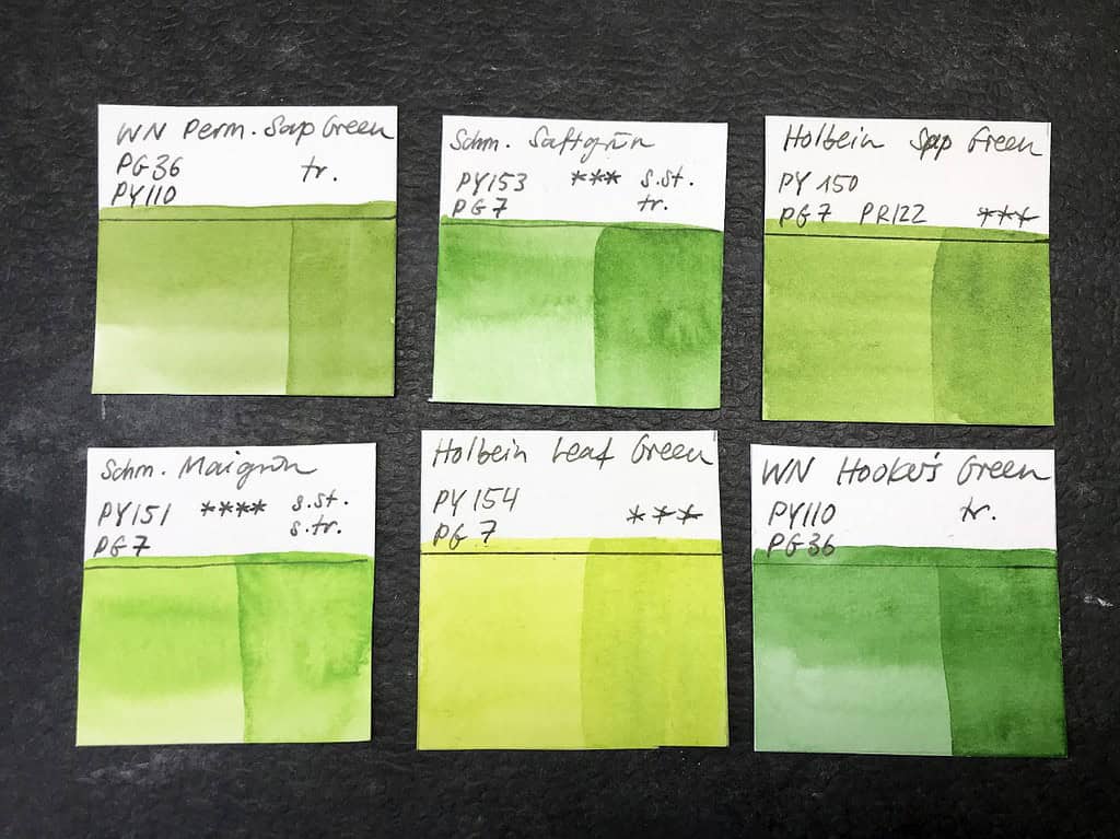
I’ve finally discovered how easy it is to mix your own greens, and how much more natural these greens are. I know, I know. I was always a bit hesitant and didn’t really want to spend a lot of time to mix greens from scratch, but it is definitely so much easier and gives much better results – realistic, muted, but lively greens, dark or light, all depending on what you want and need. This is something every botanical painter will hit you on the head with until it has sunk in: don’t use pre-made greens, but mix your own.
Sap green is the last convenience green in my palette, and I’m eyeing it suspiciously. I don’t really want to use this green right now, but I’m still a bit unsure if I can manage to do quick landscape sketches when I need to mix greens all the time. I’m also not sure if I can keep my blues and yellows clean enough for relaxed field sketching. This particular sap green (from Winsor & Newton) is the least artificial looking one I have (the neon brightness of the Schmincke or Holbein sap greens will take you back to the 90s). What do you think, should I just throw it out or will it come in handy?
Of course I knew in theory that you can get very nice greens from your blues and yellows, but somehow I thought I needed those convenience greens as a quick mixing help. There are few things that I like less than having to stand around and mix endlessly when I’m out sketching. But…it probably takes the same amount of time to mix a green from scratch as it does when you modify your garish sap green to something you can actually use. It will be interesting if I will want to keep this technique for my landscape sketching, too, and I guess it will be interesting to see if the colors in my sketches change because of this. I know I have relied a lot on these pre-mixed greens before.
All in all, I’m realizing that I’ve almost thrown out half my previous palette colors, and somehow I added more colors than I removed (due to full pans being exchanged for half pans). I’ve already noticed that right now it makes a lot of sense to have all these different magenta and violet pigments, and I’m looking forward to explore more natural greens.
Do your change your pigments based on seasons? What are your current green watercolor choices? Do you use convenience greens?


Thanks for the update. I am also concerned about colors fading and am careful to select lightfast pigments. I was on vacation and trying to sketch some very bright deep pink flowers and the paints I had in sketch kit were too red. I’ll look into the colors you are using
Yes, unfortunately some reds and pinks have lightfastness issues. When in doubt, I always select the lightfast colors over the really bright ones, even if they don’t exactly match the flower’s color/hue.
In my botanical field paintings I use Daniel Smith’s chromium green oxide, which seems like the most natural green than many others. It can be mixed with other colors to give a nice desert green. It’s an opaque, nonstaining color, so I’m not sure it would work for spring greens, but it’s a fabulous go-to green for summer foliage when working in the field. Here is a comment made about chromium green oxide: “Chromium Oxide Green can be found in nature as Eskolaite, named after the Finnish geologist Pentti Eskola. An uncanny feature of this rare mineral is the way its metallic vitreous green surface has a camouflaging moss-like appearance in the natural world. “
That is so interesting, thank you for sharing Rosemarie! I didn’t know where the name of the mineral came from. I haven’t tried this particular pigment yet, it sounds like it’s a great choice for blue-leaning greens and muted mixes.
Since I paint a lot of plant life of the high desert, which is a sort of bluish-gray-green, it took me years to find the right green. The chromium green oxide was found accidentally in an order from an art supplier who had put the “wrong” green into my watercolor order, and I’ve been using it ever since. With various mixes it turns into a nice desert green, and used pure it’s a handy color on a summer palette. It might serve your purpose for an overall summer green if you can deal with the opaque nature of it.
Lucky accidental mistake! 🙂
Thanks for sharing this, Rosemarie.
You are welcome. Hope it works for you also Nancy.
Thank you as always, Julia, for such an informative post.
Good morning, Julia – I am new to watercolour painting and am trying desperately to put together a palette of my own. Would you kindly list the colours you have chosen for your new seasonal palette, including brand name? I think this would work for me here in New England as i live in a lakes and mountains area with plenty of lovely forests filled with birds and wildlife. Thank you so much for all the information and paintings you share – they are inspiring and galvanising.
Dear Karen, my previous palette with a description of all pigments can be found here:
https://juliabausenhardt.com/my-updated-sketching-palette-in-2021/
Just compare the two posts to see what I’ve exchanged and what would make sense for you. I hope you can put together a fitting “New England palette” for yourself this way, your surroundings sound very lovely!
Thank you for replying, Julia. I had done that, but i was uncertain that i had things right. This is how i annotated your palette:
Top Row
SCH Tit White Gouache
SCH Lemon Yellow
SCH Vermilion
SCH Quin Purple (?) full pan
SCH Fr UltBlue or PhBlue or Cobalt Blue
1/2 pan of a pale blue – don’t know which
Second Row
SCH Chromium Yellow Hue Deep
SCh Chromium Orange Hue
Sch Quin Pink
SCH Fr UltBlue or PhBlue or Cobalt Blue
1/2 pan of granulating blue – WN Cerulean?
Third Row
DS Buff Titanium
SCH Yellow Ochre (?) full pan
SCH Perylene Violet
SCH Quin Violet
WN Cobalt Green
1/2 pan medium clear blue – don’t know which
Fourth Row
SCH Green Umber
SCH Yellow Ochre (?) full pan
SCH Burnt Sienna (?)
SCH Burnt Umber (?)
WN Sap Green
SCH Paynes Gray (or Neutral Gray)
If you could correct me where i’m wrong, i’d be very grateful. I’d attach a photo of your palette with my annotations, but i don’t believe your comments permit attachments. Thank you again.
That sounds about right, although you do not need all of these colors or the exact same colors for a good, working palette. Just make sure you have a cool and warm version of the primaries (yellow, red/pink, blue), a few earth colors, and any specialty colors you might want (greens, extra dark, additional blue, etc.). I was really happy with the palette I used before this one (linked in my last comment), except for the missing pinks/purples that I just added for the orchids this summer. You won’t need those if you don’t plan to do a lot of pink botanical sketches. Very likely whatever you will put together will be fine and very usable, even if it doesn’t exactly match the colors I showed here or if you use different pigments or brands. Happy painting!
Thank you, Julia – we have a marvellous bog near us that is filled with late spring and early summer orchids, so your pinks and purples are important to me (plus i just love them). I enjoyed your post re CYM colours as primaries and re-read the HandPrint articles re same. Much to learn, both from others and personal experience, and i believe your palette is an ideal starting point for the development of my own since our flora and fauna seem very similar to your own, and that’s where my interest lies vis a vis subjects. Best regards.
Oh, that sounds wonderful, what a coincidence – the palette will be really a good fit then! I hope you will see (and sketch) many orchids.