After last week’s International Nature Journaling week is over now, it’s time for me to recollect. I’ve seen so many amazing journal pages – learning about nature and how other people use their journals always brings something new to my own sketchbook. There were so many cool ideas that people integrated in their pages, and Bethan presented such an abundance of cool things to try out and read through on the website!
I’ve seen so many ideas and sketches that I’m almost a bit out of energy right now. I’ve definitely filled up my creative inventory in the last week, and saw and sketched a lot. I’m looking forward to integrate some of the new ideas I saw into my day-to-day sketching!
To keep the momentum going in these moments when I feel a bit out of energy, I tend to turn towards a single topic or medium I can dive into. Often it’s a single tool (like how many different textures can I get out of a pencil), and very often it’s color.
So today I want to share a few ideas on how to explore color in your sketchbook. Collecting harmonic color schemes can be a simple warmup exercise, but I also like to refer back to them when I want to add color to a sketch without having the reference nearby.
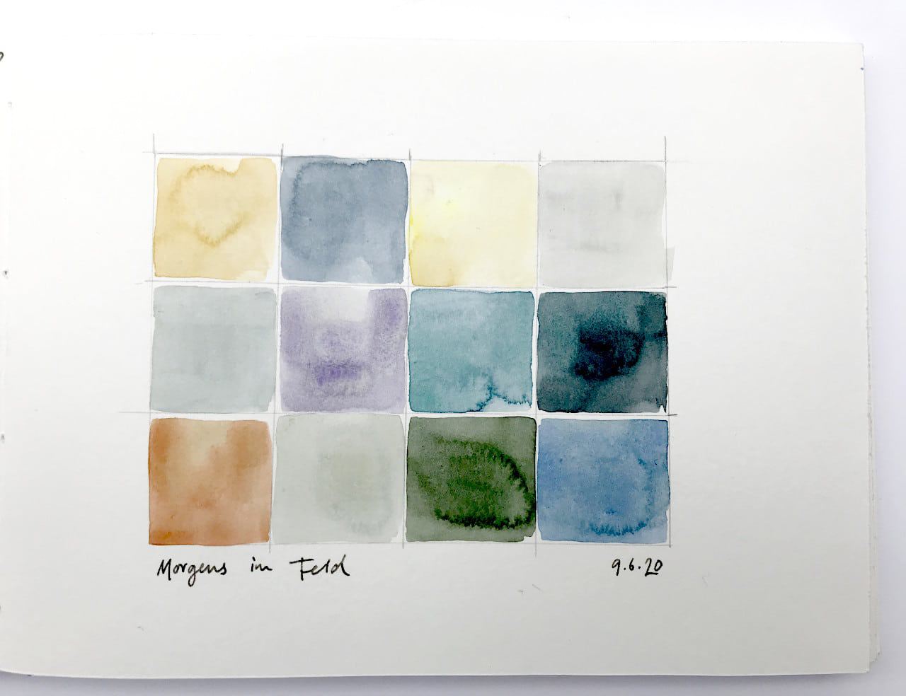
I often start or end a sketching session by just painting a few blobs or strips of different colors that I see – this could be called the local colors of the scene. I like seeing the colors of different seasons when I look at my sketchbook later. Just painting these blobs without noting the source can be interesting, as it activates the imagination – did I see this blue in the sky or the hills? Where exactly was I standing when I painted this?
And sometimes I like to add what the color stands for – this turns the page into small colorful nature impressions. This approach is also great if you want to explore mixing – my favorites for these pages are always slightly granulating pigments, or soft, muted colors. You can get a wonderful variety of greys and browns from ultramarine blue and any red brown (burnt siena, burnt umber, Indian red, caput mortum, etc.). Earth yellow and blue is also an interesting combination for green and grey tones.
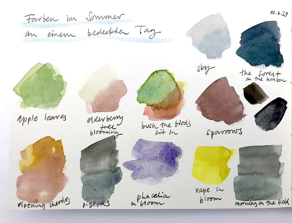
Today was an overcast day that calmed the harsh summer tones that I usually see right now – all the bright greens are dialed back a bit. I played around with a lot of muted, soft colors – mixing in Buff Titanium always gives nice results. The only things that’s as intense as always is the rapeseed in full bloom, and the soft violet phacelia flowers around the fields.
Another method to play around with colors is to try out harmonious color schemes without sampling them directly from nature, maybe for a particular mood you want to convey in your sketch. I often do this with landscapes. You don’t always have to stay true to the exact colors you see in a scene – remember that a lot depends on lighting and sun. If you want to paint a scene in a certain mood, and already have the color scheme for it in your sketchbook, it’ll be much easier – the color harmony you already have can serve as a point of orientation. It’s actually amazing with what kind of color changes you can get away when you’re painting – getting the underlying values (the light and dark areas) right is much more important for a sketch to read well, so you can definitely take a bit of liberty with color.
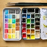
What I find important about all this is that you can go a long way with a small palette. So you don’t have to run and buy new paint to explore new combinations. As I’m working my way through my existing paint supplies this year, I’m discovering more and more that I enjoy working with less specialty colors, and I tend towards of the “classic” palette colors – they’re the classics for a reason, because they combine very well to produce a useful range of mixed colors.
So this is how I spend my rainy days – collecting energy, ideas and color schemes. What’s your favorite mix right now, and what favorites are in your palette?

I love your idea of painting the colors you see around you as an exercise. I love nature journaling for the discovery but I use my journal to improve my painting skills and try different watercolor techniques. To add your suggested activity would further enhance my “seeing” ability as well as allow me to improve my paint mixing skills. Thanks for the suggestion!
Excellent article!! I love your idea about placing the colors on your page, I keep forgetting to do that, I wonder how I can make myself remember to do it. Yes, classic colors!! You are so right! I have switched to 12 classics a while ago and I never had the desire to try new colors.