Color theory can appear difficult as there is no absolute rule for identifying a color as either warm and cool – color and temperature perception is something individual. Yet warm-cool relationships are essential to our visual system – our eyes use change in color temperature to help us understand objects in space. And there are actually a few principles that can be put into a working, practical color theory.
These general ideas can be helpful to differentiate between warm and cool colors – and this in turn can make your sketches a lot better. Not only because they seem more realistic and similar to the effects we observe in the real world, but you can also express a certain mood and atmosphere through color. So learning about color theory can be very helpful for your art practice.
Here’s a video version of this post:

How to tell apart warm and cool colors | Color theory tips (video)
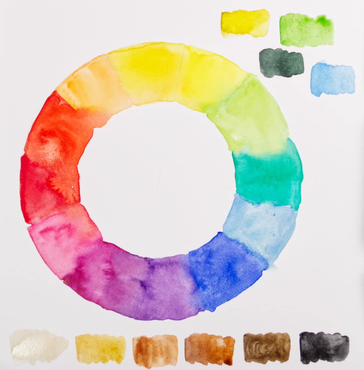
It’s often not so easy to tell the difference between warm and cool for a single color, or where to put it on the spectrum. That’s because color temperature is more or less “measured” against another color, and it’s not an exact process. A color can appear cool or warm depending on where it’s located in a painting. Nevertheless, there are some rules, and when you’re in doubt, it’s always helpful to turn to the color wheel.
The main rule is that for us, colors in the orange, red and yellow spectrum appear warm, and blues appear cool. For purples and greens it’s not that easy to say, because they’re between these two poles. It always depends on the exact hue as we will see.
There are different hues in every single color family, and even though yellows are considered a warm color, there can be such a thing as a cool yellow. If you take a look on the color wheel, you’ll find yellows that lean more towards green (and if you continue, towards blue), these are considered cool yellows. Yellows leaning towards orange and red are warm. There can be hues that don’t lean towards any color, these can be considered primary or mid. The same applies for the other color families.
Oranges are always warm, but when they are reduced in chroma (intensity), they appear more neutral, like Burnt Sienna and other Earth tones. These colors can be placed more towards the middle of the color wheel, towards grey and black tones where the intensity diminishes.
Reds are overall a warm color, but within that color family you can have cool reds (leaning towards purple and blue) or warm reds (leaning towards orange and yellow).
Purples are considered neither cool or warm overall, it depends on the hue: a blueish purple is cool, a reddish purple warm. If in doubt, check the tendency of the color on the color wheel.
Blues are overall considered a cool color, but there are blues that lean towards purple or red – those are considered warm. Blues leaning towards green are considered cool. There are mid or primary blues like cobalt blue.
Greens are, like purples, hard to put into an overall category. There are cool greens with blue in them, and warm greens (leaning toward yellow and orange).
If you reduce the intensity (chroma) of any color you will enter the territory of the different grey hues. Greys can be considered warm if the contain more yellow/orange, and cool if they have more blue.
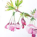
You can do simple mixing experiments on your own to see how you can change a cool color into a warm color, or how you can modify a primary color to appear cooler or warmer. This is very helpful if you need a particular color for a certain effect in your sketch, like a cool blueish green for a faraway hill, or a cool shadow in a sunlit scene.
I cover all of these principles in more detail in the video above, and also show helpful tips on how to place colors in the spectrum and on the color wheel.