
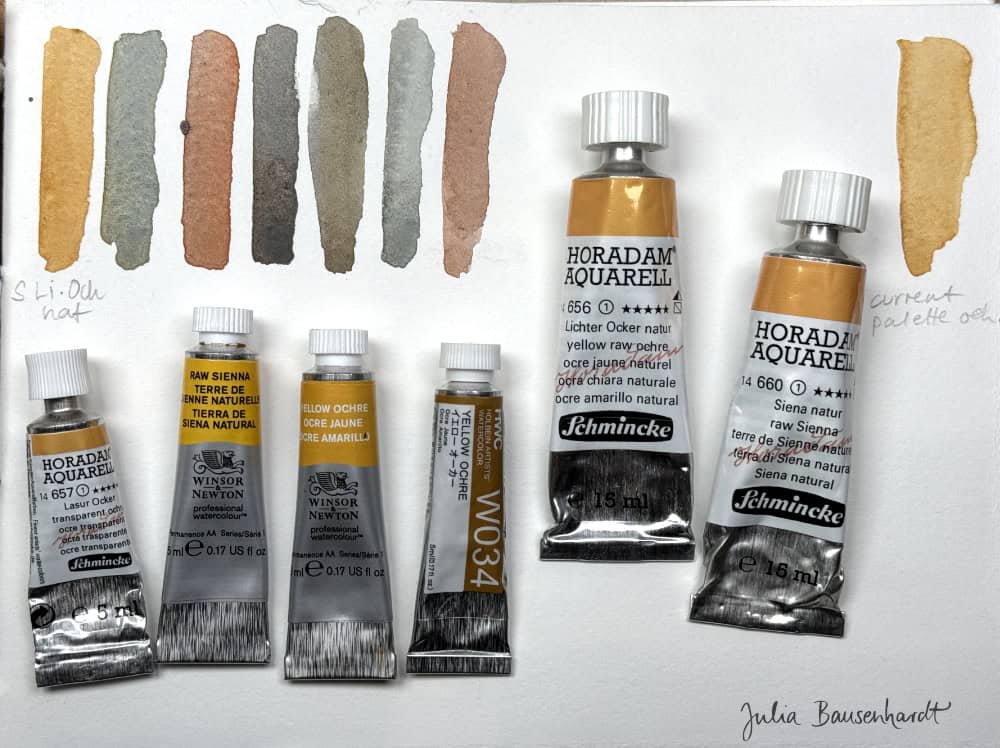
I want to look at one of the most useful pigments for landscape sketching today, and that’s Yellow Ochre and Raw Sienna. Wait, you’ll say, these are two pigments..and that’s right…or actually not entirely, since these are really similar pigments. I want to explore these two beautiful variants of the same pigment a bit more today.
Raw Sienna and Yellow Ochre are very similar, in that they come from the same kind of mineral, basically interestingly colored rocks that exist in many places on Earth, Sienna in Italy being one of the main sources for this pigments during the Renaissance. Ochre has a moderately dull yellow color, and is an excellent addition for a landscape painting palette. Ochre pigments have played a role in art, pottery and human cosmetics for thousands of years.

(Aurochs, horses and deer paintings from 22,000 years ago in the Lascaux cave, France, photo by EU/CC3.0)
Earth pigments are basically crushed rocks, specifically clay earth rocks. They contain iron oxides and clay and sand. Iron oxides can come in many colors (yellow, orange, red, brown, black). Today, mostly synthetic iron oxides are used (even if paint companies claim otherwise), manufactured in a process similar to the natural processes that created the different kinds of stone found in nature. In practice, this doesn’t really make a difference.
But there can still be variants to the individual paints from different brands, and this is what might be more interesting to us painters.

Recently I’ve been trying out and comparing different earth pigments, in particular variants of yellow ochre and raw sienna (PY42 or PY43 or PBr7 or mixtures thereof), and also different red earth pigments similar to burnt sienna. Today I want to focus on raw sienna and yellow ochre.
I was mainly interested to see how the pigments compare across brands, and if I can be persuaded to switch from my current yellow earth color of choice. I’d love to tell you which one it is exactly, but for a while I have been refilling my large pan of ochre with whatever was at hand, so I haven’t been paying close attention and the paint has mixed into an interesting mass that has several geological layers at this point. I’ve recently discovered a bit of transparent ochre that I used a lot in 2019 at the bottom of the pan.
But I’m pretty confident the largest part of my yellow earth pan is either Schmincke Raw Sienna or Yellow Raw Ochre – yeah, most of the paint companies have several almost identical earth colors and a weird naming system, which doesn’t make it easier to keep track. In part I embarked on the color tests to see if it wouldn’t pay off to consciously decide on one pigment/paint and use that.
Spoiler: it doesn’t really matter that much, most of the pigments are very similar and you will be fine with either version. So you can essentially stop reading now, plop any version of yellow earth you have into your palette and call it a day. Or maybe it doesn’t hurt to be aware of possible differences, and I have too much time on my hands, and it’s just fun to take pigments for a test drive. Here we go.

Pigments for light earth pigments
The pigments that are typically used for light/yellow earth pigments are PBr7, PY42 and PY43. PBr stands for Pigment Brown, PY stands for Pigment Yellow. The only difference between these are the means of production: PBr7 and PY43 means that natural iron oxide clays are used, PY42 means that synthetic iron oxide powders were used. It doesn’t make a difference in painting, the chemical process is the same. In the section on earth colors on handprint.com you can even find a note that the natural iron oxides are actually made from the same synthetic sources these days, so for practical reasons I would not put too much weight onto the difference between these two pigments, and natural or synthetic. It just sounds more romantic and sustainable and pure if you can put „natural“ onto the paint label.
All of these the iron oxide pigments have excellent lightfastness, they are non-toxic and safe to use.
But there can still be differences between paints using the same pigment, or combination of both pigment variants, and between paint manufacturers, which is why I do all this color testing. The color, transparency, staining and granulation of paints made from the same pigment (or paints with the same name) can be different across brands. The paints will very likely have brand-specific formulations, the milling and binder is different, and so on. Some have granulation, some don’t. Usually earth colors within one brand should be well-balanced and play well with each other. I’ve used mostly Schmincke earth pigments for a few years, and lately I’ve explored Winsor earth pigments a bit more, and I’ve used combinations of both, with a little Holbein paint mixed in – this has always worked quite well for me.
By the way, to learn more about the difference between paint/color names and pigments, go to this post:
An introduction to watercolor pigments – things you need to know about colors and pigments
Comparisons and my choices for light earth
What I wanted to know is what yellow/light earth I prefer for my every day painting and mixing, especially landscape painting. Typical uses of raw sienna/yellow ochre would be dried grasses, fields, sandstone, architecture (especially sunlit parts), or anything that’s white and needs a golden cast, like the golden yellow parts of skies.
For this I painted lots of small test strips, exploring the different scenarios.
I like to create a flexible neutral from yellow ochre/raw sienna with vermilion and cobalt blue. Again, I painted some swatches to test how easily I could mix the colors I prefer and use often.


What I found from my limited tests:
- Raw sienna is more transparent, but it’s also more yellow than the ochres I have available. I prefer the look of yellow ochre on its own and also in mixtures, it’s slightly more neutral or red-leaning, which creates slightly more balanced mixes.
- The Holbein yellow ochre is quite yellow, and rather opaque, it almost handles like gouache paint. I didn’t really enjoy mixing with it, but maybe I had a bad day with my sensory motor skills and just needed to add more water. Will need to assess this again.
- All of these decisions are of course dependent on the type of subjects and color palette you prefer.
- I find the naming systems and amount of earth pigments across brands very confusing. There’s usually an eye-watering variety of different gold ochres, light ochres, raw golden siennas, natural light siennas and so on that is a bit overwhelming. Usually you can just stick to the standard stuff (“yellow ochre”) and that’ll be a decent choice. But I like that you can choose between opaque or transparent pigments if you need to. I know I liked the transparent earth variants better for botanical and wildlife illustration when I did a lot of them.
Painting skies with earth yellows
Also important for landscape painting is how a yellow earth mixes with blue. When painting skies that have a gradient from yellow to blue, you don’t want to risk getting green where the two pigments meet. I usually work around that by leaving a bit of transparency in that zone, but why not make life a bit easier by choosing a pigment that doesn’t tend to turn green that quickly.
I’ve found the slightly more red variants of yellow ochre more suited for this task, whereas raw sienna often created a slight green cast when it touches blue.

I very much enjoyed Winsor Yellow Ochre, Schmincke Yellow Ochre, Schmincke Yellow Raw Ochre (the name?!), so I will explore these pigments a bit more.
To be completely honest, the differences between all of these pigments is so minimal, and will probably not be visible in everyday painting. It’s more about getting to know your palette well, and knowing how you can mix pigments for the effect you want. This will usually come with practice, not with a new pigment.
Here are more test strips with much more diluted pigments, exploring how you can create different materials and moods. These kind of tests are much more useful than simple swatches because they’re closer to the challenges you encounter in everyday painting. I really enjoy these experiments!



This is so interesting and useful – thank you!
Thank you Tina!
Thank you!
:)
Thank you Julia. More awareness about color helpful for me, especially when it comes in bite-size pieces like this
I’m glad to hear this is helpful Pam!
Thank you for explaining this all to me in a way that is understandable! I am one who tends to stress out over choosing colors for my palette. I forget to make what I already have work and learn how to use them. One color that seems to be “required” in the yellows is Quin gold. I really don’t use it that much but feel so guilty! For most mixing power I’ve been using DS Monte Amiata and Azo Yellow. I am wanting to use more single pigment, transparent colors (not sure if these are) so that I don’t make muddy mixes unintentionally. I guess the most important thing is to get to know the colors on my palette and make them work for what I want.
Hi Betty, thanks that’s good to hear. Don’t stress too much about palettes, try to enjoy the painting process with what you have. I know it can be so hard to decide, and somehow this process is never-ending!
I have never used Quin Gold much either, I find I don’t really gravitate towards the color. But I appreciate that some painters love it (and create beautiful work with it), and it is a great mixer. Like you I just don’t have a real use for it. There are so many beautiful dark warm yellows and oranges to choose from, Azo Yellow and DSMA are lovely choices. Exactly, I think getting to know your palette and knowing how you can get the results you want from it is so useful and will make painting more enjoyable.
This was interesting, a helpful reminder and some nostalgic color theory. We should be encouraged to do color tests and explore, it’s like an art therapy for the brain too.
Thank you.
I made my own pigments from rocks I collected in Idaho last summer. This is very helpful
Ohh that sounds very exciting, I’ll have to try that at some point. Thank you for sharing Sharon!
This is fascinating! I have not done any tests like these but I’ve wondered about these same questions. Thank you SO much for sharing your explorations with us!
I’m glad to hear this is helpful Mary. :)
I was lucky enough to find a chunk of yellow earth (raw sienna) after my neighbor ploughed his field and it is one of my favorite colors in my palette. I don’t know why, it’s just so easy on the eyes. Mulling paints from local sources has a high happiness rating. I love seeing all the other choices you presented. I will experiment with what I have to see how it works for skies especially.
Thanks for this exploration.
When I started learning watercolor from your classes a couple of years ago, I really took to heart your advice to start with cool and warm versions of the primary colors, plus a couple of neutrals and a Payne’s Gray. Since then I’ve only added a few others, most recently a yellow ochre. So far, these have allowed me to mix most of the colors I want (not always successfully!). My biggest problem is not mixing enough of a color, and not being able to reproduce it exactly when I need more.
I know that problem, it gets a bit easier if I reach for the same mixes and color combinations more often (and take notes), or when I embrace the fact that color will vary anyway and doesn’t need to be exactly the same all over the subject and I can allow or even use slight variations to show light and shadow, volume, atmosphere.
Your palette sounds well-balanced, hope you can make good use of that yellow ochre.
Thank you Julia! I’m going to try this too! I love making color swatching from mixing colors. The swatches are very useful and makes for easier choices when painting. Yellow Ochre is one of my favorites! Also, enjoyed your tutorial during Sketchbook Revival Week 2026!
Thank you so much Tamra! I also find color swatching very relaxing to do. Happy swatching. :)
Hello Julia! As always, such an interesting post. When I began painting with water colour, the artist instructor provided us with a palette that included DaVinci yellow ochre and raw sienna. To this day, I’ve enjoyed the DV versions of those pigments. I’ve also been given/used some W&N which are also fine, but as you observed, not hugely different in the way they work. Awhile back ‘everyone’ was raving about DS Monte Amiata and Transparent versions of the Earth pigments but somehow I managed to resist the FOMO (…too busy buying other colours ). I agree with your conclusion: dipping my brushes into the paints and making art with them, that needs to be my focus! (And at the same time one can also marvel and learn what the pigments and mixtures can do).
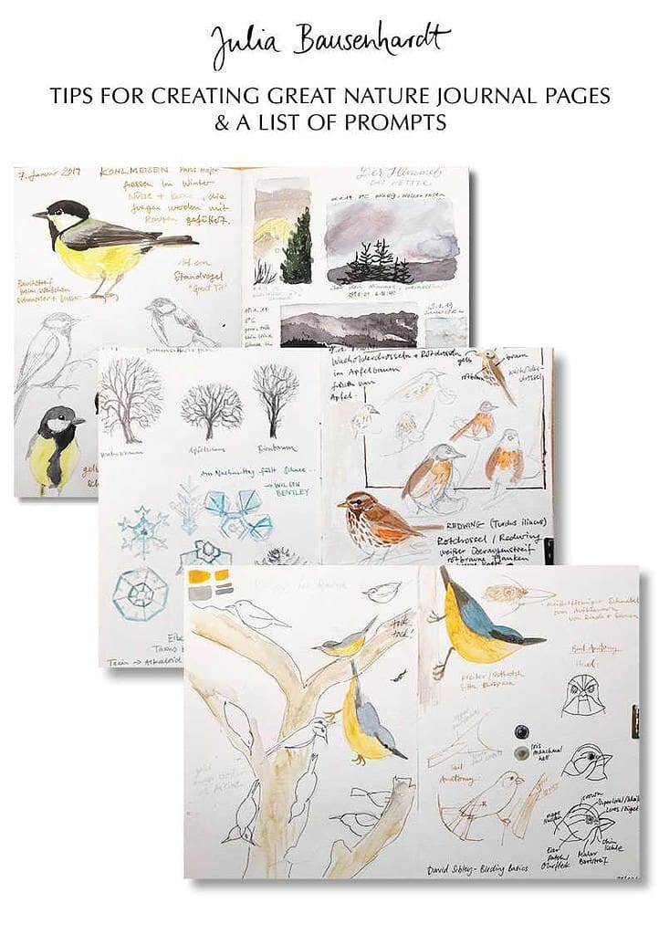
BTW Was it on purpose -or serendipitous- that your wc sketch of the buildings is right beside the little wren -beautifully painted in various earth colours- in the margin?
Thank you Jenneke! Haha I’ve also waited out that Monte Amiata hype, mainly because DS paints are crazy expensive here and I just can’t justify buying them. And what you said: there are so many other beautiful colors one can buy, and more sketches to be finished..
Good catch with the wren, it always turns up in the margin at some point. I think I used my transparent ochre for that little guy.
Great timing on this article, Julia.
This past week, I pulled out all of my yellow oches, and raw siennas from various makers because I had to chose between raw sienna and yellow ochre for a minimal palette.
I really appreciate you sharing the color swatching that you did… that was particularly helpful to me.
Vielen Dank. Nora
Thank you Nora! I guess it’s that time of the year where we all set up our minimal palettes and need to make choices on what pigments to include. Always a challenge. Glad to hear that this was helpful timing for you!