From time to time I like to try out new paints to see if they fit my way of working. Receiving and trying out new paint is always exciting, even if it’s not strictly necessary.
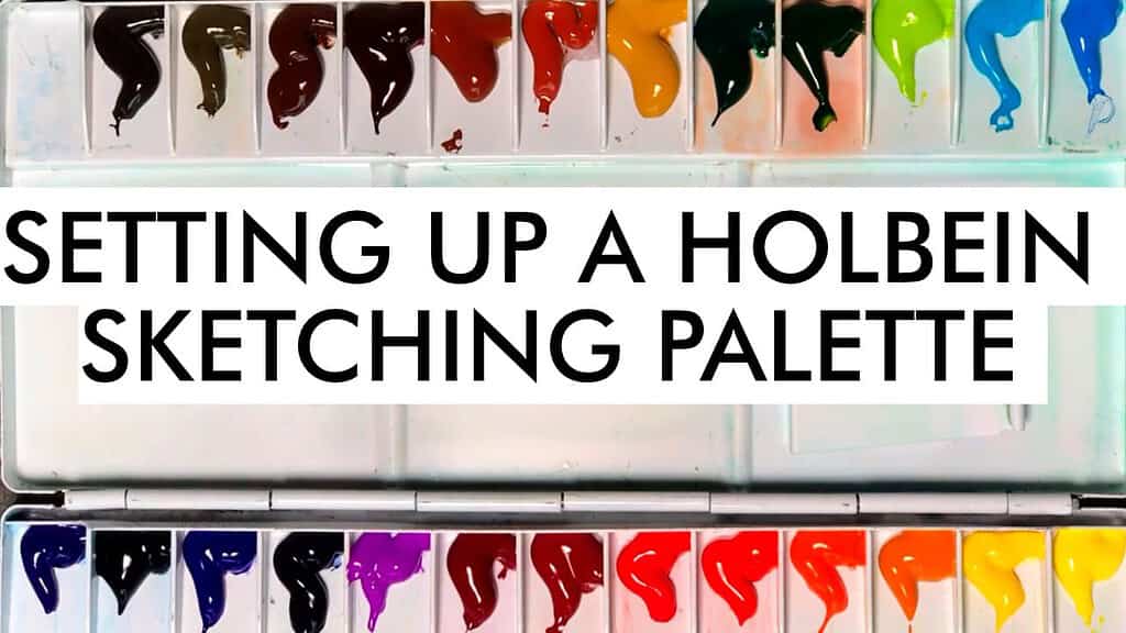
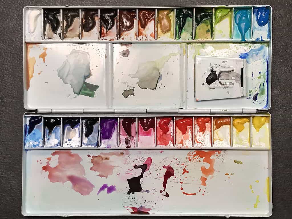
I’ve been interested in Holbein watercolor paints for a while, since they’re often described as very transparent, very even paints, similar to the Schmincke brand that I use most frequently. I still had a metal palette around (it says Holbein on the lid, but I think it’s a fake one since it was very inexpensive), and figured this would be a great little project to put together: building a sketching palette with around 25 colors (plus white), with Holbein paints in a metal palette that looks similar to the Holbein palettes out there.
Here’s the video version of this post:
Setting up a sketching palette with Holbein watercolor (video)
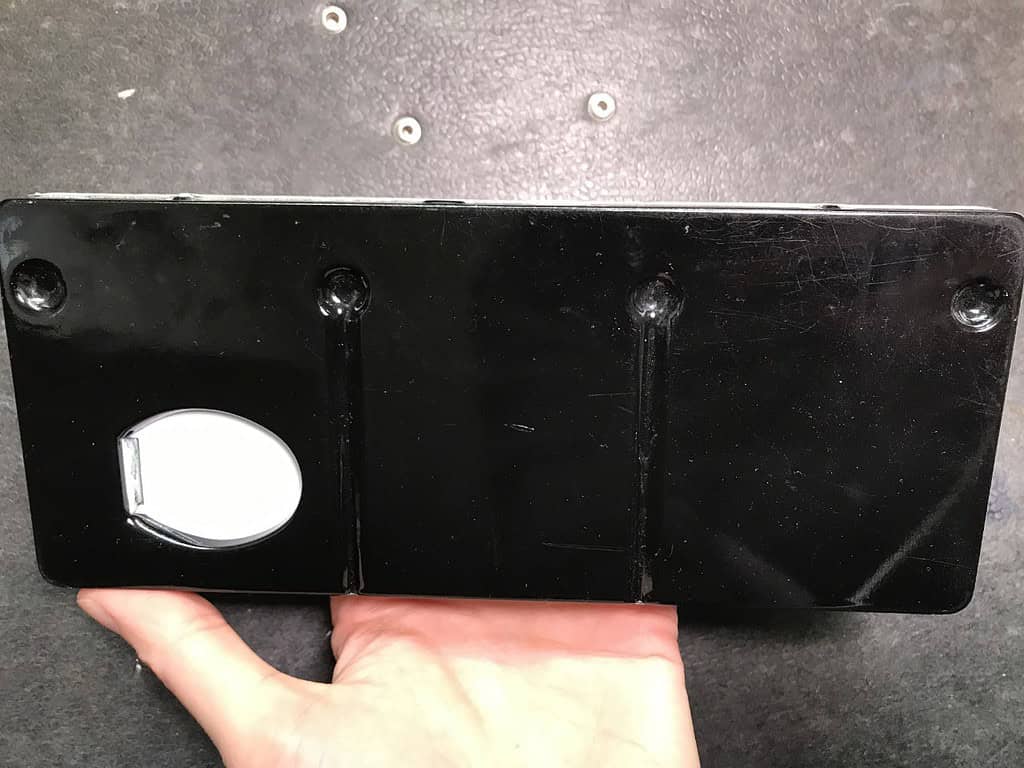
As for the palette itself, I find that folding palettes where the colors face each other when the palette is closed need to be handled carefully when you’re in the field or still have wet paint or mixing puddles in the palette – the paints can mix together more easily. But this small metal palette is compact and lightweight, so I’m sure I will bring it outside to sketch with me from time to time.
I usually pick mostly transparent pigments and often choose single-pigment paints – although I’ve become less interested in that aspect. It’s more important that the chosen colors play well together when I’m mixing them, so the knowledge of the painter plays a larger role than using the right pigments. The most important factor for me in paints is lightfastness. Holbein has some not very lightfast colors in the range, so these were off the menu for me. They also offer a few 3- or 4-pigment paints, but they can be easily avoided if needed – there is usually more than one choice for a particular color. I ended up with a few pre-mixed colors, because the place I bought my 5ml tubes from didn’t have everything in stock. As I stated above, this is not as critical for me as long as the color is lightfast, transparent and performs well. I have not had any quality issues with the paints at all. The paint activates well and feels smooth on the brush.
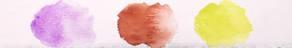
Holbein is a Japanese company, and they offer some unique pigments that I wanted to try out. I was particularly intrigued by the Cobalt Violet Light (PV47), which is a lovely warm, light violet (it seems perfect for flowers), and by the Imidazolone Brown (PBr25), a warm, reddish brown. I was also curious about their Leaf Green, a very bright, yellow green that should work well for foliage in sunlight. I have a similar light green in my palette, may green, but this is even brighter.
Holbein watercolors are very finely milled, and they hardly have granulating pigments, except for a few very softly granulating ones (Cobalt Violet, Cerulean Blue, Cobalt Turquoise). I don’t rely on granulation in my work, so this wasn’t a factor for me.
So far, I like how the paints feel and how they mix, they are indeed very transparent and you can get quite subtle effects out of them.
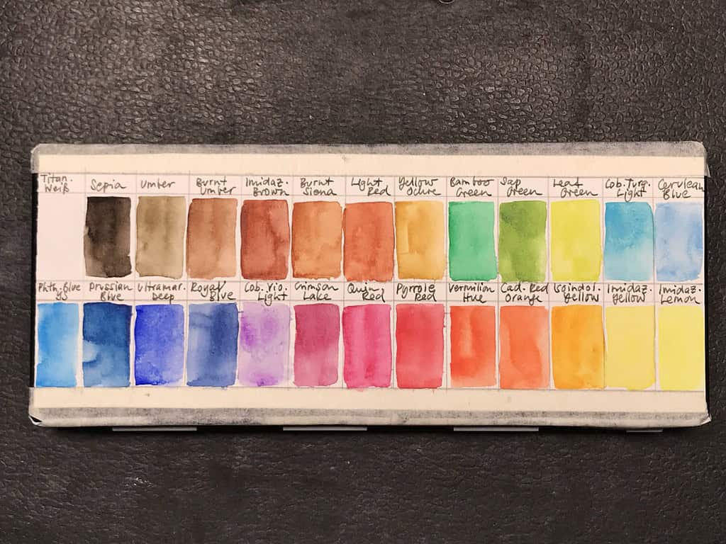
Here are the colors I chose:
- Imidazolone Lemon (PY175)
- Imidazolone Yellow (PY154)
- Isoindoline Yellow Deep (PY110)
- Cadmium Red Orange (PR108, PO20)
- Vermilion Hue (PO73, PR254, PY110)
- Pyrrole Red (PR254)
- Quinacridone Red (PV19)
- Crimson Lake (PR177, PR122, PV19)
- Cobalt Violet Light (PV47)
- Royal Blue (PB60)
- Ultramarine Deep (PB29)
- Prussian Blue (PB27)
- Phthalo Blue Yellow Shade (PB15)
- Cerulean Blue (PB35)
- Cobalt Turquoise Light (PB28)
- Leaf Green (PY154, PG7)
- Sap Green (PY150, PG7, PR122)
- Bamboo Green (PG36)
- Yellow Ochre (PY42)
- Light Red (PR101)
- Burnt Siena (PBr7)
- Imidazolone Brown (PBr25)
- Burnt Umber (PBr7)
- Umber (PBr7)
- Sepia (Pbr7, PBk6)
- (Schmincke) Titanium White (PW6)
In the end, I put together a selection of colors that is really versatile and useful for nature sketching, although I somehow forgot to put a neutral dark into the palette – I simply added some Payne’s Gray from my existing paints, since I missed having a shortcut dark color available (you can also mix great neutrals from Earth Reds and Ultramarine Blue, but sometimes it’s nice to have a “real” gray or black). For the next version of this palette I would probably leave out one of the Earth Reds, and add a gray instead. And I would place my gouache white near the yellows instead at the end (I had forgotten about it). All in all this has turned out as a great little palette and I’m looking forward to experimenting more with it.
What does your palette look like, and how do you choose colors? Have you painted with Holbein watercolor paints?
Thank you for reading this blog! It'll always stay free. To keep it going, you can support my work directly through a donation or through my nature sketching classes.
Join my free newsletter and never miss a blog post! You'll get new blog post notifications directly to your inbox. Receive 5 great sketching resources as a welcome gift for joining my newsletter! Here's what's inside:
- How to draw anything (PDF guide)
- Getting started with watercolor (free ebook)
- My favorite tips for creating great sketchbook pages
- My 5-step guide for drawing birds (PDF guide)
- My current watercolor palette layout (PDF guide)
By subscribing, you agree that I may process your information in accordance with my privacy policy

Hi Julia,
I’ve been following you on YouTube and News Letter for a while now because I love your bird and nature sketches so so much. I always wanted to comment but always shied away. But today I read your blog and got very excited because I was like “wow, Julia is trying out Holbein!? The paint from my country!? What an honour!” I do not think Holbein is comparable to Schmincke because in my opinion Schmincke is the best paint brand in the world. I don’t know why but it seems so hard for Japanese brands to create the “depth” in a colour like Schmincke’s. But Holbein is without a doubt very good professional brand and I am glad your first impression was good! I will watch the video from now. So excited!
Thank you so much! And I’m really glad you commented, it’s so interesting to hear other opinions about watercolors! I’ve never tried Japanese paints before, so it is very exciting for me. So far the Holbein paints hold up quite well, and some of the colors really appeal to me. I have to test them more for sketching. I too love Schmincke paint, but I might be biased because I’m so used to it. Hope you enjoy the video – I will hopefully put out a sketching demo with the Holbein paints soon!
By the way I love a lot of Japanese art and have learned a lot from the Japanese masters!
I am so happy to hear you love Japanese art. I think traditional Japanese art is unique in its composition and I love them too!
I enjoyed the video! I’d choose some colours of Holbein over other brands, especially Imidazolone Brown, Umber (I think this is unique to Holbein? Never found Greenish Umber/Raw Umber as dark as this) and their PB16 (Marine Blue) is a very beautiful, too. I want to compare PB60 of Holbein (Royal Blue) and Schmincke (Delft Blue, was it?) after I finish Hobein’s.
I always thought the interpretation of a colour is different between Asian and European (and other areas) because of different substances in the air reflect light differently. I think colours from Europe are deeper or should I say, ours are shallower. I used to live in England and when I come back to Japan for vacation, same clothes looks differently in colour. Anyway, sorry for my long comments. I’ve been meaning to take your courses the next time I have a chunk of time. My bird paintings are too stiff. Your sketches really teaches me something I want to learn. Thank you very much!
Absolutely, Japanese art has unique colors and composition, it’s been a huge influence for me. And don’t worry about long comments, I love talking about these things! 🙂 I find it very interesting that Japanese colors/clothes generally seem to be softer and more muted than their European counterparts.
I too like the Imidazolone Brown, very unique and useful, as for the Umber I think a similar color exists from other brands, but the Green Umber by Schmincke is much softer and lighter, and the Daniel Smith Raw Umber is darker. The Royal Blue from Holbein is a bit lighter than Schmincke’s Delft Blue, but that could also be my uneven color application. It is definitely a beautiful color.
Thank you, you are so kind. Yes, I cannot stop talking about these things… The Green Umber by Schmincke is subtle and beautiful! I love it. I can imagine Schimincke’s delft blue to be so deep. I love PB60 so I want to ha ve deeper one the next time.