

Neutral colors play a very important role in painting, the give our more saturated colors meaning and a bit of room to breathe.
If you create a sketch with only the intense, candy-colored saturated versions of colors, you’ll quickly overwhelm the sketch, and your viewer. Neutrals colors can help with that. A lot of the subtle beauty in nature can be shown or brought out with these more neutral, subdued colors.
These colors often appear gray or desaturated, but they can also take on a slight warm or cool tinge – just as the colors around them. Subtle grays, browns, ochres, greens – all of these can enhance each other.

Neutrals can often be found in the muddy parts of our palette, or they can be created by mixing opposites – opposites of what exactly? There are a lot of ways to chart and organize colors to show their relationships, one of them is the color wheel. If we organize our saturated colors in a color wheel, we have a practical tool to see what combinations are possible to create neutrals – it’s roughly the opposites, or complimentary colors. Pigments or colors opposite each other create a neutral color when mixed. I say roughly because it can always differ a bit because we’re using actual physical pigments for mixing, not rays of light in ideal conditions.
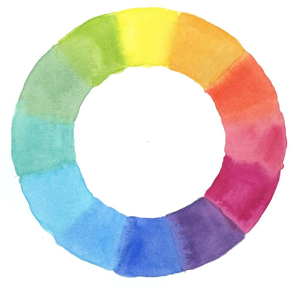
When you’re mixing neutrals (or any two colors), you can choose to create a smooth mix, or let the individual pigments show through a bit by leaving them unmixed, or drop in slightly more paint or water – this will create interesting variety just as you can see in nature.
It’s often a better decision to mix neutrals yourself, particularly for field-sketching. When it comes to detailed renderings of black or gray animals or pants (think corvids, black insects or black berries), the premixed colors have their place. As a rule of thumb, I try to stick with a gray/black pigment when the local (actual) color of the object is also gray/black and I don’t gain anything from adding subtle changes in color, or when showing light effects doesn’t make sense. This is often the case for more neutral, scientific sketches or a black animal – though some of these have iridescent colors. For landscapes or any kind of loose sketches, it almost never makes sense to use pre-mixed black except for dark accents. So rather create interesting neutrals from your complementaries than mixing your bright colors with black or gray.
Complimentary color pairs are red and green, blue and orange, yellow and violet. Mixing those complimentary colors can give you a broad range of neutrals – it’s worth to give these color pairs on your palette a try. If you start by mixing in just a little of the opposite and see how your mix changes. You’ll get a range of neutral colors that way. I recently explored this with some new pigments I experimented with.

So try mixing reds and greens, oranges (also earth colors) and blues, and yellows (light earth colors) and purple and see what happens. Also try less obvious mixes, like pink/red and turquoise, red earth tones and blues, or greens and violets. Pigments have different physical properties and will combine (and sometimes separate again) in interesting mixtures, and they don’t always follow the simple rule of combining opposites on the color wheel – sometimes those combinations bend and flex the wheel a bit. But it’s a good tool for orientation.
Very transparent pigments with a high vibrancy (also described as chroma) will get you strong dark grays, whereas less saturated colors will often produce lovely subdued mixes. You can learn a lot about your pigments by doing mixing experiments. Take plenty of notes!
A great place to start is the classic combination of burnt sienna and ultramarine blue (or any other blue) to create a gray, or a subdued blue, or a subdued brown – all depending on the pigment ratio.
Another good trick is to add a tiny bit of red, or red earth, into your greens if you find them to saturated and bright. The red will neutralize the color just a bit and take away some of the vibrancy and candy-color aspect. You don’t have to dull down your greens everywhere, but I find it can help to have a good mix of very vibrant and less saturated areas of color.
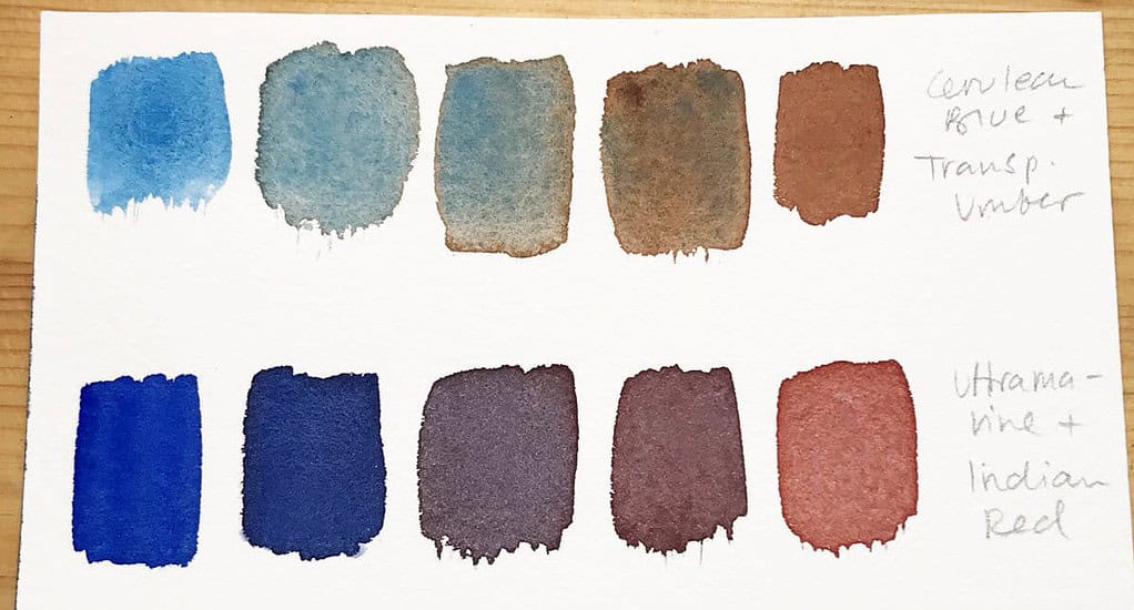
I’ve recently explored all my pigments and tried new and different combinations with the goal to create interesting neutrals. Don’t be overwhelmed, I have a lot of pigments – I don’t use all of those on a daily basis. Just start with what you have available and go from there.
I usually note the pigment numbers rather than the names of the colors (with a few exceptions like sap green) to make these easier to understand and recreate.
If you haven’t looked into pigment names and why they’re preferable to paint names from manufacturers, this post will give you a good introduction:
An introduction to watercolor pigments – things you need to know about colors and pigments
The same pigments can also vary a bit between brands, but this should be a good starting point.
For a more general introduction to color mixing and terms, this post is helpful:
The properties of color + how to mix colors
List of pigments I used and their names:
PY110 Isoindolinone Yellow
PY43 Yellow Ochre
PBr7 Raw Umber, Burnt Umber
PR101 Burnt Sienna
PBr25 (Benz)Imidazolone Brown
PR254 Pyrrole Red
PR209 Quinacridone Red
PV19 Quinacridone Rose
PR179 Perylene Maroon
PR122 Quinacridone Magenta
PV14 Cobalt Violet
PV15 Ultramarine Violet
PV23 Dioxazine Violet
PB27 Prussian Blue
PB28 Cobalt Blue
PB29 Ultramarine Blue
PB35 Cerulean Blue
PB36 Cerulean Blue GS
PB60 Indanthrone Blue
PG50 Cobalt Green
PG7 Phthalo Green BS
PG18 Viridian
PG36 Phthalo Green YS
PG17 Chromium Oxide Green
Here are the results:


I often find myself drawn to the bright, candy-like variety of color itself (who can resist a vibrant primary palette?), but then I often find the neutrals that I mix from these intense colors equally useful in my sketches. Those neutrals can be a framework that brings out your intense saturated colors and gives them meaning. That doesn’t mean you should paint everything in neutrals and muddy colors, but the combination of these makes a sketch interesting.
Of course there are scenes that are just full of intense candy colors, but I find those almost always need a bit of a buffer with more neutral, muted colors. Take a look at what the impressionists did with color – they loved saturated colors and chose bright pigments to be able to recreate light effects on the canvas, but they also combined them with desaturated, more neutral colors in a very effective way to make the intense color stand out more.
I hope my mixing experiments can give you some useful ideas to create your own neutrals, and also showed you why it’s important to think about these muted colors in the first place. Let me know your favorite mix to create neutrals in the comments!



Really informative. Great to see how your mixes turned out. I like the idea of allowing the diffrent pigments to kind of peek out so the color slightly varies. Always look forward to reading your posts. Thanks, Julia
Thank you Trudy, I’m glad to hear that!
This is wonderful and very helpful, Julia. Thank you especially for your lovely charts. Often I end up mixing whatever is leftover on my palette which creates harmonious neutrals but is, of course, impossible to replicate on purpose. Your methodical mixes are an excellent resource and inspiration. My favorite neutral mix today is Phthalo Turquoise PB16 + Quinacridone Red PR208 + Transparent Yellow PY150. It’s a silvery grey just like the clouds scudding across the sky this afternoon.
Thank you Laura, glad to hear the post gave you some ideas. Your mix sounds very interesting, I’ll have to try it!
Thanks, Julia!
I’ve heard about neutrals for a long time, and appreciate this longer discussion and also how you’ve painted your charts. I have a light green that looks great on the palette but just too bright on paper. The tip about adding just a touch of red will definitely help.
Thanks again, I love your work!
You’re welcome Tracie! You can try different small amounts of red, orange, earth colors or pink to mute the green, as well as yellows or blues to change their temperature a bit. Happy mixing!
Wow, what a great explanation of neutrals. Thank you so much for the time and effort you put in to your posts. The inclusion of seeing your examples is also so helpful. I look forward to your posts! I will start practicing this. Thank you!
Thank you Hayley and happy sketching! :)
So spannend , das muss ich auch mal systematischer angehen. Danke. Du bist auch eine tolle Urban Sketcherin.
Ganz lieben Dank! :)
I love seeing your mixing chart. I like how you record the two colors being mixed on each side of the resulting neutral. One of my favorite mixes is perylene maroon and indigo. It makes such a rich black or brown. But now I’m interested in trying out all my complimentary mixes too!
Those dark neutrals are stunning, I agree. And yes each one has their place. Happy mixing!
Ooh, sometimes it takes me a while to find the right ratio between two colours to get a good neutral – I could do this for hours!
Side question – Julia, do you plan on opening up your fundamentals with feedback course again?
Yes, it’s a fun activity, I find it quite relaxing too! As for the course, it will hopefully return next year as a feedback course, but it’s always available in the self-study version.
Thank you for the color challenge today, Julia. I’m on a beach trip and am enjoying matching up my paints to find these subdued shades. They are for more interesting this way!
What a great idea to create swatches just for neutrals in your collection of paints. I love it! Now I want to try this activity out with my watercolor collection.
I typically am the kind of person that likes to paint directly from the tube… and go bold and loud with colors. lol But when I do use a better balance and bringing in more neutral colors I usually get a lot of compliments from people on the that piece!
Thank you for the article. <3
Hi, thank you very much for sharing another enjoyable and informative post .
Oh my – that opening photo captured my attention and made me contentedly sigh. Even as a child, I was drawn to what might be called more regimentation rather than looseness so that page of precise squares and rectangles of colors just sings to me. :-) I immediately want to open a sketchbook and do the same, so interesting to see what happens when different colors are mixed. Your mentioning the advantages of adding some muddy colors reminded me of a quilter I took classes from who had a big influence on the quilting world at that time with her suggestion of adding “mud” to your quilts, i.e. it’s always more interesting when some muted browns or rusts get mixed in with the brighter fabrics quilters love. Well, right up my alley as I already loved those tones in my fabric stash, and now I knew better how to use them. Same here with your post. So excellent – thank you!
Great post! I am encouraged to have some fun experimenting with neutral mixes.
I enjoy painting birds and my go-to for black is Ultramarine blue and Burnt Umber. Recently I painted s as blackbird and I had fun adding violet, green or blue to try to capture the many colors that shine in a blackbird’s feathers.
Love this Julia! I can never try enough and read enough about mixing colours, just playing around with colours and see how they change is already a big satisfaction, and then I haven’t painted or drawn anything yet. What fun and very useful to see how to experiment with mixing colours in a more structured way. Thank you for sharing!