In the last post, I wrote about how I use greens in my landscape sketches. I explained why I think it’s useful to have premixed convenience greens, but why I always change them a bit to make them less intense.
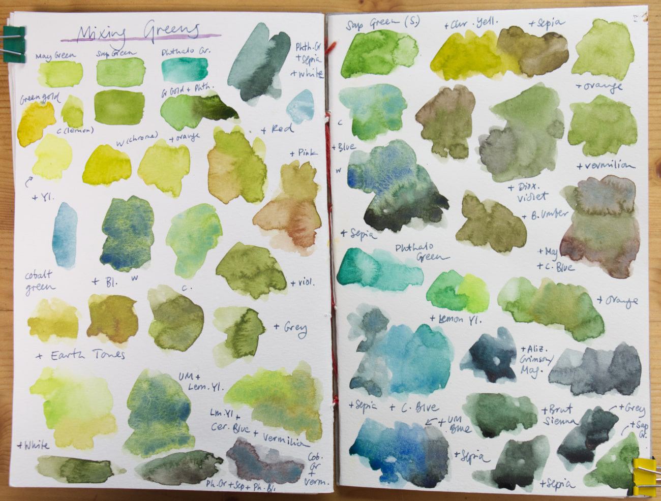
Today, I want to take a very practical look at different green mixes. I have three different greens in my palette: a bright warm green (Schmincke May Green), a darker warm green (W&N Sap Green), and a cool green (Phthalo Green Blue Shade). With these I can mix a big variety of different green tones, although you don’t even need greens: with a cool and warm version of yellow and blue, you can also get far. I use these greens for my sketches because they are a convenient shortcut. When I want to paint fast I don’t want to mix everything from scratch.
Here’s a video version of this post:
Mixing greens: A look at different combinations with watercolor greens (video)
Let’s take a look at the different greens in my palette.
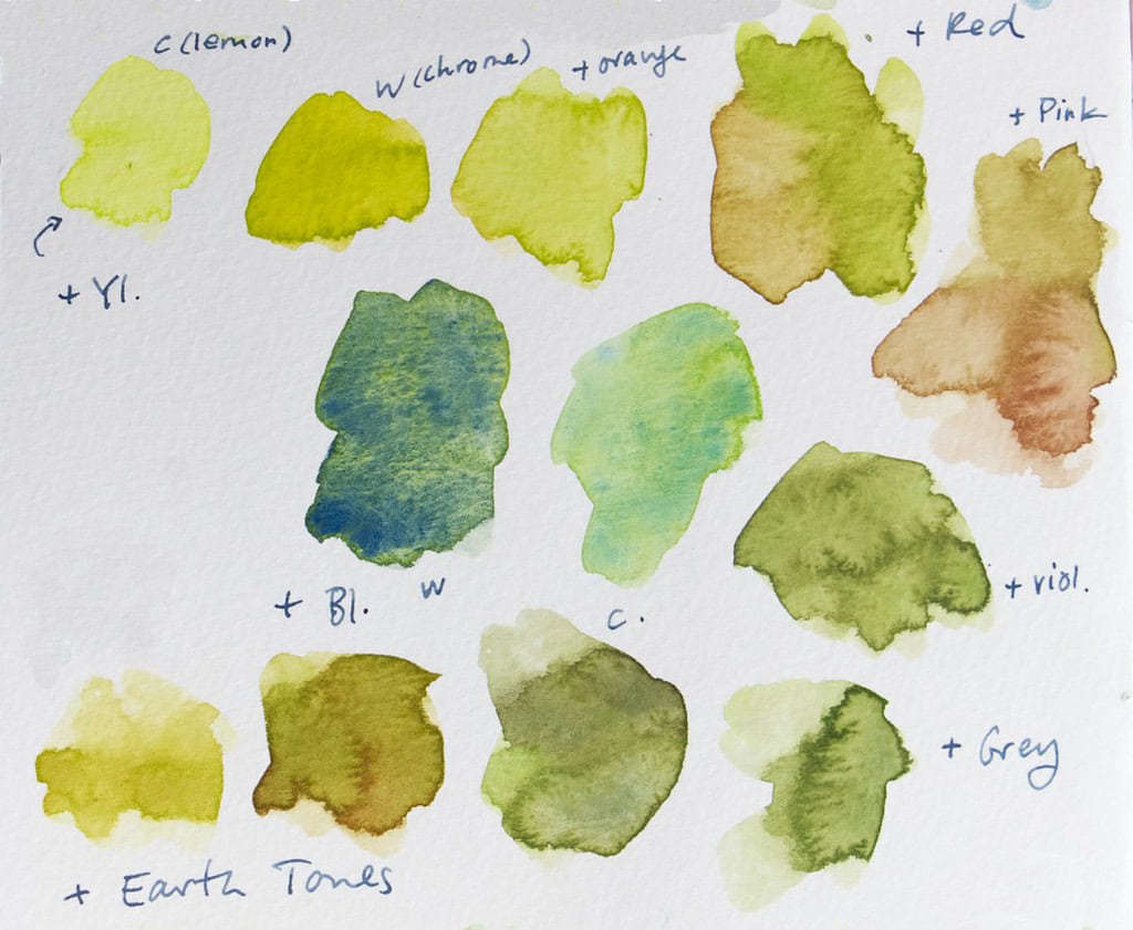
May Green (Schmincke):
This warm bright green is useful for a lot of the light parts in foliage and meadows. Particularly in spring, but also for sketches on sunny days, or when you have light shining through tree tops. I particularly like mixing it with white and lemon yellow for really bright spots, with cerulean blue for an interesting granulating cool blue green, or with red, violet or any reddish earth tone for a muted, warm green.
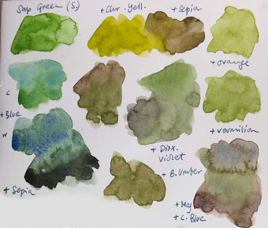
Sap Green (Schmincke, or W&N):
Sap Green is a classical convenience green, and it comes in a lot of variants. In my example I used the Schmincke variety, which I find a bit too bright for most uses, for out of the box use I prefer the Winsor & Newton mix. You can still get very nice green mixes out this color, particularly when you add reds, burnt sienna, or sepia.
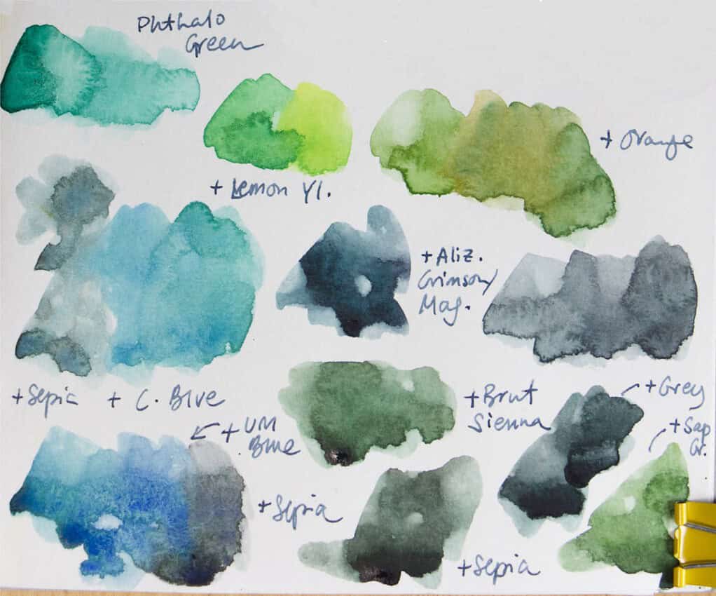
Phthalo Green (Schmincke):
This is probably the most artificial color in my palette and I never use it on its own, but it can produce useful greens. It is often used in premixed greens, too. Phthalo Green is very overpowering and intense, so use it in moderation and always try to reach into the other color first – it can ruin yellow pans better than any other pigment. I like it for cool greens (mixed with blue), and if you add sepia you’ll get nice dark green greys. Also worth mentioning is the combination with either dark red (alizarin crimson, madder red) or Quinacridone Pink (Magenta), the resulting color is a deep cool green that’s useful for spruces, shadow areas, or faraway green hills.
Other interesting mixes:
Try adding white to any of the above. It will make your mixed greens lighter and cooler. If you need a warmer light color, mix a tiny bit of Yellow ochre in.
For some paintings I like to have specialty colors like Cobalt Green (a useful blue green, great for mixing grays) or Green Gold (a particularly luminous warm yellow-green, wonderful for light-filled areas). Perylene Green is another interesting pigment that produces an almost black green – great for spruces. You can mix a similar hue from Phthalo Green and Sepia. All of these pigments produce interesting and useful mixes.
Did I forget anything interesting? How do you mix and combine your greens? I’d love to hear your favorite mixes and it also makes this post more interesting for others to read!


Hi Julia,
Love it! I’m often thinking about different green mixes and playing with my colours to find the range and subtle differences in the greens I can create from my palette.
I haven’t tried any sap greens or Schmincke’s may green, but my favourite in the colours I’ve tried is Schmincke’s Olive Green Yellowish. It is a nice base leafy olive green for both the tropics and Australia’s south west despite the very different greens in both these places. I was relying on it too much (using it 90% of the time in anything green) so I took it out of my palette recently to force myself to use and find other ways to make greens before I bring it back in.
I like Pthalo green for mixes as well but I prefer the yellow shade (Mission Gold Bamboo Green PG 36) as it also allows for the warmer mixes and can get close enough to the olive-greens I like. It is also great for the bright tropical warm greens of Christmas Island where I’m currently sketching.
Mission Gold’s Cobalt Green Deep (PB36) has been a relatively recent favourite for me. The bluish tones in it are so perfect for the bluish, grey-greens of some Eucalypts and other subtler greens in the south west of Australia.
I also really like Perylene Green and Green Gold but I use them sparingly so far. Have been wanting to play more with Green Gold to see how I could use it more.
Greens are the hardest for me when deciding on what to include in my main palette just because I want to keep so many! Even though it is easy to mix most greens, I do love the convenience of having a few options especially when sketching outdoors. Do you have a particular colour you find the most difficult when deciding what to include in your palettes?
I’m not as sure about greens. I’ve used Sap Green, Hookers green, Thalo green. But I’m open to trying new green so I’m making notes to the new ones you mention.
Somehow, I missed reading this post and found it on Pinterest! I just got a little trial set of schminke colours and wondered what to do with the May green…now I know! I’ve also rarely used the sepia for anything other than animal eye liner, so it will also be something to experiment with. A green I’ve come to enjoy using is MG viridian in place of pthalo green. Green gold, sap and Perelyne have been what I use most regularly.
That sounds like a nice combination of greens, Jenneke! Viridian is wonderful for landscapes, and I like that’s it’s softer and more natural than Phthalo green. But you have to love the granulation.