Landscape sketches can succeed or fail with the combination of colors we use. Green is a predominant color everywhere in nature, so it’s important to look at how you use your greens when you’re painting a landscape sketch.
There are a ton of different green shades out there, yet landscapes usually work best when you keep the individual colors to a minimum. How do I choose my greens then? I don’t always have it perfectly figured out when I start, but I look at the light in a scene, and think about the color temperatures. Sunlight usually means warm light, that means my greens have more yellow or orange in them. Shadow, or unlit parts, or parts of the landscape that are far back (and therefore influenced by atmospheric haze) are usually cooler and bluer, so I mix in blues or violets.
Not using green pigments out of the box is one of the key factors for me. Premade greens from most manufacturers are not very realistic, they’re usually very bright and cartoony looking. This is good, because we want our watercolor paint to be bright and luminous so that we can decide on the amount of brightness we need for a scene. But it’s also bad, because you will end up with a cartoonish painting if you use your greens like this.
You don’t want to use your greens in the pure intensity that they come in. The more intense, high-contrast colors you have in a painting, the more confusing it will become, because everything is emphasized. If you practice restraint in most areas, desaturate your colors and only emphasize a few brush strokes, they will stand out. These should be the eye-catchers of your sketch.
So how can you get less intense greens that harmonize with the rest of the sketch?
A good practice is to get more convincing greens is to mix your premade greens with a bit of other colors, especially with complementary colors before you apply them to paper: a bit of red or orange or burnt siena helps to dial back the green and gives you a nice, natural green hue. Remember, you will very rarely see pure saturated colors in nature. If you take this mixing process further, you will get browns or grays, depending on the exact pigments. Use them in your painting. The will harmonize the overall look of your scene. The smaller your palette is, the more harmonious the result usually is, because all the colors relate to each other. You can also affect the color temperature of a hue with this: If you use colors closer to blue to modify your green (or any other hue), you’ll cool it down, if you use a color closer to orange, you’ll warm it up. This way you can show different light qualities in your sketch.
You can also get really dark mixes from some combinations, useful for shadow foliage or a dark ground. I will show a number of practical examples for mixing greens in my next post.
If you see foliage that’s directly in light, you can use your brightest mixes there, or mix in some yellow. Every color and value decision you make will be influenced by what’s next to it – you can intensify colors by surrounding them with their complement.
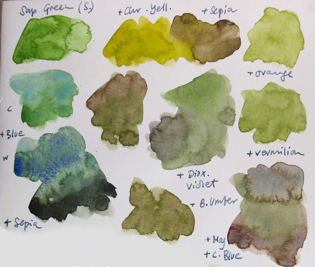
You can definitely use a sketching palette that has no greens at all and mix all of the cool and warm green tones you need. You can also take the shortcut by having premixed greens in your palette, just remember that you need to adjust them before applying them to paper. I don’t like mixing a lot of paint from scratch, so I have three greens in my palette – a bright warm green (Schmincke May Green), a darker warm green (W&N Sap Green), and a cool green (Phthalo Green Blue Shade, or Viridian for a softer variant).
I almost never use any of the greens I have out of the box, at least for landscape sketching – I always use a green as the base color that I need to adjust to my needs, and add other colors. The more pigments and the more different color temperatures you add into a mix, the more muddy it will likely be – but that could just be what you need for a particular spot.
In the next post, I will show different green mixes that I can get from my palette to give you an idea of what’s possible.
What are your favorite greens? And why? I’d love to hear your favorite greens and your comments make this post more interesting for others to read!


Very useful article. Thank you! BTW, I was wondering how you would go about mixing a pine tree green.
I assume you mean a green that’s a bit darker, as you can often see in evergreen trees. I’d probably use Phthalo Green and mix it with Burnt Siena or Sepia. You can also use perylene green (single pigment) for very dark trees. But it always depends, there’s no definite recipe for these things.
Hi Julia,
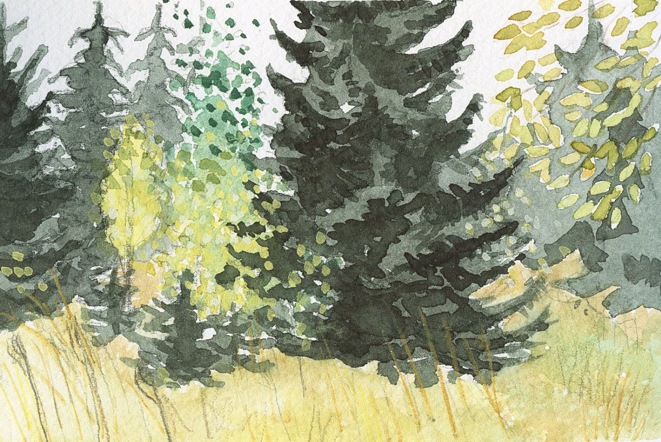
I’ll second David Jones’ suggestion. I love the deep green you have in the front tree in the sketch you posted to headline this article, and I have been trying for a long time to get a really good deep green for evergreens, so would love to know your secret. Is it sap green and sepia (noticed it on the color chart) or something else?
Thanks for your help. I really enjoy your posts and find them very useful!
You’re welcome!
I think in this sketch I used perylene green, which is a single pigment and matches the dark green of evergreens very well. But a similar hue can be mixed from Phthalo Green and Burnt Siena or Ph.Green and Sepia. You could also use Sap Green and add a bit Ultramarine blue and Sepia.
this was helpful. I sometimes just use blue and yellow and sometimes I use a premixed with other colors. I had heard about adding red or orange, now I will try it.
Yes, definitely try it, it can make a huge difference. :-)
Yes, greens can be difficult. I used to use Sap Green and Viridian but have given them up and mix from blues and orange, ochre or sienna’s. Good lesson Julia.
Lee
That’s a really good solution to get natural greens each time!
Thank you for your time. Very useful article. I am just starting out so this is a wealth of information. Can’t wait to try.
I’m always happy to talk about paints and colors. Hope you enjoy your mixing sessions. :-)
This is very helpful to me as a beginner. I will print this out to keep with my notes.
I’m glad to hear that, Susan!
I’m finally going through all the watercolour paints I’ve accumulated and painting them out in varying intensities to get to know them. I haven’t done any systematic mixing but for greens straight out of the tube, I especially love these: Green Apatite (Daniel Smith) for its warm tones, its beautiful sedimentary texture and the brown that settles out,and its vivid natural green colour with a range of possible greens; Pthalo Green Light (Sennelier) and the similar Pthalo Yellow Green (Daniel Smith) for mixing and for dramatic pops of colour; Green Gold (Daniel Smith) for its rich warmth and for its mixing possibilities; and Zoisite Genuine (Daniel Smith) which is this lovely, subtle tray-green colour with granulation. Cascade Green (Daniel Smith) is another beauty –it’s a cool, dark green, perfect for evergreen forests. It’s made from Pthalo Blue and Raw Sienna and you can get beautiful effects as the blue separates out. I’m hoping to put together a plein air palette of a limited set of colours and learning more about mixing greens from them. Your article is great, Julia–lots of good information about colour principles that will help in my journey. Thanks so much!
I’ve heard a lot of good things about some of these, particularly Green Apatite seems to have quite a few fans, and I personally love Green Gold (W&N though) very much for some scenes. It makes foliage glow. Great that you’re investigating all of your greens so thoroughly and I’m curious to hear what you’ll put into your limited palette!
Great overview on mixing greens – looking forward to your next post on the mixes!
Thank you Kit! :-)
Julia,
I really enjoy reading your emails and as a newbie to ‘art’ I’m learning so much from them. This latest ‘greens in landscape’ was very exciting and one I’ll try with my portable watercolor kit. My interest is nature journaling and just learning so many basics.
Thanks so much.
Joyce
This was very helpful Julia. Thank you! I struggle a little bit with greens but I am looking forward to trying your suggestions!