
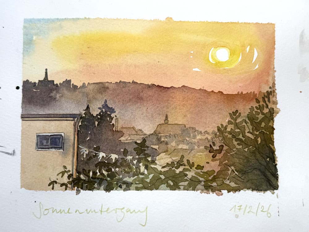
I’m back from my summer break!
One thing the relentless heat wave has given us in Europe this summer is endless sunsets in a clear sky. The moment when the sun finally goes away and you can open the windows often was the first moment of relief in the day.
I’ve been sketching a few of those moments.
I thought it would be fun to take a closer look at sunset colors and how I paint these moments.
I love sketching sunsets, you could call it an ongoing long-term project that I return to in phases. I just love painting the sky. One of the things I like about sunsets (and sunrises) is that they are very fleeting, so I’m actually forced to paint quickly. It removes overthinking, and you get fast results. I just put down pigments and see how they end up (due to the heat the paint dried instantaneously, which I guess is something positive), and when I really want I can do a second study.

There is something fascinating to me about putting down a few brush strokes of watercolor and create the illusion of light on the paper.
I keep experimenting with my watercolor pigments to see what effects I can get out of them. The colors depend a bit on the weather and can range from bright yellow, orange, reds, to pink, violet and the sky can range from light blue to dark blues and violets. In my area in central Germany, we have very classic yellow-orange-red sunsets against a deep blue sky, the slightly kitschy pink only joins the scene during winter.
So what I’ll share here are the every day sunsets I can see on my walks, in my neighborhood – pretty standard stuff.
Watercolor pigments for sunsets
You don’t need special pigments or anything for painting sunsets or skies, if you have a couple of yellows, reds and blues you will be fine. Here is what I like:

These are some of the pigments I have in my every day palette. I have experimented a bit with new pigments for skies recently, but I will put this in a separate post.
- For the lightest areas immediately around the sun itself: PY154 (Winsor Yellow, Holbein Imidazolone Yellow) – a slightly warm, transparent yellow, very versatile.
- PY175 (Winsor Lemon, Holbein Imidazolone Lemon) – a very fresh transparent lemon yellow. Looks good in combination with light grays, when the sky is slightly cloudy and the sun is less intense.
- For darker areas of glowing sunlight I like PY110 (Holbein Isoindolinone Yellow Deep) – a yellow orange, transparent and lightfast.
- A touch of PR255 (Schmincke Vermilion) or PR108 (Cadmium Red Orange) works for those areas that are slightly touched by the fading light. Very useful to give the impression of light effects on paper.
- Often just a touch of blue, either Cerulean (PB35 or PB36) or Cobalt (PB28) or Ultramarine (PB29) is needed for the sky.
- All of these can be mixed in with green, blue, violet or earth colors depending on where they are placed. You will want a touch of orange or red where the sun still touches foliage, or hills. Blue colors in the shadows.
It’s fun to study those light effects and also to see how other artists have solved painting these in the past. Maybe with different pigments and in different mediums. I’ve been in a few exhibitions over the summer and it’s always amazing to see paintings up close, and not as a reproduction.

Painting tips:
- Paint around the center of the sun, the white of the paper will never appear as bright as the sun, so you can only suggest its glow by exaggerating the contrasts around it.
- Use a combination of warm and cool colors, play with color contrasts.
- Really push value contrasts with dark and light areas in the sketch, this way the colors can shine more intensely
- Too much pigment can render a scene kitschy. Use the power of saturated, but not too saturated mixes, add water to your mixes to achieve gradients that create an atmospheric effect.
- I also find working into the paint layers too much and disturbing the pigment will often destroy the effortless effect that you want for skies. It definitely takes a bit of practice to leave your washes alone. Especially granulating pigments (many blues) will look better if you apply the paint with generous brush movements and then let them settle on their own. Use the largest brush you can.
I’m exploring similar and other color combinations for painting skies in some of my courses, namely:
Painting clouds and skies in watercolor
Luminous Landscapes
and the upcoming Landscape Sketching Fundamentals (yes it will really, finally come out very soon!)
I’ve also discussed different yellow and yellow earth pigments (a color we might need to reach for more often in the future when sketching nature in summer, sigh) in this post:
https://juliabausenhardt.com/a-look-at-different-yellow-pigments-earth-yellows/
https://juliabausenhardt.com/comparing-raw-sienna-and-yellow-ochre/
Hope you’ve all enjoyed your summer. How have you been, what has everyone been up to?


Thank you, Julia. This was so lovely. Glad you had a good holiday.
Thank you Bonnie!
Julia me alegro muchísimo de tu vuelta y de que estés tan animada y con tantos proyectos bonitos de dibujo. me ha gustado mucho lo de los atardeceres y voy a practicarlos un poquito. un abrazo
Thank you very much Marta! Lovely to hear you feel inspired to paint some sunsets too. Hugs to you!
I love the freedom of color and brushwork in your sunset paintings! Very inspiring observations. I will look at my sunsets in St. Louis with more intensity. Thanks, Donna J.
Thank you Donna. Enjoy those sunsets!
Thank you for these glowing sketches (and for the advice on how to avoid seeping over into kitsch). Partner and I took a fascinating trip to Mongolia; so much to see, think about, and sketch. I used so much of what you’ve taught me over the last few years. Met a young woman who, five days a week, walks a mile up a mountain to get a cell signal so she can take a course preparing her for college admission exams (the SATs). Her parents are herders of horses, sheep and yaks. A beautiful country in profound flux.
Now I’m back to accompanying immigrants to ICE check-ins and working with the many thousands here who are fighting for the soul of our country.
Abrazos,
Rebecca
Thank you Rebecca for sharing this. Wonderful to hear you had such a good trip with seeing new things, meeting people and sketching. And thank you for helping those people.
I hope you feel refreshed after your break! It’s always healthy to step back a little bit. Thank you for the sunsets! I’m inspired by how you handled them and can feel the sun on my face! I live in a wooded area and miss seeing sunsets. I keep thinking I need to find a place nearby where I can see more of the sky.
As to what I’ve been up to – my husband and I have almost 2 acres, and I’ve decided to paint every living thing I find on (above and under) our land for one year. Sometimes I think I’ve bitten off more than I can paint!!! How rich I feel in just 2 weeks of watching and looking!! 50 weeks to go!
That sounds like a wonderful project Audrey!
Hi Julia. I found it very helpful that you documented which colors you used for these beautiful sunsets.