Color can be a bit intimidating when you start sketching landscapes, but it’s also one of the most fun and rewardable aspects of our sketches. It can make everything shine and vibrate when we learn how to use it right.
Fortunately there are a few good principles for mastering color.
Today I want to share the core concepts that help me make better color decisions in my sketches.
To get a more practical insight, I’m also sharing this as a lesson from my course Landscape Sketching Fundamentals, so that you can see how I teach.
Landscape Fundamentals: Painting Light and Color (course lesson)
Here are some core concepts for adding color and light to your sketch:
Value Structure
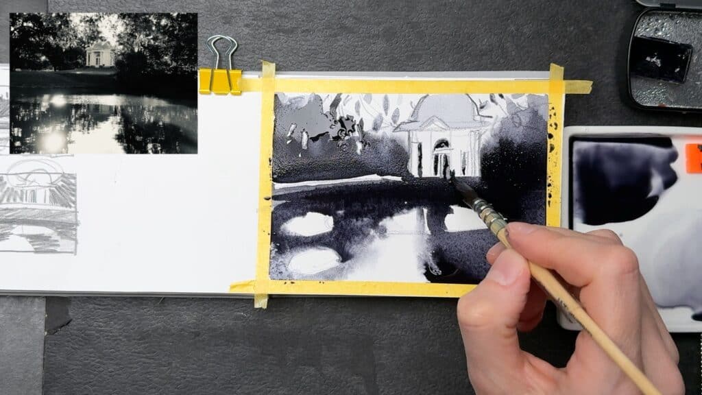
The foundation of a good landscape sketch is not color (surprisingly), but light: our value structure. Value describes how light or dark different areas in our sketch are, and it will help massively to figure this out before we start reaching for out palette.
You can create small studies to figure out where you want to place your lights and darks, where you want to add more and less contrast. A helpful practical approach to seeing value can be squinting, or using the black and white mode of your phone.
Color temperature + modulating color contrasts
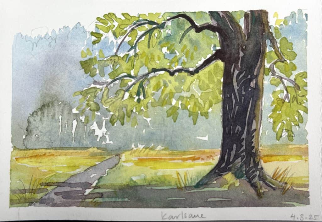
Colors are not static, and they especially don’t need to be in a painting. The appearance of color changes based on its environment, and maybe you’ve heard about the term “color temperature” before: by grouping our color hues into warm and cool colors we can create more interesting and life-like effects, as well as bring across the quality of the light in our scene. Yellow and oranges are warm colors and can create the effect of sunlight, blues and greens are considered cool colors, and can be used effectively in shadow areas. It’s never as straight-forward in a painter’s practical reality though, in our paintings the color temperature always depends on what color is next to it. So color temperature is never an absolute measurement.
Color contrasts
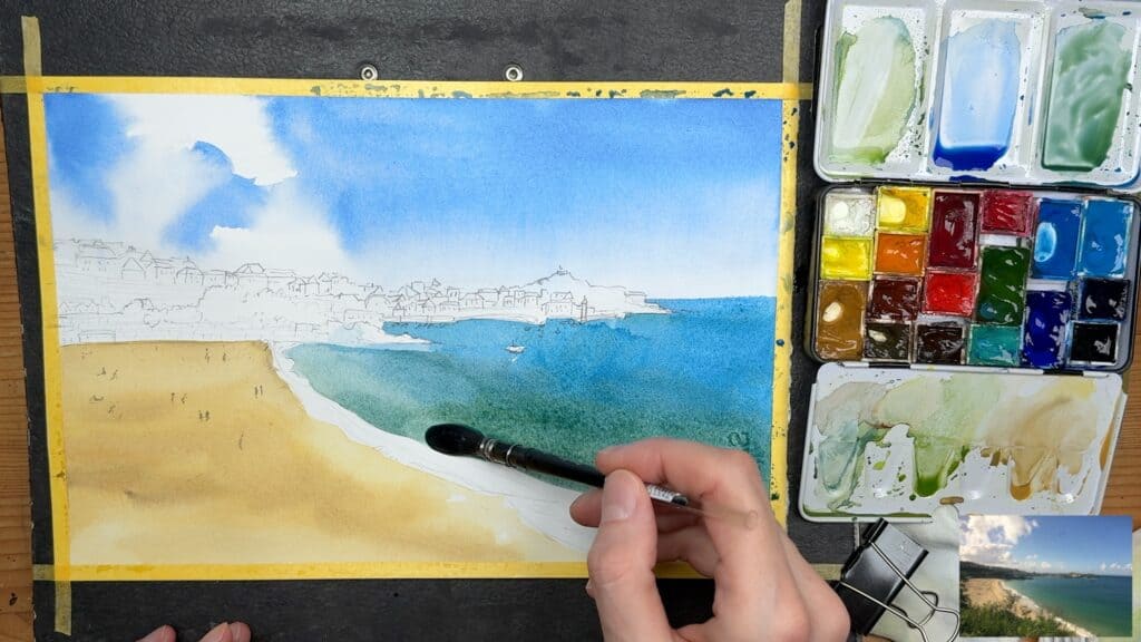
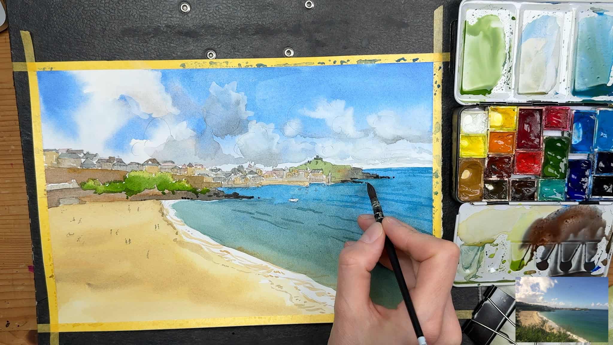
Similarly, you can use color contrasts to make an area in your sketch stand out. There are different types of contrasts, like analogous or complementary, and this essentially means playing with different color temperatures next to each other to increase contrast. In the sketch above, I’ve used cobalt green next to my blue – the hues are quite similar (close to each other on the color wheel), so this would be called an analogous color contrast. It unifies the shape and adds depth to the water.
As a practical tip to make your sketch more compelling by adding color contrasts is to combine different colors (of the same color family or a different one) in your wash, like introducing a bit of yellow into your yellow ochre, or adding some violet and muted reds to a green area. This will simulate light effects and will make your sketch more realistic and believable. And yes, of course it’s something to experiment with and learn about – but it’s a very fun technique.
Atmospheric Perspective
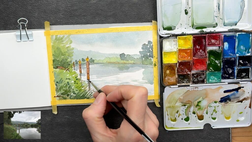
This is another basic concept that describes how light interacts with a scene: objects further away appear less saturated and lighter (and bluer) due to atmospheric effects, and objects in the foreground appear with more clarity, contrast and with more intense color. You can use this as a painter to structure your scene and give it depth.
For most scenes (excluding special situations like backlight or fog) you can think about going from strong to soft colors (and values).
With watercolors going lighter is very easy: you simply add water.
There are other aspects to consider like edge design and detail, but changing the saturation and vibrancy of a color in the background will be a great first step to create atmospheric perspective and add a sense of distance in your scene.
Learning to see color like an artist
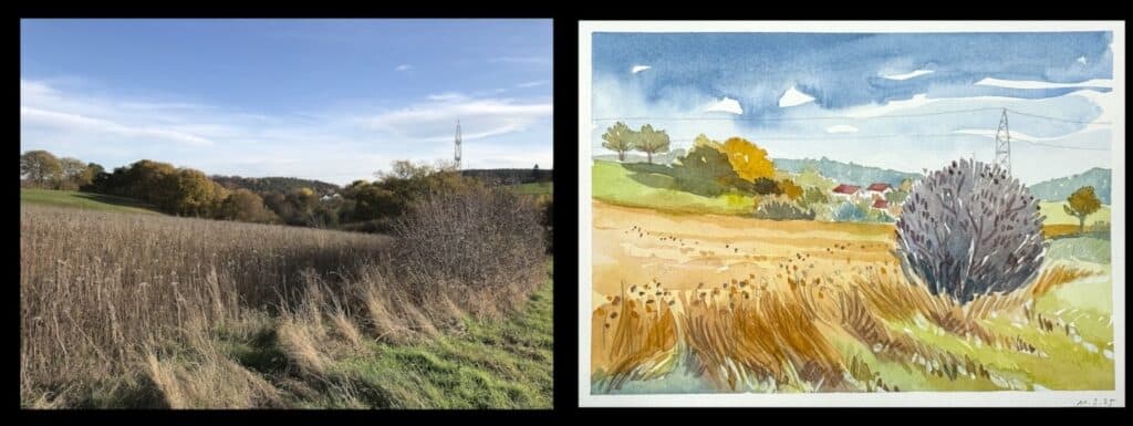
This is maybe the biggest step for beginning landscape sketchers. It’s definitely something I’ve grappled with for a long time. When you start out, you immediately reach to “standard” colors, like green for grass and brown for tree trunks. This isn’t wrong per se, but it will make for very cartoony sketches if you follow it literally. Considering what we’ve learned about light and how it can change colors, it makes sense that we don’t have these static colors that we just need to slap onto our drawing everything look realistic. The color you see in your reference is just a starting point. Also, be aware that photos compress and change colors, so they’re never really accurate in that regard.
It’s up to us as the artist to create a color story for our paintings and modify the colors that are present in the reference in an informed way.
Go to a museum and look at the masters have solved this throughout the centuries. Particularly impressionists and classic 19th century landscape painters are interesting to study, but also all kinds of artists throughout the centuries (I can share a few favorites if you like).
You will notice that very often, you can find all kinds of colors in an area, but not really the one you associate with it. Water is supposed to be blue? No, it can actually be green, brown, violet, white, or yellow. Ok, water is reflective, so maybe a bad example, but trees are surely green and brown? Maybe so, but you can make these base colors more interesting by introducing yellows, reds or blues to the foliage, and violet, blue or earth tones to the bark. Be aware that these aren’t formulas, these are just examples that can work better in some cases, and will look totally different in another light situation. It really always depends on the light, and what aspects interest you in a scene, and the story you want to tell in your sketch.
This is what’s essential: how the light interacts with your scene, and how you can show that. What I want you to get away from is just thinking like a color photocopier. Use your photo references for shapes and details, but not for the colors. They don’t tell the whole story. You can also depart entirely from the “realistic” colors present in your reference and focus on how you can show the effects of light and atmosphere with a very modified palette. Every painter has their own approach to this.
What I’d like to encourage you to: Do lots of color studies. Say goodbye to the formulaic depiction of what things are supposed to look like. This is the beginning on what learning to see color like an artist is like. It’ll take a lot of practice and will get easier with experience, but it can be one of the most powerful tools to sketch realistic and beautiful landscapes.
I hope these tips have been helpful to you, I find them to be a valuable starting point when thinking about color in my sketches. If you want to dive into landscape sketching as a whole, all of this is in Landscape Sketching Fundamentals (a foundational landscape sketching class that will teach you basic landscape sketching skills in-depth and in a structured approach).