
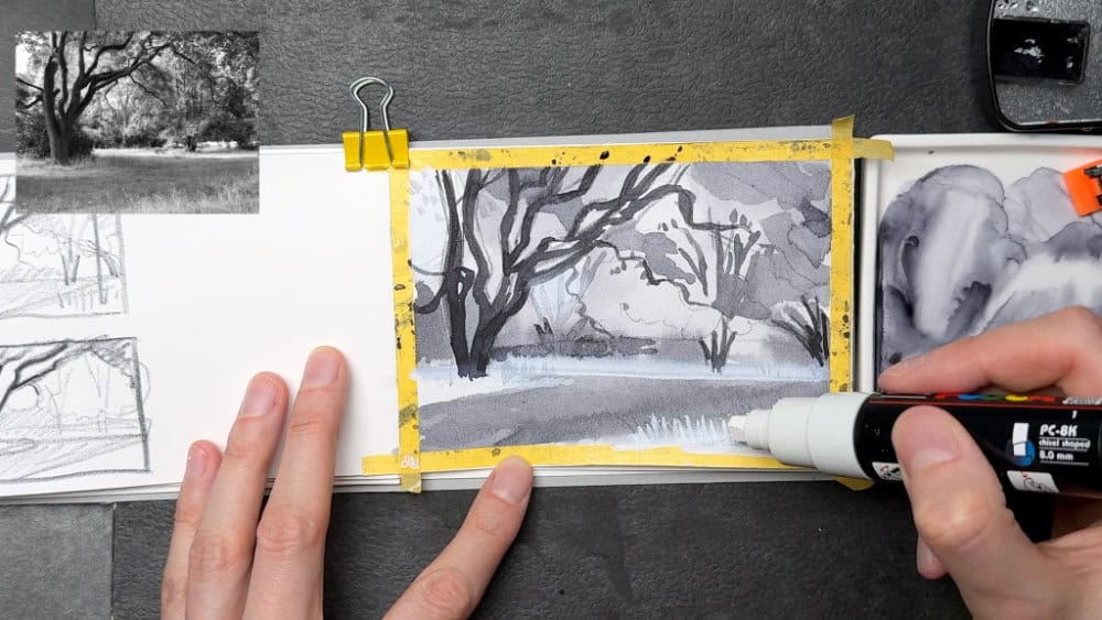
Last week in the current feedback group for my Landscape Sketching Fundamentals course, we looked value in detail, and explored the benefits of value studies especially at the beginning of your sketching process.
Today I want to give you a few practical tips if you want to explore value studies on your own. These tips are based on what I see students struggling with the most, and questions I frequently get in my feedback courses. I think value studies are beneficial for every sketcher – whether you’re focusing on landscapes or really just any subject. Control over values is an essential skill to have for drawing and painting realistically.
My last post also gave a introduction to this useful foundational technique, so if you want to recap the basics about what value is and how you can use it for better sketches, also read that post if you haven’t already (there’s also a video):
Small landscape studies – The power of value
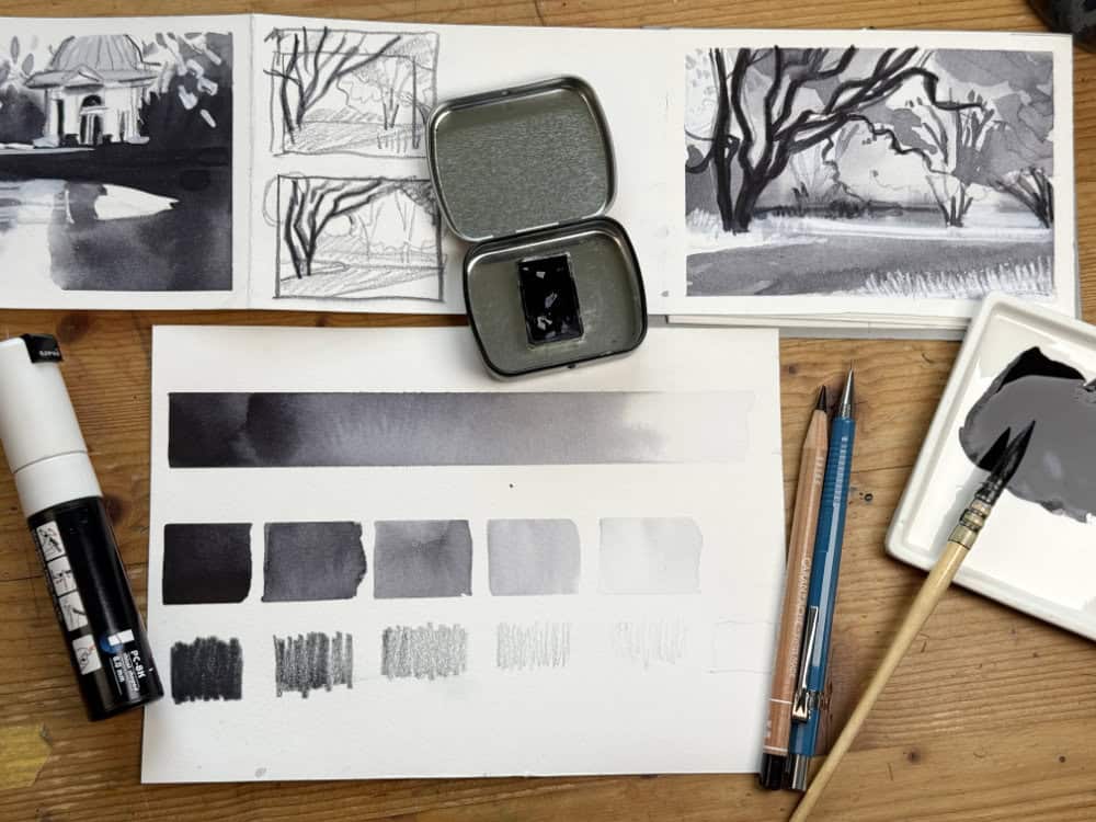
Five tips for better value studies:
- Limit the value steps: Don’t make it more complicated than it has to be. Nature is full of infinite value changes, and our eyes can certainly see them all, but that doesn’t mean you need to include them in your sketch. In fact, you shouldn’t, because it will overcomplicate and muddy your sketch. You need a well-structured, easy to read sketch if you want to show atmosphere and depth. To make this easier to attain, remove complexity: reduce the amount of different values in your sketch. 3-5 value steps are usually enough. Darkest shadows and lightest highlights should be a part of your value range, as well as one or several mid tones.
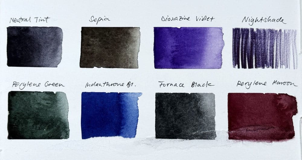
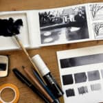
- Use dark colors for value studies: It’s recommended to use one color for your value studies, because that’s the entire idea behind tonal sketches: removing color, and focusing on lights and darks to work out the structure of light in a scene. That doesn’t mean you have to use black. There are a number of beautiful, very usable dark-valued colors you can definitely use for your value studies. Why dark colors? Because you will be able to cover a bigger range and can go really dark where needed. I like watercolors like Indigo, Sepia, Neutral Tint, but also dark colored pencils in colors like Nightshade (a dark aubergine), or Perylene Maroon or Perylene Green. There’s an image at the end of this post showing a few of my favorites.
- Squinting really helps: I know I keep talking about how squinting the eyes slightly helps you to see less color. Color will only distract you when you want to focus on light and dark. Using your phone in black and white mode is a great shortcut, but it has one issue: it doesn’t remove detail. You don’t want too much detail in your value study, because see above: you want to limit the amount of distinct values in your sketch. Slightly squinting has the benefit that it also removes detail from your scene. Give it a try. I suppose you could also use your phone in b&w and then take off your glasses if you’re shortsighted like me.
- Don’t start with big sketches: embrace small thumbnail or postcard size studies. You don’t want to spend hours on a value sketch, because you probably won’t look at it again, it’s not such an appealing end product. But it’s still so valuable before diving into color. Several small thumbnails or value sketches are more useful than one big value study that took hours. Plus, creating smaller value sketches means you won’t get caught up in details that easily, which, again, is good in this stage.
- Dare to push in the darks: this is the most common oversight I see with students creating value studies: their value studies are nice overall, but a bit flat: they lack depth and a certain punch. That’s because you haven’t punched in the darks! If you have spent some time placing all of those lovely midtones, and leaving space for highlights and think you’re finished, put the sketch away for a few minutes, and when you come back take a brush full of really concentrated dark paint, and add those dark values. You need contrast in your sketch.
I hope these practical tips are helpful. If you’ve never done a value sketch before painting a landscape in color, give it a try, it’s worth it!
What are your favorite dark colors for value studies (or anything else)? Here are a few colors I found in my palettes that are fun to use for tonal studies.

Hello Julia
I agree with everything you wrote in your post except for that phrase “you probably won’t want to look at it again, it’s not such an appealing end product” . It’s always OK to have bad practice sketches, but I have been stunned in a good way by 6-feet-tall hanging scrolls of Chinese ink paintings, done entirely as value studies. Color in Chinese landscape paintings came later.
Definitely I enjoy your posts.
Hello Jane, you’re absolutely right, I could have written that in a different way and it certainly wasn’t intended to describe practice sketches as terrible. There are absolutely stunning value studies out there that stand on their own as artworks, and I’m a big fan of learning from experimenting and (bad) practice too. Thank you for your comment!
Hi Julia,
What a helpful post for me at this point in my learning-to-sketch journey, thanks so much! Value is one of the aspects of sketching I’m struggling the most with up to now. I find your encouragement to dare push the darks extremely valuable (no pun intended, but welcome :)): I have repeately found myself using only light to mid-darks in my sketches, as if there was an invisible barrier stopping my putting in anything darker than midtones — with your encouragement in my inner ear, I’ll cross over into the really dark darks, curious and eager to find out what depth and aliveness for my sketches I will find there. (A process nicely parallel to the shortening days and lengthening nights in the northern hemisphere at this time of year.) Thank you, too, for hauling me back from another of those endless wells of details which I find myself veering to (sometimes falling in) again and again, off course to a concise and punchy sketch.