I’ve been asked how I do color studies and how I generally use my sketchbook to test color mixes. I don’t have a fixed system behind color mixing, but I like to test new paints whenever I get them to see how they react with other colors, and I often explore new mixes when I switch around paints on my palette to see how I can get the desired effect or a particular hue (for example when seasons change). Recently, I’ve shared my current palette, and shortly after I revisited my earth tones and did a few test swatches and comparisons. I’m tempted to make changes again, but first let’s take a look at how I test different color combinations in my sketchbook.
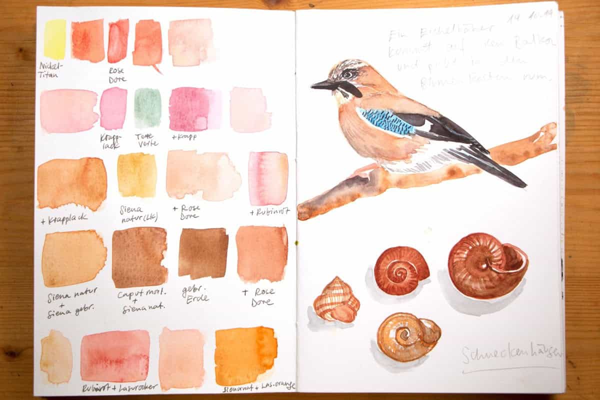
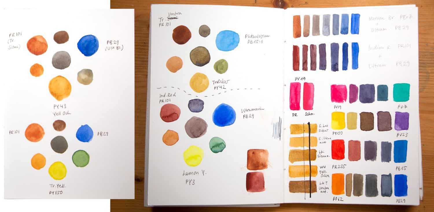
There are different ways to make color studies. The easiest is to paint swatches of colors or color mixes – this is particularly useful when you want to compare different hues directly, or if you’re looking for a particular color to add to your picture. I sometimes test colors next to my sketch somewhere on the paper, sometimes I will use a full page to make more organized tests. It’s good to note what colors and mixes you used so you can replicate them.
Some artists like to have a separate sketchbook for these color tests, you could also use a sheet of paper, or just keep it in your main sketchbook. What matters is what you learn from these experiments.
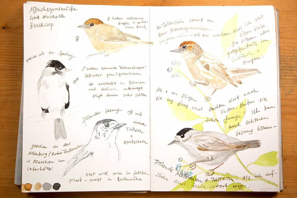
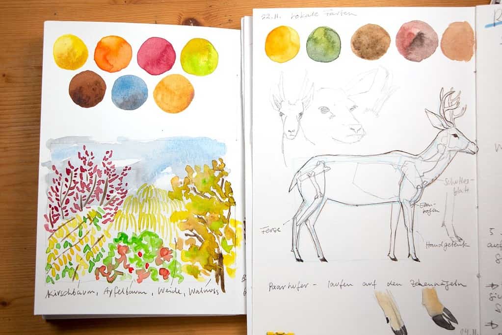
One technique I like as a standalone sketchbook activity is to collect local colors in a scene and add these swatches throughout my sketchbook. You can add a landscape with the same colors below, but you don’t have to. This can show you how the colors change throughout the year.
A great way to see how two colors mix is to paint small charts with different amounts of each paint. Start by mixing two puddles of each color, and then add in a bit of one color into the other. This is particularly effective with complementary colors (and you’ll get a beautiful neutral hue in the middle). If you’ve never done this, start by mixing Ultramarine Blue and Burnt Siena – the range of these two is amazing. See how you can produce subtle greys or browns, or how some colors intensify each other (like transparent colors with a similar color temperature), and others just darken or produce mud. Again, I usually note the pigment name along with the brand so that I know later how I got this particular mix.
Another way to test colors is to see for yourself how opaque or transparent they are. You draw a black line first, and then paint on top of that line. When the paint is dry, you can see how much it was covered up by the paint. I find this kind of test useful because you can’t always trust what the manufacturer says on the tube – particularly for earth pigments like Yellow Ochre that can end up quite opaque and chalky. Make your own tests if you see your sketches turn muddy again and again.
Another nice way of studying the capabilities of paints is to see how just a few select colors can make a basic palette. Of course, you will likely have more than three colors on your palette, but it’s nice to see how a limited palette can produce a sketch that works. Here I have painted different color wheels with just three colors – in each case a red, a blue and a yellow – but the results can really differ.
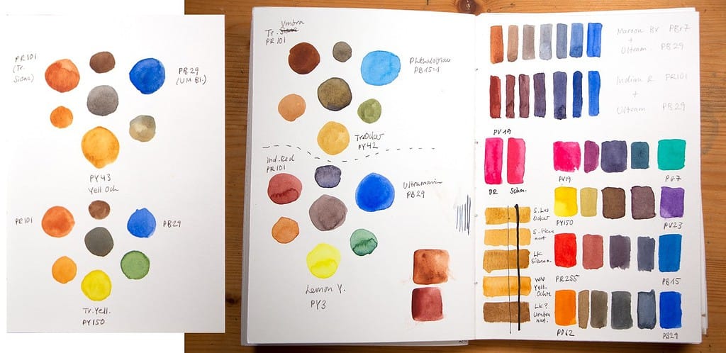
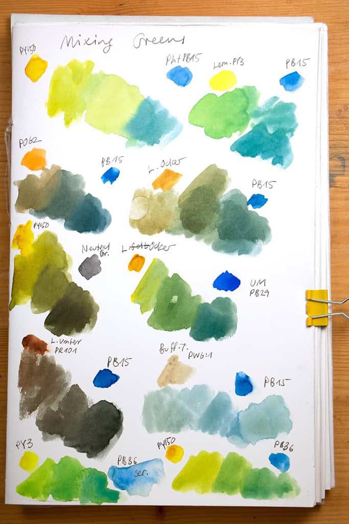
Mixing greens can be difficult, so it’s worth a look to see what types of different greens you can get from your paints. Here I’ve tested different combinations of blue and yellow to achieve a wide variety of greens. It’s always a good idea to note which colors you’ve used – at least I tend to forget this, and my ability to see which color I used doesn’t always work.
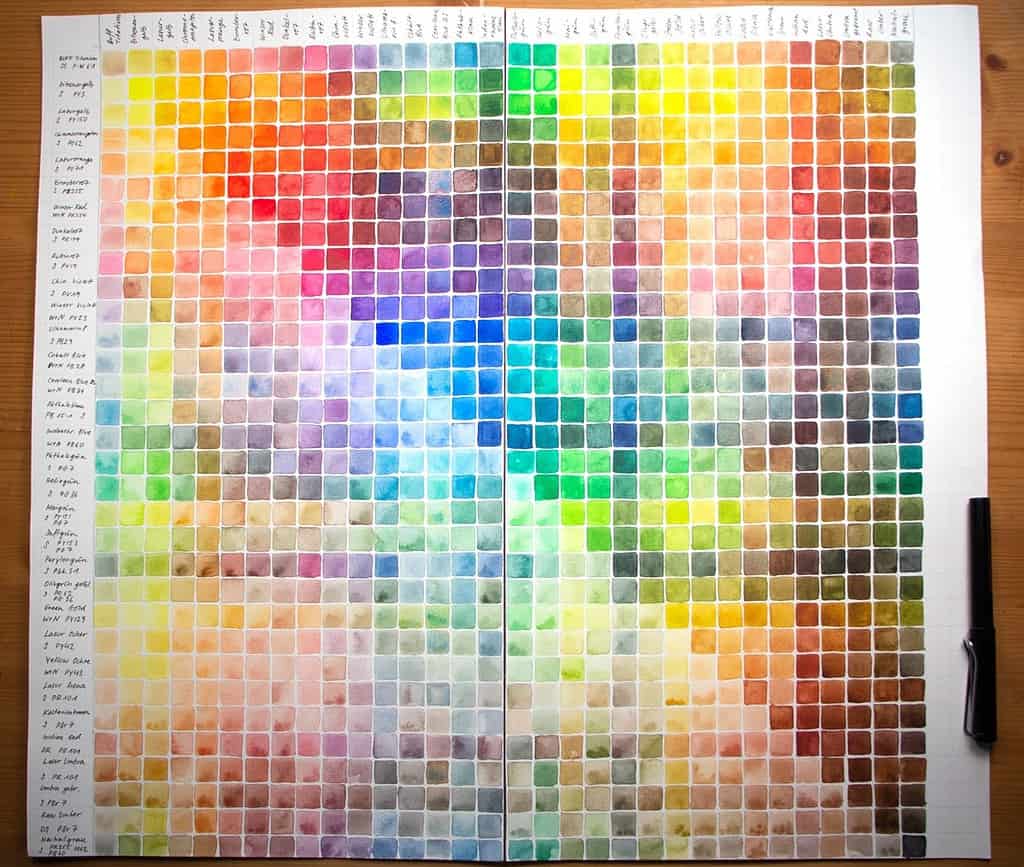
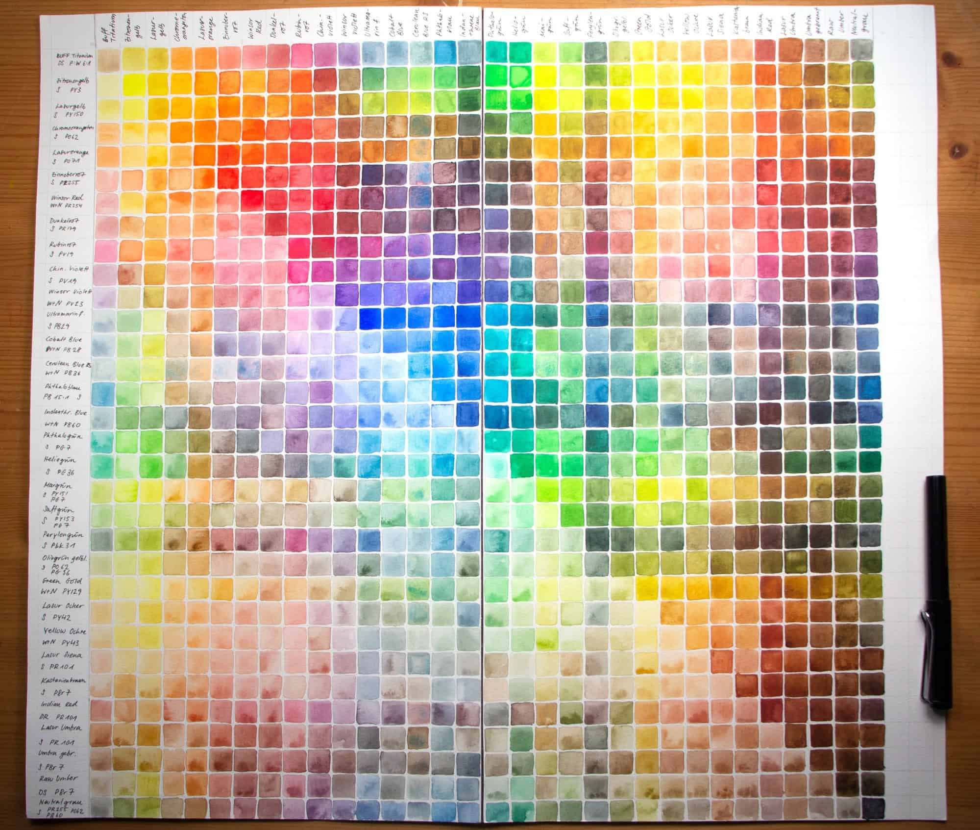
A more organized approach is to make a color chart with each color in your palette – this method is a bit more time-consuming, but you will have a very detailed overview of all the colors you can mix. I’m usually to lazy to make these charts, but it can be a great way to see the possibilities of your palette colors. You can see from the picture that I went through that arduous process once – with way too many colors. If I’d do this again, I would use much fewer colors, maybe 8 or ten at the most, and use better paper – one that I actually paint on. But I still take a look at this chart from time to time and it’s a good tool to use when you want to achieve a very specific hue.
All in all, I find these mixing exercises and color studies very useful to learn about my paints and how they react with each other, which in turn lets me make better decisions when I’m sketching. It’s a never-ending process, since we have so many different paints and pigments available today.
What are your favorite methods to compare and mix colors? Let’s discuss!


Julia, I am an absolute beginner with watercolour, but I am heading rapidly towards age 70 so I don’t want to spend a lot of time learning how to paint “things” and “places.” But, I do want to learn how to play with watercolour paints! I was gifted a set of more than 70 (large tubes) of Daniel Smith paints – they utterly overwhelm me. I am beginning to see, from reading your posts that I really need to extract sets of 3 colours from this bounty, and play with just them. Once I have a firmer idea of what I am dealing with, then I can branch out using other alternatives. I also have this nagging feeling that I need to understand warm and cool colours to make my mixes as successful as possible. How on earth do I learn to distinguish, for instance, a warm yellow from a cool yellow?
Hi Jakki, 70 tubes is a lot, but it’s also a wonderful range to choose from and experiment with, and Daniel Smith paints are of great quality. You have more possibilities than I can probably cover in this comment, but if you start with choosing three primary colors, a yellow, a pink (or red) and a blue, you can explore mixing all kinds of other colors with that. They’re called primary colors because you can (theoretically) achieve any hue with them. After a while, you could add more colors that aren’t mixable so easily, or that you want a shortcut for. If you change the hue (=color) of the primary, for example by changing your yellow to an earth tone, than you can see you entire palette shift. Mixing all primary colors will get you a dark hue, with the right amount of each color a neutral or almost black tone.
Warm and cool aren’t fixed categories, unfortunately, so everyone sees these a bit differently (I assume there are also cultural differences). There are color theories out there that basically order all hues in a circle, the primary colors and all mixed hues in between. They usually have an orange red as the warmest perceived color, and a greenish blue as the coolest perceived color. So a cool yellow would usually be leaning more towards green/blue, and a warm yellow towards red. Similarly, a red, in itself a “warm” color, can lean more towards orange or yellow, which will be perceived warmer than a red that has blue in it (like pink). Many painting books explain this in more depth, but there are also printed color wheels that you could use as a practical guide. It really helped me to have such a color model to understand how I can manipulate and mix my paints.
I hope this was at least a bit helpful, if you have any more questions, let me know! In any case, I hope you’ll enjoy exploring all the colors – it’s a wonderful subject and a lot of fun!
Another thought I had on how to learn to differentiate color temperature more easily: you can associate warm colors (so everything grouped around orange, red and yellow on the color wheel) with warm things: fire, sunset, blood, energy, spice, autumn leaves, etc. In the same way, cold colors (blue, green, violet) are usually associated with things like snow, night, ice, shadow, sleep, calm. Maybe this more psychological approach helps to better see the two temperature families. It’s also worth noting that a color on its own is hard to describe, it’s usually the relation between two (or more) colors that helps you describe one color as warmer or cooler as the other. So it’s a very relative approach.
I hope this makes sense. 🙂
Hi Julia,
My name is Betty and I live in Upstate New York. I wanted to comment and let you know that I really love your classes. I’ve been taking your lessons on Skillshare and I’ve just signed up for your blog. I really enjoy all of your classes and have learned a lot. I am also a “late bloomer”, in my 70’s. I have drawn all of my life and have attempted different painting mediums, but like watercolor and colored pencils the best. I’ve especially enjoyed your lesson with the walk in the woods on nature journaling, and the classes how to draw birds and butterflies. You have inspired me to take my journal into our woods in my back yard, and we have a conservation organization just up the road where I can view birds in their habitat. I noticed that your woods in Germany are very similar to our woods here in Upstate New York. Thank you for sharing your wonderful talent. I look forward to more of your lessons in the future.
Hi Betty, thank you! It’s great to hear you enjoy my classes. What a wonderful opportunity to watch birds in their habitat, that’s something very valuable. And how interesting that you have similar woods where you live – I think my city has the same latitude as Québec, so the climate is probably not that different. All the best for your sketching!