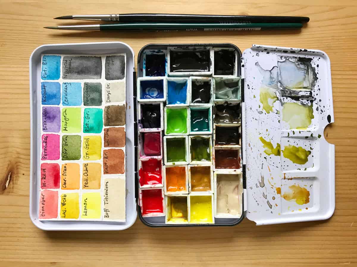
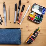
This is the palette I’m currently using for my sketchbook work and when I’m out in the field. When I work in my studio, I like to keep a bigger palette around just in case, but most of the time I end up using this one, too.
I also have a Youtube video in which I discuss my palette:
Some general thoughts about choosing paints:
- You will notice that this small metal palette has a lot of colors, right now there are 23 pans in it. This is due to the fact that I recently got some new paints I’d like to experiment with, and I know I will just forget about them if I store them in a box somewhere. You don’t really need more than 16 or 20 colors to mix most hues you can think of (or need).
- I prefer to use metal palettes, if just because I find mixing on them easier. Plastic palettes might be slightly lighter, but I find the paint sits on it in small droplets instead of a larger puddle. Both variants stain after a while, but I can’t see myself carrying a ceramic plate with me in the field (this is what I like to use in the studio).
- When I started painting a few years ago I got student grade paints that I’ve been replacing bit by bit with artist grade paints. The rule of thumb here is to get the best quality you can afford, and to get mostly single pigment paints that will mix well. I noticed my mixes became clearer and easier to layer when I switched to professional paints.
- When choosing paints it’s best not to go by the color’s name (these are usually chosen for marketing reasons) but by the pigment. You can find the little letter-number codes on the tube or pan. Pigments can differ a bit between brands, so it’s best to check out online sources that have already compared them.
- A great resource (and a big time sink) to learn about pigments is the handprint website – it’s a comprehensive source to compare watercolor paints and pigments. If you feel ready to dive into the slightly nerdy side of watercolors, check it out.
- Another color expert is Jane Blundell – she has tested and swatched paints from almost all watercolor companies out there, and put them up on her blog for comparison. Also a wonderful resource for setting up your palette.
- I mainly work with Schmincke Horadam paints because I can get them at a decent price here in Germany. I also use some Winsor & Newton and the odd Daniel Smith, although the latter is ridiculously overpriced here. All of these paints have a great quality.
- While getting a watercolor kit may be the easiest step for a beginner, these kits often contain pigments that aren’t really useful for mixing, like cadmium pigments that are very opaque and can make muddy mixes. If you can, try to build your own palette from the start.
- One thing that you will inevitably do is make your own experiences and color choices – assembling a palette is a very personal thing, and you will find which pigments work well for you. Experiment with everything! Also the things that I told you don’t work well. It’s how you learn.
- I love transparency and brightness in my colors, so I tend to get transparent pigments over opaque pigments, they usually mix better. While I enjoy granulating colors in my sketchbook (the pigments of these colors group together and give an interesting effect on the paper), I don’t have a big use for it when making more realistic illustrations, so I keep my granulating colors to a minimum. I still love to experiment with them from time to time!
- In the beginning, get to know your paints. If you’re into relaxing, repetitive work, making a mixing chart is an excellent way to find out how your colors combine with each other.
- I don’t have a black in my palette, but a very dark gray with black pigment, and I also keep white gouache around for highlights.
In this basic palette I have taken the standard approach of having a warm and a cool version of each primary color, plus a few convenience greens, grays and earth colors, plus some colors that I simply enjoy or want to test. You can definitely choose a great palette with only 12 or 16 colors, so don’t let my exuberance influence you. I’m just not very good at excluding paints! (I have another field palette with 26 wells that I’m excited to try out, and the one in my studio holds 48 pans…) I also carry around a small gouache palette with light colors so I can add lighter colors on top if I want. Some artists prefer a smaller palette with only the primary colors and mix all the colors they need from that, but I like to take advantage of having a few more choices when it comes to pigments.
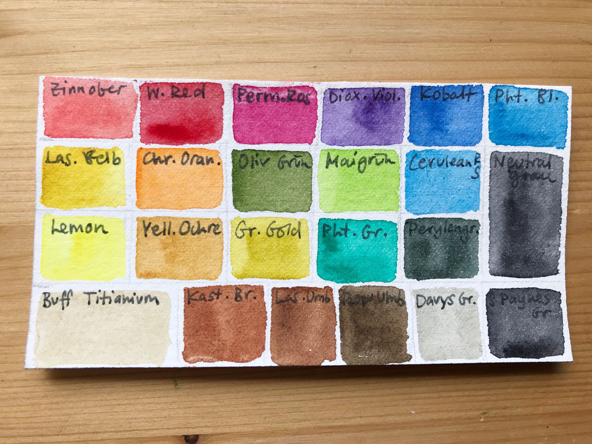
Note that the abbreviation behind the color’s name is the pigment number. You can see I prefer to have single pigments, with the exception of a few convenience grays and greens.
Schmincke Vermilion PR255 – semi-staining, opaque red, a good warm red for mixing
W&N Winsor Red (Pyrrol Red) PR254 – semitransparent, staining, cool red
Schmincke Ruby Red PV19 – semitransparent, semi-staining pink. A cool red that’s great for mixing purples, pinks and oranges.
W&N Winsor Violet (Dioxazine Violet) PV23 – staining, transparent purple, great for shadows
W&N Cobalt Blue PB28 – semitransparent, warm blue.
Schmincke Phthalo Blue PB15:1 – semi-staining, semitransparent primary cyan (greenish blue), good mixing color, but intense.
Schmincke Transparent Yellow PY150 – Semi-staining, transparent warm yellow that changes from a brownish dark tone to light warm yellow when diluted.
Schmincke Chrome Orange PO62 – Semitransparent, semi-staining orange
Schmincke Olive Green Yellowish PO62, PG36 – staining, semitransparent warm green mix, good for olive birds.
Schmincke May Green PY151, PG7 – semi-staining, semitransparent warm, bright green mix, great for mixing into Spring foliage
W&N Cerulean Blue Red Shade PB36 – semi-opaque, cool blue, great for skies because of its granulation
Schmincke Lemon Yellow PY3 – Semitransparent, semi-staining cold yellow. A good primary yellow for mixing.
W&N Yellow Ochre PY43 – semi-opaque earth yellow, similar to raw siena
W&N Green Gold PY129 – warm transparent yellow-green, good for mixing with other greens.
Schmincke Phthalo Green PG7 – non-staining, semitransparent cool green. I never use this on its own, but it’s a great color for mixing with yellow or reds.
Schmincke Perylene Green PBk31 – semi-staining, opaque dark green, almost black, great for shadows.
Schmincke Neutral Gray PR255, PO62, PB60 – semi-staining, semi-opaque grey without black pigment. Great for mixing and painting dark areas you want to look alive.
DS Buff Titanium PW6:1 – Semitransparent pale light brown. A favorite of mine for painting sand, or light areas of birds.
Schmincke Maroon Brown PBr7 – semi-opaque, non-staining warm earth tone, a granulating alternative to Burnt Siena. I’m currently experimenting with this color.
Schmincke Transparent Umber PR101 – staining, transparent warm brown, a bit cooler than the Maroon Brown, great for mixing.
DS Raw Umber PBr7 – staining, semitransparent deep cool brown, a difficult color to mix.
W&N Davy’s Gray PG17, PBk19, PBk6, PW5 – semi-opaque light cool gray, nice to have around but not really essential. I like it for light areas in birds.
Schmincke Payne’s Gray PR101, PB29, PBk7 – semi-staining, semi-opaque cool dark-gray mix, I use it instead of single-pigment black.
DS = Daniel Smith W&N = Winsor & Newton Professional
Please note: there is no perfect palette and you will likely change your palette over time. This is normal! As you add or switch colors, consider things as lightfastness, transparency, staining, granulation, and overall paint quality.
My final tip to you would be to use the paint you have, and get to know it. Find out about the pigments and experiment with different mixes. You might want a slightly different palette than me, and that’s totally fine. Every artist has their own preference!

Hi Julia, I have just subscribe for you newsletter
Thank you for suggesting these items. It is really useful in assisting me in selecting the ideal watercolor palettes.
You’re welcome! 🙂