
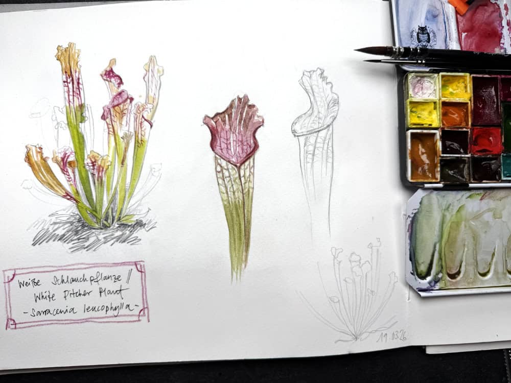
In the middle of all the landscape sketching I’m doing, it’s nice to change things once in a while and return to other subjects. Since spring is finally around the corner, I thought it’s a great time for some botanical sketching. I’ve chosen a pitcher plant, which feels a bit like cheating, since it’s further along than the native plants (it lives in a cozy terrarium in the botanical garden). It’s definitely a fun plant to draw, and I’ve never taken a closer look at it – time to change that!
As I’m showing the different phases of how I’ve put this page together, I hope I can give you some ideas for how to compose these kind of study pages in your sketchbook. This isn’t limited to botanical sketching, you can apply it to all subjects.
I’m starting with a pencil sketch and capturing the shapes of the entire plant first. As I’m drawing, I’m trying to break down what I see into simple geometric shapes. So the entire plant would be a broad cylinder opening up at the top, similar to a yoghurt cup, and the single elements of the pitcher plant look like tubes, but this time getting broader at the top, and with a lid on top. Treating something complex in front of you as a group of simple shapes is one of the keys to create a dynamic and three-dimensional sketch.

I’m trying to keep everything very simple, especially the textures, because I know I
want to add more of them with my watercolors. I’m adding a small plaque like note for the three names: German name, English name, and Latin name – this last one is the one that essentially matters if you want to know exactly which plant you’re dealing with.
I’m starting to add watercolor with a larger brush, with this I can add loose washes that don’t seem overworked. I’m thinking about where I want to add color and if I can leave parts of the sketch unpainted, giving it a study feel. There are wilted parts at the top of the tubes that I add with yellow ochre and raw umber, and I’m using permanent rose for the veins and textures – I’ve switched to a smaller brush here.

I mix a bit of yellow into my sap green to make it slightly warmer, and I add some cobalt blue to show the areas in shadow.
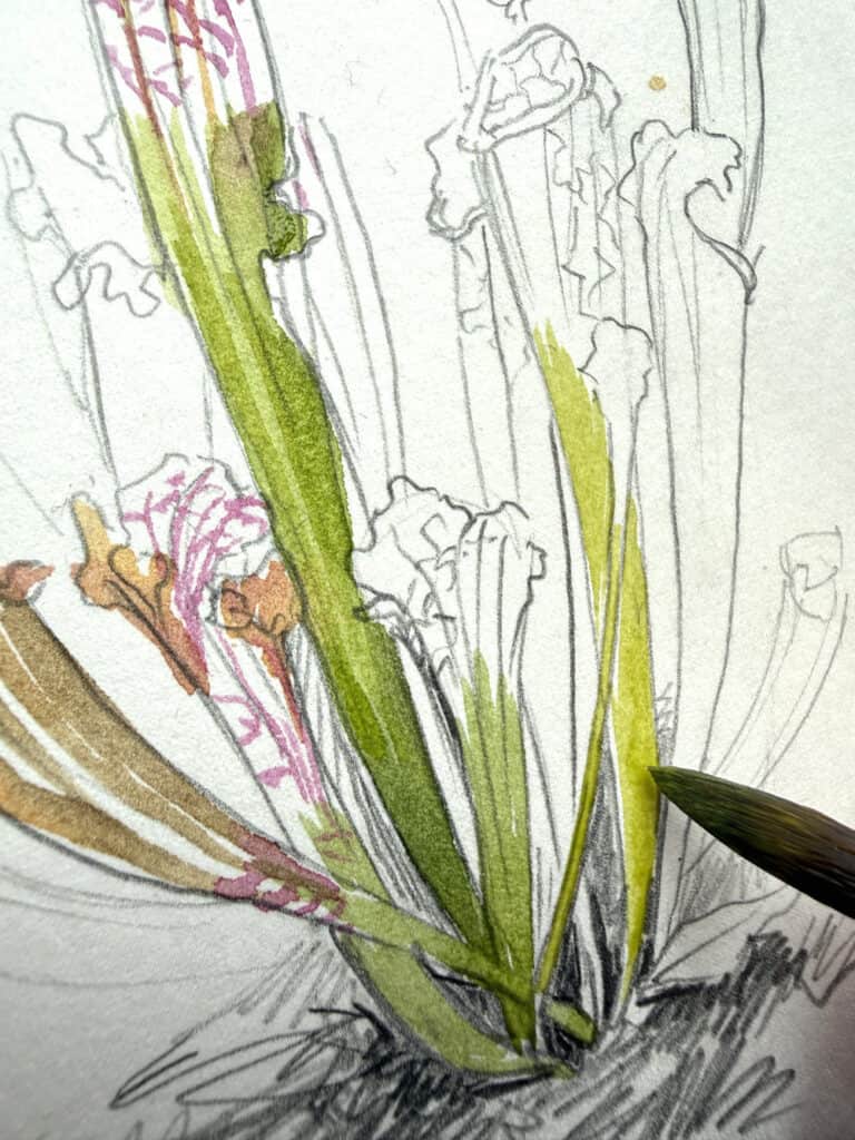
Here is the finished color sketch, I ended up coloring most of the plant on the left, except some tubes in the back which adds a bit of depth. I consciously left the right plant detail unpainted, so that I can add a few notes to it.
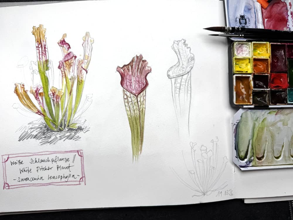
Adding color to selected elements only give the page a study feel, which I like. I’ve also added a small thumbnail to memorize what the plant looks like as a larger shapes and to practice those forms – long tubes with a flap on top.
As a last step, I’ve added a few annotations around the sketch, this helps to balance the entire page, but more importantly you learn fun facts about what you’re drawing. Note the small insects! I haven’t seen any near the live plant, but I’m sure this beautiful carnivorous plant is well fed.
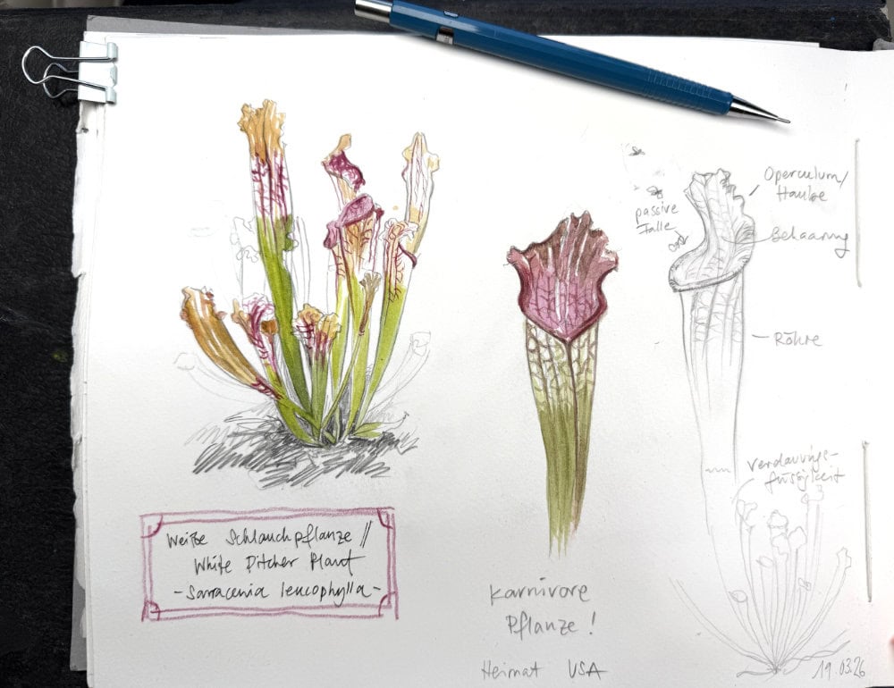
You can play around with these concepts more and add more elements, like a title at the top, or frames to structure the elements further. I usually like to keep my layouts quite simple, so this is as elaborate as it will get for my compositions.


Your work is so encouraging. I have tried for years to show the middle areas of a rural scene (fields) of a watercolor such as grasses, but I either do too much ‘grassy look’ or not enough. Close ups are easier but the middle ground is a mystery!
Thanks for all your ideas and visions. I look forward to your posts.
Such a lovely sketch and study I love Nature Journaling and am teaching some classes on it and your post and blog really inspire me! Thank you for listing the names of colors you used to paint and blend. I’m planning to teach another class about drawing birds this Sat and will recommend your blog again to the students.
Thank you Jenny, that sounds like a fun class!
Just keep practicing and study how other artists solve this. But yeah keeping those areas loose enough but still showing some texture can be challenging.
Thanks for sharing your process with us, Julia. iI love reading your blog posts because I learn much from them.
Thank you Rosanna, glad to hear you enjoy my posts so much!
This is a really helpful lesson, it brings us back to really observing and getting what we see down on paper. I’m off in the realms of abstract collage so this is bringing me back to basics and to real painting. Thank you for the colour tips. Your blogs are always a pleasure to read. Thank you Julia.
Thank you Monica, yes it always starts with observation for me. Abstract collage sounds really fun too, I find this kind of art can really help to loosen up sometimes!
We just spent nearly two months in the Mojave desert, including a month camping in Death Valley and watching a super bloom emerge. i did a lot of flower sketches & thought about you & your work!
That sounds like a wonderful trip and a beautiful sketching location!